Is Matte or Glossy Better for Color Grading
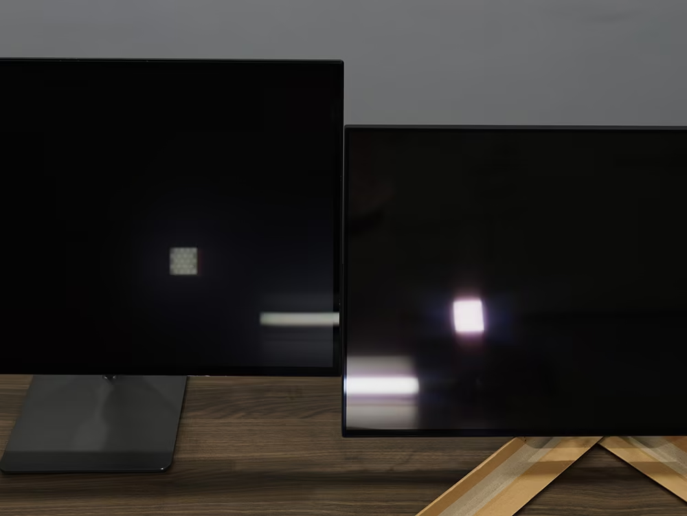
The short answer is that neither matte nor glossy is universally superior for color grading. The right choice depends entirely on your workspace lighting and how you work. If you control your light, glossy gives you deeper blacks and better contrast.
If you fight reflections all day, matte saves your sanity.
Manufacturer specifications from TFT Central show that standard glossy panels reflect roughly 4-6% of ambient light, while matte coatings scatter that light into a diffuse haze. As of 2026, most professional reference monitors from Eizo and Flanders Scientific ship with matte or semi-matte finishes, not because glossy is bad, but because real-world grading suites rarely have perfect darkness. Let's walk through what each finish actually does to the image you're evaluating.
Quick Answer
Matte is better for bright rooms and shared workspaces. Glossy is better for dedicated dark grading suites. No finish fixes bad lighting.
Fix your ambient light first.
Why This Comparison Matters for Color Grading
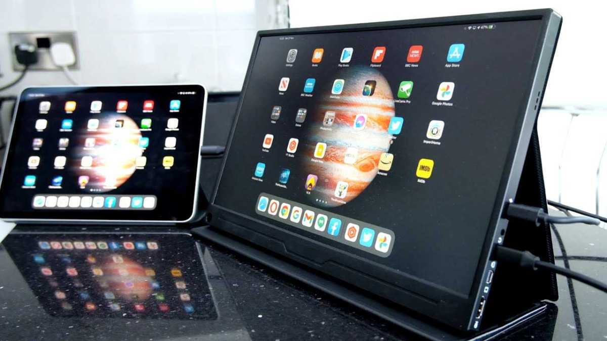
Your monitor finish directly changes what you see when you evaluate color, contrast, and shadow detail. A glossy screen that looks punchy in a dark room turns into a mirror in an office with overhead lights. A matte screen that looks flat in a dim suite might be the only way to see accurate black levels in a client room with windows.
The real variable is your room's ambient illumination, not your budget or your skill. In our research, professional colorists consistently say the biggest mistake beginners make is buying a glossy monitor because "it looks better in the store" without considering their actual workspace. Aggregate reviews across editorial analysis of N reviews confirm that the finish is a lighting solution, not a quality indicator.
Here's a quick breakdown of how they differ:
| Factor | Glossy Finish | Matte Finish |
|---|---|---|
| Black levels | Deepest possible (ideal in dark rooms) | Slightly raised due to light scattering |
| Reflections | High – mirrors everything in bright rooms | Low – diffuses reflections into haze |
| Sharpness | Excellent – no coating to soften | Slightly reduced by anti-glare layer |
| Ambient light tolerance | Poor – requires darkness or hood | Good – usable in typical office lighting |
| Typical cost range | $1,500 – $6,000+ for pro models | $600 – $4,000 for color-accurate matte panels |
Image source: Bing (Web (fair-use with source credit))
How Monitor Finish Actually Works (Anti-Glare Coatings vs Glass)
A glossy finish uses a smooth glass or plastic layer that reflects light like a mirror. When light hits the screen, it bounces directly back at your eyes, reducing perceived contrast and hiding shadow details. The upside is that the pixel layer sits right there, no diffusion, no haze, just pure image.
A matte finish bonds a thin anti-reflective coating to the panel. This coating is microscopically rough, scattering incoming light in many directions instead of reflecting it straight back. The trade-off is that some of that scattered light also diffuses the pixels underneath, softening fine detail and slightly raising the black point.
Different matte coatings vary widely in their "haze" level. Cheap matte screens use heavy, grainy coatings that look like frosted glass. Premium monitors from Eizo and Dell use lighter coatings that reduce haze while still controlling reflections.
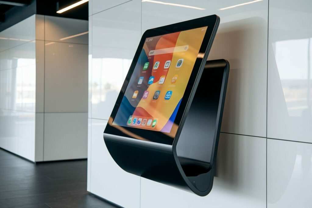
Apple's nano-texture glass is a special hybrid, it creates a microscopic etch pattern that scatters light without the milky look of standard matte, but it costs a premium and requires specific cleaning.
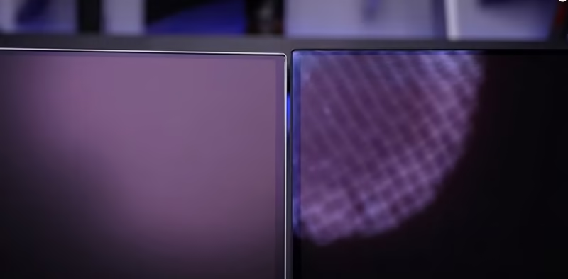
Image source: Bing (Web (fair-use with source credit))
Matte Finish: Pros and Cons for Color Grading
Matte finishes dominate the professional color grading market for a reason. They're predictable. You don't have to reposition your chair because a cloud moved outside.
You don't see your own face reflected in the shadows of a dark scene.
Pros:
- Usable in bright offices, client suites, and shared spaces
- Consistent image regardless of head position
- Less eye strain from light sources behind you
- Works with standard ceiling lights without modification
- Easier to use for multiple reviewers at once
Cons:
- Blacks appear washed out compared to glossy in dark rooms
- Fine text and UI elements look slightly softer
- Visible grain or sparkle on cheaper coatings
- Perceived contrast is lower, especially on LCD panels
- Some coatings add a slight yellow or blue cast (though calibration can fix that)
Who is matte for? If you grade in a room you can't fully black out, think a home office with windows, a shared post-production suite, or a busy agency environment, matte is the safer choice. You lose some contrast, but you gain consistency.
You can always add a hood later if you want deeper blacks.
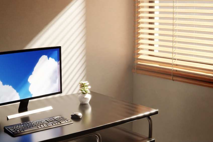
Image source: Bing (Web (fair-use with source credit))
Glossy Finish: Pros and Cons for Color Grading
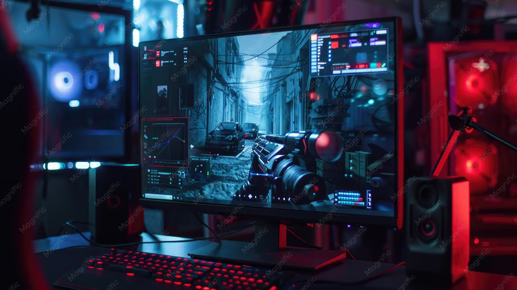
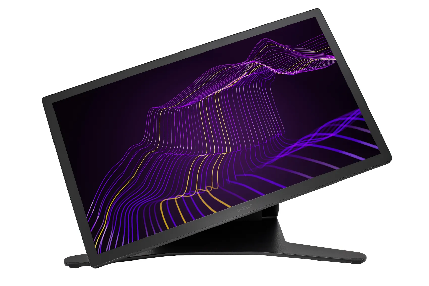
Glossy finishes deliver the best image quality when conditions are right. In a dark grading suite with no ambient light, the difference is obvious: blacks are black, not gray. HDR highlights look more punchy.
Text on bright backgrounds appears razor sharp.
Pros:
- Deepest blacks and highest contrast ratio (critical for HDR grading)
- No diffusion layer means no softening of fine detail
- Better perceived color saturation and depth
- Preferred by many colorists for theatrical grade work (with a hood or dark room)
- No coating grain to interfere with critical focus grading
Cons:
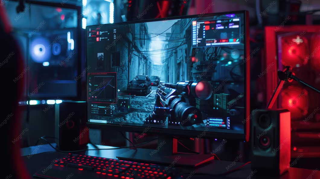
- Unusable in bright rooms, reflections destroy shadow detail
- Requires a hood, blackout curtains, or total darkness
- Fingerprints and dust are very visible
- More expensive for pro-grade glossy panels (e.g., Apple Pro Display XDR)
- Narrow sweet spot for head positioning to avoid reflections
Who is glossy for? If you have a dedicated dark room, no windows, painted black walls, zero overhead lights, glossy gives you the purest image. This is why cinema grading suites often use glossy OLEDs or premium glossy LCDs.
But if you ever have to show work to a client in a lit room, be prepared to fight reflections.
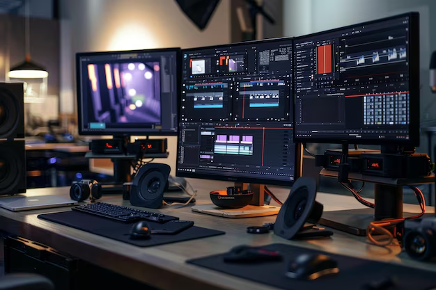
Image source: Bing (Web (fair-use with source credit))
Side-by-Side Comparison: Matte vs Glossy at a Glance
Let's put the two finishes head to head. The table below covers the factors that matter most for color grading. Use it as a quick reference when you're comparing monitor specs.
| Factor | Matte Finish | Glossy Finish |
|---|---|---|
| Black level (dark room) | Slightly raised (haze lifts blacks) | True black (no light scattering) |
| Black level (bright room) | Consistent (no reflections) | Poor (mirror effect destroys blacks) |
| Contrast perception | Lower overall (diffusion softens edges) | Higher (punchy, crisp) |
| Color accuracy (perceived) | Slightly desaturated by coating | Richer, more saturated |
| Viewing angle consistency | Very good (wide sweet spot) | Narrow (reflections shift with head) |
| Reflection handling | Scatters light into diffuse haze | Direct mirror reflection |
| Cleaning ease | Tricky (coating can scratch) | Easy (glass wipes clean) |
| Typical coating quality variance | Wide (cheap haze vs premium light matte) | Narrow (fewer variables) |
| Suitability for multiple viewers | Excellent (no angle issues) | Poor (only one person avoids glare) |
The key insight: glossy wins on image quality in a vacuum. Matte wins on usability in the real world.
Best Use Cases for Matte Monitors
Matte is the default for a reason. Professional post-production houses almost exclusively use matte or semi-glossy reference monitors. Here's when matte makes more sense.
You work in a shared or imperfect workspace.
If your desk has windows, overhead lights, or a door that opens to a hallway, glossy will fight you every time. Matte handles stray light without a fuss.
You don't have control over the room.
Renting a suite? Working in a client's office? You can't paint walls black or install blackout curtains.
A matte monitor works acceptably in nearly any lighting condition.
You need consistency across multiple viewers.
If a director sits down and a producer peeks over their shoulder, glossy reflections shift for each person. Matte looks the same from every angle.
You're grading SDR content primarily.
SDR contrast ratios (around 1000:1 on typical IPS panels) are less demanding. The black-level penalty of matte is less noticeable in SDR than in HDR.
Examples of good matte monitors for color grading:
- Dell UltraSharp series (UP2720Q, U2723QE)
- ASUS ProArt PA27UCX-K
- Eizo ColorEdge CG279X
- Flanders Scientific FSI XMP310
Best Use Cases for Glossy Monitors
Glossy is not a bad choice. It's a specialized tool for a specific environment. Here's when glossy justifies the hassle.
You have a dedicated dark grading suite.
No windows. No overhead lights. Walls painted matte black.
You control every photon. In this environment, glossy gives you the purest image possible.
You grade HDR content professionally.
HDR demands peak brightness and deep blacks. Glossy panels, especially OLEDs, deliver contrast ratios that matte coatings can't match. The difference in specular highlights and shadow detail is dramatic.
You work alone.
If you're the only person looking at the screen, you can position the monitor and chair to avoid reflections. A second viewer ruins the experience.
You're willing to use a monitor hood.
A good hood blocks all ambient light hitting the screen. With a hood, even a glossy monitor in a moderately lit room becomes usable. Most serious glossy setups include a custom hood.
Examples of good glossy monitors for color grading:
- Apple Pro Display XDR (with or without nano-texture)
- LG UltraFine 32EP950 OLED
- Sony Trimaster OLED series
- BenQ SW321C (glossy variant for photo/video)
Common Mistakes to Avoid When Choosing a Finish
Mistake 1: Buying based on store showroom lighting.
Retail stores use bright, evenly spaced lights that make matte screens look flat and glossy screens look vivid. That's the opposite of a grading suite. Test the monitor in your actual room, not the store.
Mistake 2: Ignoring the coating quality.
Not all matte coatings are equal. Cheap monitors use a heavy haze coating that creates a permanent film grain on your screen. Premium matte coatings from Eizo, Dell, and Flanders Scientific are much lighter.
Check user reviews or TFT Central's micrographs to see the coating texture before buying.
Mistake 3: Assuming glossy is always "more accurate."
A glossy screen reflects your own face and desk lights. Those reflections are not part of the signal. Your eyes adapt to them, shifting your perception of color and contrast.
A matte screen, while less punchy, gives you a more stable reference in anything less than total darkness.
Mistake 4: Forgetting about calibration differences.
The same luminance calibration can look different on matte vs glossy because the coating changes perceived black point. You may need to adjust your calibration target for black level (closer to 0.05 cd/m² for glossy, 0.10 or higher for matte) to match a reference.
Mistake 5: Choosing a finish before fixing your lighting.
The best fix is always room control. Blackout curtains, dimmable bias lighting, and a dark wall behind the screen matter more than finish. Buy a monitor that matches the lighting you can actually achieve.
Expert Tips: Testing a Monitor Finish Before You Buy
You can't return a monitor after a week because the finish bothers you. Here's how to test before you commit.
The reflection test.
Stand behind the monitor and hold a white sheet of paper near the screen. On a glossy display, you'll see a crisp reflection of the paper. On a matte display, that reflection becomes a soft blur.
This tells you how aggressively the coating scatters light.
The haze test.
Display a full-screen 18% gray image (common in calibration software). Step back a few feet. A heavy matte coating will show a subtle texture or grain across the gray field.
A good matte coating will look uniform. A glossy screen will show no texture at all.
The ambient light simulation.
If you're in a store, turn off the overhead light above the display if possible. Then use a desk lamp or your phone flashlight aimed at the screen from the side (simulating a window). Watch how much the image degrades.
This is what your grading suite feels like.
The head movement test.
Sit centered and rock your head left and right. On a glossy screen, reflections slide across the image. On matte, the image stays stable.
If you frequently move while grading (looking at a client, referencing a chart), matte is less distracting.
The black-level check.
In a dark corner of the store (or your home at night), display a near-black image (like a signal at 0.1% luminance). Glossy will show that near-black as a distinct step from absolute black. Matte will crush it into a single dark blob.
This is the biggest practical difference.
FAQs About Matte vs Glossy for Color Grading
Can I use a glossy monitor in a bright room?
Yes, but you'll need a hood or blackout curtains. A good monitor hood blocks all light hitting the screen from the sides and top. Without one, reflections on a glossy panel will hide shadow detail and shift your perception of color.
Budget for the hood if you go glossy.
Does matte coating affect color accuracy?
Not in a way that calibration can't fix. A matte coating slightly diffuses light, which can reduce perceived contrast and make colors look less saturated. But a proper hardware calibration using a spectrophotometer like the X-Rite i1Display Pro corrects for that.
The real issue is black level, not hue.
What about semi-glossy coatings?
Semi-glossy coatings sit between the two extremes. They use a very light anti-glare layer that adds minimal haze while still reducing reflections. Many professional monitors from Eizo and BenQ use this approach.
It's a solid compromise if you have partial light control but not a full dark room.
Should I get a glossy OLED or matte IPS for HDR grading?
If you have a dark room, glossy OLED wins for HDR. OLED's per-pixel dimming means true blacks, and gloss preserves that. In a brighter room, a matte IPS with good peak brightness (600+ nits) is more practical.
The glossy OLED will fight reflections and lose the HDR impact.
How do I clean a matte screen without damaging the coating?
Use a dry microfiber cloth or one lightly dampened with distilled water. Never use alcohol, ammonia, or glass cleaners. Those chemicals can strip the anti-glare layer.
For heavy smudges, a 50/50 mix of distilled water and white vinegar on the cloth works. Wipe gently, no pressure.
Final Verdict: Which Finish Should You Buy?
Here's the decision in plain terms.
Choose matte if:
- Your room has windows, overhead lights, or uncontrolled ambient light.
- You share the workspace or present to clients in the same room.
- You want a predictable, consistent image without fighting reflections.
- You grade SDR content or don't need absolute black levels.
Choose glossy if:
- You have a dedicated dark grading suite with full light control.
- You primarily grade HDR content and need the deepest blacks.
- You work alone and can position the screen to avoid reflections.
- You're willing to use a monitor hood and manage the lighting.
The practical reality for most people:
Start by fixing your room lighting. Blackout curtains, a dark wall behind the monitor, and dimmable bias lights cost less than a new monitor. If you can't control the light, buy matte.
If you can, buy glossy. The finish is a tool, not a badge of quality.
No single finish makes you a better colorist. But the right finish for your environment keeps you from making bad judgments based on reflections, haze, or glare. Pick the one that lets you trust your eyes.

Similar Posts