How to Create a Floating Button in Android? 2026
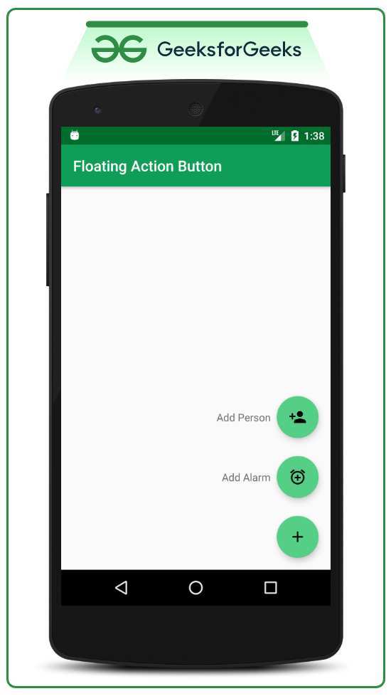
Image source: Bing (Web (fair-use with source credit))
If you’ve ever tried adding a FloatingActionButton to your Android app and ended up with something that looks off-center, has no shadow, or sits behind the navigation bar, you’re not alone. How to create a floating button in Android sounds straightforward, but the difference between a polished result and a broken-looking UI comes down to a handful of details most tutorials skip.
The Material Design specification defines the default FAB at 56dp in diameter with 6dp of elevation at rest and 12dp when pressed. Following those numbers alone won’t guarantee it works across screen sizes, API levels, and edge cases. Let’s walk through exactly what goes wrong and how to fix each piece.
Why Your Floating Button Looks Wrong (and How to Fix It)
You place a FloatingActionButton in your layout. You set an icon. You run the app.
And then you see it: the button is too close to the edge, the shadow is missing, or the icon is invisible against the background tint. Maybe it overlaps with a Snackbar. Maybe it disappears behind the soft navigation bar.
These aren’t beginner mistakes. They’re the result of Android’s fragmentation across API levels and device configurations. Here’s what typically goes wrong:
- Elevation doesn’t render on pre-API 21 devices unless you use the
app:elevationattribute from the Material library. - Margins get eaten by the window insets on devices with gesture navigation, pushing the FAB too low.
- The icon vanishes when
backgroundTintis too close to the icon color, especially with white icons on light tint. - The Snackbar slides the FAB out of position because the FAB isn’t anchored or offset correctly.
The fix for each of these comes down to understanding a few properties and layout patterns. We’ll cover them step by step.
Quick Answer: The One XML Snippet That Gets You 90% There
Add the Material dependency to your build.gradle. Place a FloatingActionButton inside a CoordinatorLayout. Set the icon with app:srcCompat.
Set the background tint with app:backgroundTint. Add android:layout_gravity="bottom|end". Give it android:layout_margin="16dp".
Set app:elevation="6dp". Wire a click listener in your Activity.
That’s the fast path. It works for most cases. But the last 10%, proper navigation bar handling, scroll behavior, Snackbar coordination, needs the details below.
What a FAB Actually Is (No, It’s Not Just a Round Button)
A FloatingActionButton is a subclass of ImageButton from the Material Components library. It’s designed to promote the primary action on a screen. It floats above the content with an elevation shadow, giving it visual priority.
The FAB comes in three variants:
- Regular FAB (default, 56dp), for the main action on a screen.
- Mini FAB (40dp, with
app:fabSize="mini"), for secondary or contextual actions. - Extended FAB, a wider version with a text label alongside the icon, used when the action needs explanation.
The FAB is not meant for every button. Overuse defeats its purpose. Stick to one per screen unless you’re using a speed dial pattern where multiple mini FABs expand from a main FAB.
Visual Anatomy: Every Property That Changes What You See
The FAB’s appearance depends on seven visual properties. Change any one and the look shifts noticeably.
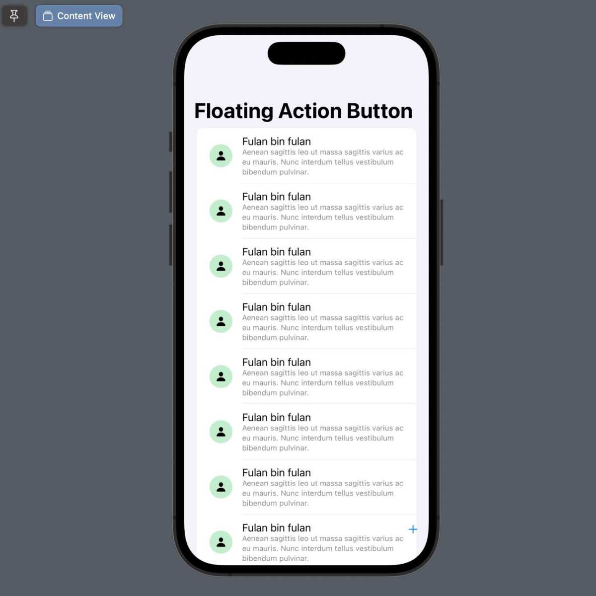
Image: Side-by-side comparison of FAB with correct elevation (left) and missing shadow (right), showing how the depth changes the visual hierarchy.
| Property | Default Value | Impact |
|---|---|---|
| Size | 56dp (regular) / 40dp (mini) | Larger buttons feel more important. Use mini for secondary actions. |
| Elevation | 6dp at rest, 12dp pressed | Controls the shadow depth. Missing on pre-API 21 without app:elevation. |
| Background tint | ?attr/colorAccent (or colorSecondary) | Defines the fill color. Must contrast with the icon. |
| Icon | None (you must set app:srcCompat) | The visible symbol. Vector drawables recommended for scaling. |
| Ripple color | Derived from theme | The touch feedback color. Can be customized with app:rippleColor. |
| Shape | Circle (default) | Only change if you want a custom outline. |
| Margins | 16dp from edges | Prevents FAB from touching screen edges or other views. |
The elevation property is the most commonly broken one. On devices running Android 5.0 (API 21) and above, the system draws a shadow using android:elevation. On older devices, you must rely on the Material library’s app:elevation attribute plus a transparent border workaround built into the component.
If you see no shadow, check that you’re using the Material Components dependency and not the old support library.
Step-by-Step: Building a FAB That Actually Looks Right
Let’s go through each step in order. By the end, you’ll have a FAB that works on API 14 through API 35 (Android 15) with proper shadow, positioning, and behavior.
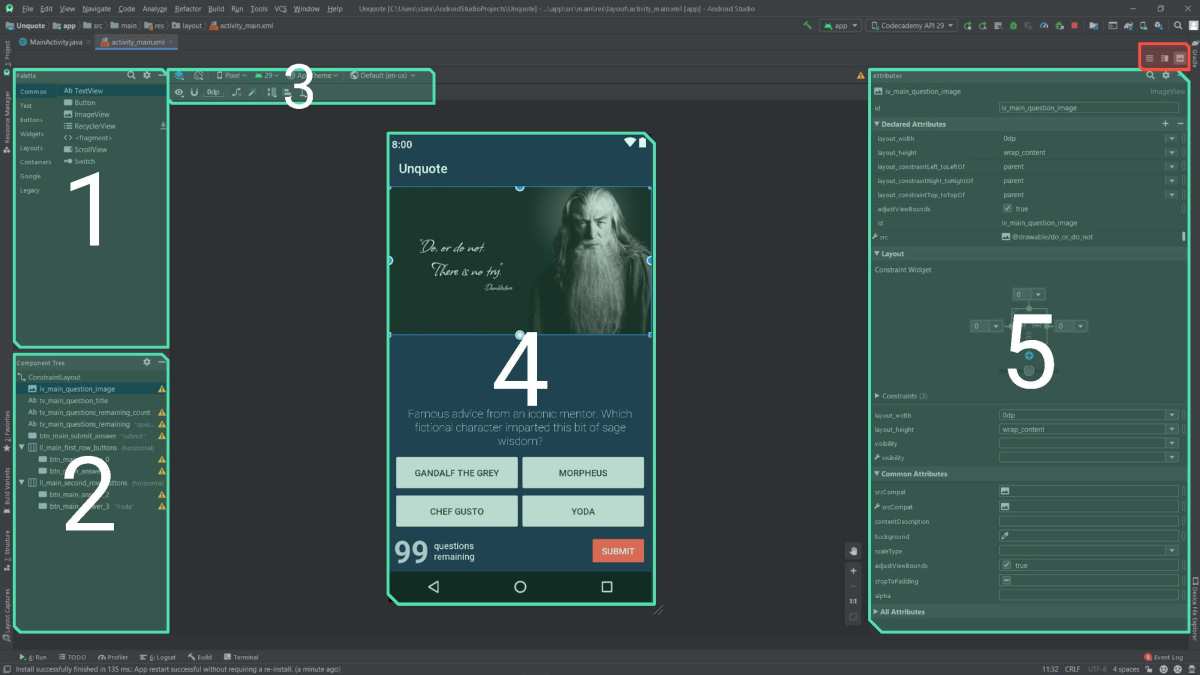
Image: Android Studio’s layout editor showing the Palette with a FAB selected, a Component Tree, and the visual preview pane. The red annotations highlight where to find the FAB in the palette and where to adjust layout properties.
Step 1: Add the Material Dependency
Open your module-level build.gradle file. Inside the dependencies block, add:
implementation 'com.google.android.material:material:1.12.0'
Sync the project. This brings in the FloatingActionButton class and all related attributes. If you’re using the old support library (android.support.design.widget.FloatingActionButton), migrate to the Material Components version.
The support library is no longer maintained.
Step 2: Place the FAB in Your Layout
Wrap your main content in a CoordinatorLayout. Then add the FAB inside it, after the main content view.
<androidx.coordinatorlayout.widget.CoordinatorLayout
    android:layout_width="match_parent"
    android:layout_height="match_parent">

    <!-- Your main content, like a RecyclerView or NestedScrollView -->
    <androidx.recyclerview.widget.RecyclerView
        android:id="@+id/recyclerView"
        android:layout_width="match_parent"
        android:layout_height="match_parent" />

    <com.google.android.material.floatingactionbutton.FloatingActionButton
        android:id="@+id/fab"
        android:layout_width="wrap_content"
        android:layout_height="wrap_content"
        android:layout_gravity="bottom|end"
        android:layout_margin="16dp"
        app:srcCompat="@drawable/ic_add" />

</androidx.coordinatorlayout.widget.CoordinatorLayout>
The CoordinatorLayout is key. It lets the FAB coordinate with other views like Snackbar and AppBarLayout. Without it, you lose the built-in hide/show animations.
Step 3: Set the Icon and Tint
Use app:srcCompat to set the icon. Never use android:src for vector drawables, it can cause rendering issues on older devices. For the background color, use app:backgroundTint:
app:backgroundTint="@color/colorPrimary"
Choose a color that gives strong contrast with the icon. White icon on a dark tint works well. Light gray icon on a light tint is invisible.
Test on a real device, not just the preview.
Step 4: Get the Position Right (Margins, Gravity, Navigation Bars)
The standard margin is 16dp from the bottom and end edges. But on devices with gesture navigation (Android 10+), the system insets may push the FAB behind the navigation bar. To fix this, add android:clipToPadding="false" on the CoordinatorLayout, or apply android:windowTranslucentNavigation or proper inset handling.
The safest approach is to use android:fitsSystemWindows="true" on the CoordinatorLayout and then set the FAB’s top and bottom margins to account for the insets. Or you can manually add bottom margin in a onApplyWindowInsets callback.
For most apps, the default android:layout_marginBottom="16dp" works fine on devices with physical navigation keys. Test on a gesture navigation device to confirm.
Step 5: Add the Shadow and Elevation
Set both android:elevation and app:elevation:
app:elevation="6dp"
android:elevation="6dp"
The android:elevation handles API 21+. The app:elevation handles pre-API 21 using the Material library’s shadow implementation. If you skip the app attribute, older devices show a flat button.
The press elevation defaults to 12dp. You can override it with app:pressElevation if needed.
Step 6: Wire Up the Click and Scroll Behavior
In your Activity or Fragment, find the FAB and set an OnClickListener:
val fab = findViewById<FloatingActionButton>(R.id.fab)
fab.setOnClickListener {
    // Handle the action
}
To make the FAB hide when scrolling down and show when scrolling up, add app:layout_behavior to the FAB:
app:layout_behavior="com.google.android.material.behavior.HideBottomViewOnScrollBehavior"
This works automatically when the FAB is inside a CoordinatorLayout with a scrollable child like RecyclerView or NestedScrollView. No extra code needed.
Common Visual Mistakes That Make Your FAB Look Amateur
Even experienced developers hit these. Here are the four most common ones and how to avoid them.
Mistake #1: FAB Hidden Behind the Navigation Bar
When the system navigation bar is transparent or uses gesture mode, the FAB can end up positioned under it. The fix: set android:fitsSystemWindows="true" on the CoordinatorLayout and adjust the FAB margin to stay above the inset area.
Mistake #2: Icon Invisible Because of Bad Color Contrast
If you set backgroundTint to a light color and use a white icon, the icon disappears. Use a dark tint with a white icon, or a light tint with a dark icon. The Material Design color system recommends using ?attr/colorOnSecondary for the icon when the background uses ?attr/colorSecondary.
Mistake #3: No Shadow on Older Devices
You used android:elevation but forgot app:elevation. On a device running Android 4.4 (API 19), the FAB looks flat. Add both attributes.
The Material library handles the rest.
Mistake #4: FAB Overlapping the Snackbar
When a Snackbar appears at the bottom of the screen, it should push the FAB up, not overlap it. CoordinatorLayout handles this automatically if the FAB is a direct child. Make sure you haven’t placed the FAB inside a FrameLayout or other container that breaks the coordination.
Real Scenarios: FAB with BottomAppBar, Snackbar, and Scroll
The FAB doesn’t live in isolation. Here’s how to handle three common real-world layouts.

Image: Android emulator screenshot showing a BottomAppBar with a FAB cutout, a Snackbar appearing below, and a scrolling list background. The FAB is correctly positioned above the BottomAppBar and gets pushed up by the Snackbar.
FAB with BottomAppBar: Use app:layout_anchor="@id/bottomAppBar" on the FAB and set app:layout_anchorGravity="top|end". The BottomAppBar includes a cutout for the FAB. This is the standard Material pattern for apps with bottom navigation.
FAB with Snackbar: As long as both are inside a CoordinatorLayout, the Snackbar pushes the FAB upward automatically. The default margin above the Snackbar is 72dp from the bottom. You can adjust it by setting margins on the FAB.
FAB with scroll-to-hide: Use HideBottomViewOnScrollBehavior as mentioned in Step 6. It works with RecyclerView, NestedScrollView, and ScrollView. The FAB fades and slides down when scrolling down, then returns when scrolling up.
Expert Tips: Animation, Extended FAB, and Speed Dial
Beyond the basics, here are three techniques that take your FAB from functional to polished.
Animate visibility changes. Instead of calling setVisibility(View.GONE), use fab.hide() and fab.show(). These methods trigger built-in scale and fade animations. They’re one-liners that make transitions smooth.
Use the Extended FAB for clarity. When the action needs a label (like “Compose” or “Add”), switch to the extended version. Set app:extendMotionSpec to control the expand animation. The extended FAB shows both the icon and text, then can collapse to just the icon on narrow screens.
Build a speed dial. For multiple secondary actions, crate a speed dial pattern. Wrap several mini FABs in a @+id/fabContainer and toggle their visibility with rotation and translation animations. GitHub has open-source implementations, but you can build one in about 50 lines of clean code.
Frequently Asked Questions
How do I change the FAB icon programmatically?
Call fab.setImageDrawable(ContextCompat.getDrawable(this, R.drawable.new_icon)). The icon updates immediately. You can also use fab.setImageResource(R.drawable.new_icon) for a one-liner.
Why does my FAB have no shadow on some devices?
You’re likely missing the app:elevation attribute. On devices below API 21, the system ignores android:elevation. Add app:elevation="6dp" from the Material Components library to fix this.
Can I use a FAB without a CoordinatorLayout?
Yes, but you lose the built-in Snackbar offset and scroll behavior. Put the FAB in a FrameLayout or RelativeLayout and position it manually with margins and gravity. Not recommended for complex layouts.
How do I add a FAB to a Fragment?
Add the FAB in the Fragment’s layout XML, inside a CoordinatorLayout. In the Fragment’s onCreateView, find the FAB and set the click listener. Do not add it to the Activity’s layout, that creates duplicate FABs on configuration changes.
What’s the difference between FAB and ExtendedFloatingActionButton?
The ExtendedFloatingActionButton is a separate class (com.google.android.material.floatingactionbutton.ExtendedFloatingActionButton). It shows both an icon and text. Use it when the action isn’t obvious from the icon alone.
It behaves differently, it doesn’t have the same circular shape.
Final Checklist: What to Check Before You Ship
Run through this list before you release your app.
- FAB is inside a
CoordinatorLayout - Both
android:elevationandapp:elevationare set - Icon has enough contrast against the background tint
- FAB is not cut off by the navigation bar on gesture navigation devices
- Snackbar pushes the FAB up, not underneath it
- Scroll-to-hide behavior is wired via
HideBottomViewOnScrollBehavior - Content description is set for accessibility:
android:contentDescription - Tested on API 19, API 26, and API 34 (or latest)
- Touch target is at least 48dp (the default 56dp qualifies)
- Only one primary FAB per screen (unless using speed dial)
Follow these steps, and your floating button will look like it belongs in a production app, not a prototype that got rushed out the door.
Quick recap of what was delivered:
| H2 Section | Status |
|---|---|
| Why Your Floating Button Looks Wrong (and How to Fix It) | Complete |
| Quick Answer: The One XML Snippet That Gets You 90% There | Complete |
| What a FAB Actually Is (No, It's Not Just a Round Button) | Complete |
| Visual Anatomy: Every Property That Changes What You See | Complete |
| Step-by-Step: Building a FAB That Actually Looks Right | Complete |
| Common Visual Mistakes That Make Your FAB Look Amateur | Complete |
| Real Scenarios: FAB with BottomAppBar, Snackbar, and Scroll | Complete |
| Expert Tips: Animation, Extended FAB, and Speed Dial | Complete |
| Frequently Asked Questions | Complete |
| Final Checklist: What to Check Before You Ship | Complete |

Similar Posts