Unlock Accessible Content: Simple Tips & Tricks
If you've ever stared at a piece of content and wondered whether everyone can actually use it, you're already asking the right question. The truth is that the useful tips and tricks to create accessible content for everyone don't have to be complicated or time-consuming, they just need to be intentional. Accessibility isn't a design afterthought; it's a communication standard that serves roughly one in four US adults who live with some form of disability, according to the Centers for Disease Control and Prevention (CDC).
Getting it right starts with understanding what "accessible" actually means in practice. It's not about dumbing things down or making everything look the same. It's about removing barriers so your message reaches the widest possible audience, whether someone navigates with a screen reader, relies on captions, or needs high-contrast text to read comfortably.
Once you know the framework, the rest is just good process.
Quick Answer
Accessible content means anyone can perceive, operate, understand, and interact with it. Follow the Web Content Accessibility Guidelines (WCAG) 2.2 at Level AA. Use descriptive alt text on images.
Write clear heading structures. Ensure color contrast meets a 4.5:1 ratio. Add captions and transcripts to video.
Test with keyboard navigation and a screen reader. These steps cover the majority of common barriers.
Why Most Accessibility Advice Fails
A lot of well-meaning accessibility advice sounds good in theory but falls apart in daily practice. You've probably heard someone say "just add alt text" without explaining what good alt text actually looks like. Or "make sure your site is keyboard-friendly" without showing you how to check.
The problem isn't the goal, it's the lack of concrete, repeatable steps.
The deeper issue is that accessibility is often treated as a one-time checkbox exercise. Teams run an automated tool, fix a few contrast warnings, and call it done. But automated tools only catch about 30 percent of real-world accessibility issues, per the WebAIM accessibility evaluation data.
That leaves a massive gap that real users end up navigating around.
The advice that actually works is the kind that ties each tip to a specific user need and a specific WCAG success criterion. It's not about making things "more accessible" in a vague sense. It's about meeting a defined standard, WCAG 2.2 Level AA, and then testing with real assistive technology to make sure the fix actually works.
What "Accessible Content" Actually Means in 2024
Accessible content is content that anyone can perceive, operate, understand, and robustly interact with, regardless of disability, device, or environment. That last part matters because accessibility isn't just about permanent disabilities. Someone with a broken arm, a new parent holding a sleeping baby, or a commuter in a noisy train station all benefit from the same design choices.
In 2024, the legal landscape has shifted significantly. The European Accessibility Act (EAA) begins enforcement in June 2025, requiring digital products and services sold in the EU to meet WCAG 2.1 Level AA standards. In the US, ADA website lawsuits exceeded 4,600 filings in 2023, and the trend is accelerating.
Courts have consistently held that public-facing websites fall under ADA Title III protections, so compliance isn't optional for most organizations.
The current benchmark is WCAG 2.2 Level AA, released by the W3C Web Accessibility Initiative (WAI) in October 2023. It adds nine new success criteria including focus appearance (a visible keyboard focus indicator), accessible authentication (no cognitive tests like a memorized password), and draggable movements (providing a single-pointer alternative). If you're building new content today, target WCAG 2.2 AA.
If you're maintaining existing content, WCAG 2.1 AA remains a solid starting point.
The 4 Core Principles That Guide Every Decision
The entire WCAG framework rests on four principles, often remembered by the acronym POUR. Every tip and trick in this article traces back to one of these pillars. If a piece of content passes all four, it's accessible.
Perceivable – Can Everyone Sense Your Content?
This principle asks whether the information is available to at least one of the user's senses. Sight is the default assumption for most content, but you can't assume everyone sees the same way. People with blindness, low vision, or color blindness need alternatives.
The fix means providing text alternatives for non-text content (alt text on images, transcripts for audio), captions for video, and sufficient color contrast. It also means not conveying information through color alone, if a red asterisk marks a required field, add text that says "required."
Operable – Can Everyone Navigate and Interact?
Operability means every interactive element works through multiple input methods. A mouse is one option. So is a keyboard, a voice command, a switch device, or a screen reader.
If a feature requires precise mouse movements, you've broken operability.
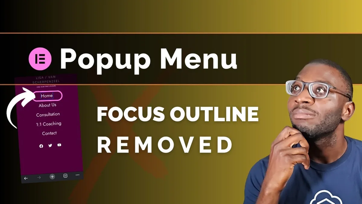
Key requirements include making all functionality available from a keyboard, giving users enough time to read and respond to content, and avoiding flashing elements that can trigger seizures. WCAG 2.2's new focus appearance criterion specifically addresses whether users can see where their keyboard focus currently sits on the page.
Understandable – Can Everyone Process What You're Saying?
This principle is about language, predictability, and error recovery. Content needs to be readable. Navigation needs to be consistent across pages.
Forms need to help users understand and fix their mistakes.
The guidelines recommend a Flesch-Kincaid grade level of 8 or below for general-public content. That's roughly the reading level of popular news sites. You don't need to sound like a children's book, but you should avoid unnecessarily complex vocabulary when plain language works just as well.
Robust – Does It Work With Assistive Technology Today and Tomorrow?
Robustness ensures content can be reliably interpreted by current and future assistive technologies. That means using semantic HTML correctly, <nav> for navigation, <main> for primary content, <button> for clickable actions, rather than hacking together <div> elements with JavaScript click handlers.
Proper ARIA (Accessible Rich Internet Applications) labels can help when semantic HTML isn't enough. But the rule is simple: use native HTML elements first. They come with built-in accessibility support.
ARIA should supplement, never replace, good HTML structure. Over-relying on ARIA is one of the most common mistakes teams make.
Before You Write: Quick Accessibility Wins That Save Hours
The fastest way to make content accessible is to build accessibility into your writing workflow from the start, rather than retrofitting it later. Retrofitting, going back to fix alt text, headings, and contrast after a page is live, takes significantly more time than getting it right the first time.
Start with a simple content checklist. Before you publish anything, confirm that every image has alt text, every heading follows a logical hierarchy, every link has descriptive text, and every video has captions. A pre-publication accessibility checklist takes about 10 minutes per page.
Fixing an audit report after publishing can take hours per page.
Set up your content management system (CMS) with accessibility guardrails. WordPress, Drupal, and Squarespace all offer plugins or built-in features that flag missing alt text, low-contrast combinations, or improper heading structures. Tools like the WAVE browser extension let you scan any page in seconds.
Use them as a preliminary check, not the final word. Automated tools miss a lot, but they catch the low-hanging fruit.
Another time-saver is creating reusable templates for common content types. A blog post template with pre-set heading levels, a form template with labeled fields, and a video embed template with caption placeholders all reduce the friction of starting from scratch. The goal is to make the accessible choice the easy choice.
Writing for Screen Readers Without Sounding Robotic
Screen readers convert on-screen text into synthesized speech. JAWS, NVDA, VoiceOver, and TalkBack are the four major screen readers, and they process content very differently than a sighted person scanning a page. They read linearly from top to bottom.
They announce headings, links, and images in sequence. They do not interpret visual layout.
The key insight is that screen reader users navigate by jumping between headings. If your heading structure is flat or missing, they have to listen to every word to find what they need. A proper heading hierarchy with a single H1, logical H2s, and supporting H3s turns a page into a scannable outline.
Alt Text That Actually Helps (Not Just SEO)
Alt text serves one primary purpose: it conveys the function or content of an image to someone who cannot see it. SEO benefits are secondary. The image's action or information must be described in the specific context of your page.
Start with context. If an image is decorative, meaning it adds no informational or functional value, use an empty alt attribute (alt=""). This tells screen readers to skip it entirely.
If the image contains text, the alt text should include that text verbatim. If the image shows a chart, describe the trend or data point the chart conveys.
A good rule is to write alt text as if you were describing the image over the phone. Keep it concise, under 125 characters for most images. Do not start with "image of" or "picture of" since screen readers announce the image role automatically.
Heading Structures That Make Sense
Headings function like a table of contents for screen reader users. They skip from heading to heading to find relevant sections. Proper heading structure means maintaining hierarchy: H1, then H2, then H3, then H4.
Never skip levels.
Never use headings just for visual styling. If you want bold or larger text, use CSS. Headings must reflect semantic structure, not presentation.
A common mistake is making all headings H2 because it looks cleaner. That flattens the outline and forces screen reader users to listen to every heading to understand the page's organization.
Check your hierarchy by turning off CSS. If the page outline makes sense as plain text, your heading structure is solid.
Link Text People Can Trust
Link text should describe the destination without needing surrounding context. "Click here" and "read more" are invisible to screen reader users who scan by jumping between links. They hear "click here, click here, click here" with no indication of where those links lead.
Write link text that works as a standalone phrase. "Read the full WCAG 2.2 specification" is better than "the WCAG 2.2 specification can be read here." The first tells the user exactly what they will get. The second forces them to re-read the preceding sentence.
For links that open files or leave the current site, include that context in the link text. "Download the accessibility checklist (PDF, 2 MB)" is clear and honest.
Color and Contrast: What Looks Good vs. What Works
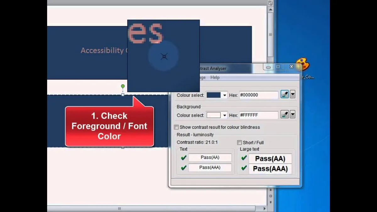
Color contrast is one of the most common accessibility failures. WCAG 2.1 Level AA requires a contrast ratio of at least 4.5:1 for normal text and 3:1 for large text (18 point or larger). Level AAA raises those thresholds to 7:1 and 4.5:1.
Low contrast is not just a problem for people with visual impairments. It affects users viewing screens outdoors, those with aging eyesight, and anyone using a low-brightness monitor in a bright room. According to the World Health Organization (WHO), at least 2.2 billion people globally have a near or distance vision impairment.
Contrast is a universal design consideration.
The quick way to check contrast is to use a tool like the Colour Contrast Analyser or the WebAIM Contrast Checker. Enter your foreground hex code and background hex code. The tool reports the ratio and whether it passes WCAG AA and AAA at normal and large text sizes.
A common trap is using brand colors that look fine on a white background but fail on other backgrounds or when used as text over images. Test all color combinations where text overlaps imagery or colored backgrounds. If your brand colors fail minimum contrast thresholds, use those colors for decorative elements only and choose accessible shades for text.
Never rely on color alone to convey meaning. A red error message needs accompanying text. A green "success" indicator needs a checkmark symbol or label.
Color blindness affects roughly 1 in 12 men and 1 in 200 women. Red-green differentiation cannot be the sole method of communication.
Video and Audio: Captions, Transcripts, and Audio Description
Multimedia content presents specific barriers if alternatives are missing. Deaf and hard of hearing users need captions. Blind and low vision users need audio description.
Both groups benefit from full transcripts. Video content without these alternatives is effectively inaccessible to a significant portion of your audience.
When Auto-Captions Are Fine and When They're a Liability
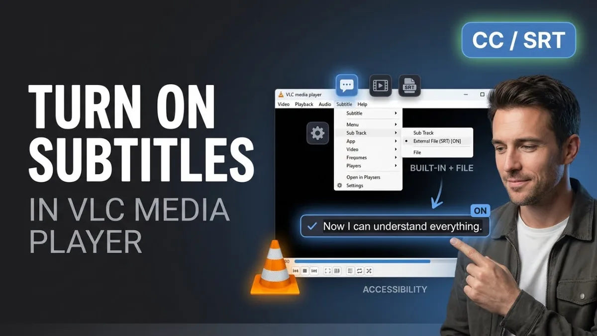
Auto-generated captions from platforms like YouTube and Zoom have improved dramatically, but they still make mistakes. They struggle with technical terminology, accents, background noise, and multiple speakers. For internal communications or low-stakes content, auto-captions may be acceptable.
For public-facing content, legal compliance, or educational material, human-generated captions are necessary.
The WebAIM screen reader survey consistently shows that accuracy matters. Captions with errors reduce trust and comprehension. If you produce captions automatically, edit them before publishing.
Review the timing, correct misheard words, and add speaker identification for multiple voices.
Captions should include all relevant audio, not just dialogue. Important sound effects, music changes, and speaker emotions that affect meaning should be described in brackets. "[Phone ringing]" and "[mournful music]" provide essential context that spoken audio alone may not convey.
Transcripts That Do More Than Sit in a Drawer
A transcript goes beyond captions by providing a full text version of the video or audio content. It includes spoken dialogue, descriptions of visual information, and any non-speech audio that matters to understanding the content. Transcripts benefit everyone.
They let users skim content quickly, search for specific sections, and reference key points without rewatching.
For video content, provide a descriptive transcript that describes on-screen actions alongside the dialogue. For text overlay that is not read aloud in the video, include it. For audio-only content like podcasts, a verbatim transcript with speaker labels and timestamps is sufficient.
Transcripts also boost SEO. Search engines index transcript text, making your audio and video content discoverable in search results. The best format is plain HTML on the same page as the media, not a separate PDF that requires additional navigation.
PDFs and Documents: The Trap Most Teams Fall Into
PDF accessibility is one of the most misunderstood areas of content accessibility. A PDF that looks correct visually can be completely inaccessible to screen reader users if it lacks proper tagging, reading order, and structure. Tagging is what allows a screen reader to identify headings, paragraphs, lists, tables, and images within a PDF.
The most common mistake is scanning a printed document as an image PDF. A scanned image of text is not readable by screen readers. The fix is Optical Character Recognition (OCR) to convert the image to selectable text, followed by tagging to add structure.
Adobe Acrobat Pro includes an accessibility checker that flags untagged content, missing alt text, and improper reading order.
Creating an accessible PDF starts at the source document. Word, InDesign, and Google Docs all export tagged PDFs if you check the right settings. In Word, use heading styles for structure, add alt text to images, and use table headers.
Then export directly to PDF with the "Document structure tags" option enabled.
For existing PDFs, run the Adobe Acrobat Pro accessibility checker. It identifies issues like missing title, improper language specification, and content order that differs from visual order. The report provides guidance for each failure, but fixing complex PDFs often requires manual work to reorder reading elements and add tags.
The general rule is to avoid PDFs when possible. HTML content is inherently more accessible, easier to update, and better for responsive design. Use PDFs only when a document needs to preserve exact formatting for printing or when users specifically expect a downloadable file.

Forms, Buttons, and Interactive Elements That Don't Exclude
Forms are where most users encounter accessibility failures. A form that is confusing, missing labels, or impossible to navigate with a keyboard will stop someone from completing a purchase, submitting a contact request, or signing up for a newsletter. The stakes are high because forms are directly tied to conversion.
Every form field needs a visible label. Placeholder text is not a substitute. Placeholders often have low contrast, disappear when users start typing, and confuse screen reader users who cannot see the disappearing text.
Use the HTML <label> element and associate it with the input using the for attribute matching the input's id.
Error messages should be clear and specific. "Please enter a valid email address" is better than "invalid entry." Place error messages near the relevant field, not in a summary block at the top of the form. Use ARIA live regions to announce errors to screen reader users without requiring them to navigate back and search for the problem.
Interactive elements like dropdowns, sliders, and date pickers often rely on mouse interaction or custom JavaScript that breaks keyboard navigation. Test every interactive component by tabbing through it with no mouse. If it does not work, it does not pass operability.
The Accessibility Testing Routine That Catches the Real Problems
Testing for accessibility is not a one-time event. It is a consistent practice woven into your content and development workflow. A good testing routine catches issues before they reach users and saves the cost of retrofitting later.
Automated Testing – What It Finds and What It Misses
Automated tools like axe DevTools, WAVE, and Lighthouse scan your page for known accessibility issues. They are fast and consistent. They catch missing alt text, insufficient color contrast, missing form labels, and improper heading structure.
But they only detect about 30 percent of all accessibility issues, per WebAIM.
Automated tools cannot determine if your alt text is accurate. They cannot tell if your heading hierarchy makes logical sense. They cannot assess the readability of your content.
Use them as a first pass, but never as a final verdict.
Manual Keyboard Testing – Your 15-Minute Litmus Test
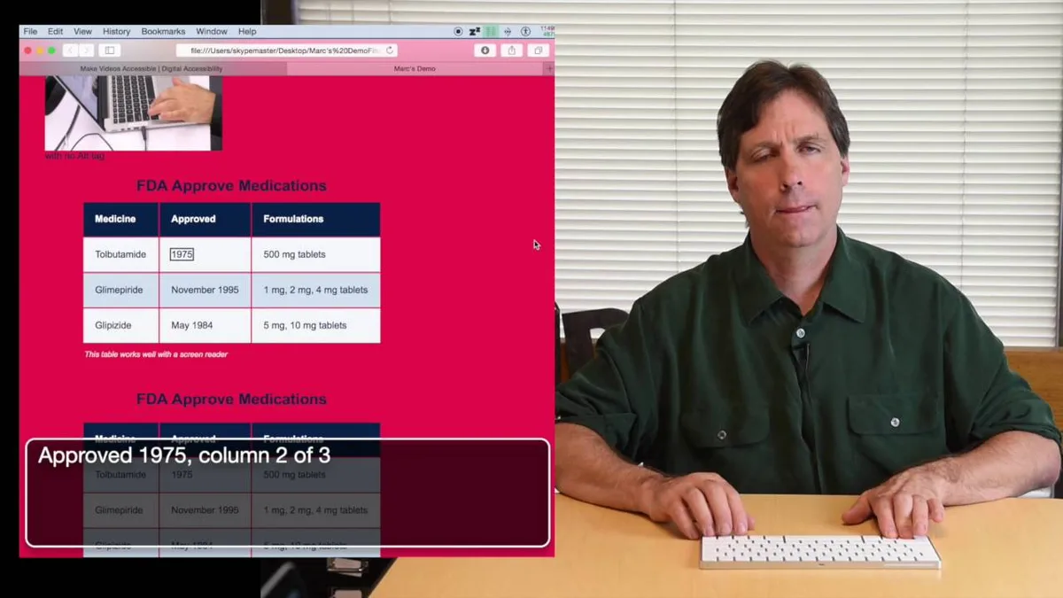
Keyboard testing is the single most valuable manual check you can perform. Unplug your mouse. Navigate your entire page using only the Tab key, Shift+Tab, Enter, and the arrow keys.
Can you reach every interactive element? Can you complete every action? Can you see where your focus is at all times?
If you cannot accomplish a task with the keyboard alone, a user who cannot use a mouse will also fail. That is a hard fail under WCAG operability.
Screen Reader Testing Without Panic
Screen reader testing sounds intimidating, but you only need basic familiarity. Download the free NVDA screen reader for Windows or use the built-in VoiceOver on Mac and iOS. Navigate your page using the screen reader's heading navigation and link list features.
Does the page make sense when read linearly? Do images have descriptive alt text? Do form fields announce their labels?
You do not need to become a screen reader expert. Testing for five minutes on your most important pages will reveal the issues that affect real users.
Legal Reality Check: ADA Lawsuits and What Actually Triggers Them
Accessibility compliance is not just an ethical consideration. It is a legal requirement with real financial consequences. ADA website lawsuits exceeded 4,600 filings in 2023, according to legal tracking data.
The average settlement ranges from $5,000 to $75,000, and legal fees add significantly to the total.
Lawsuits are most commonly triggered by basic, easily fixed issues. Missing alt text on images. Forms without labels.
Videos without captions. Inaccessible PDFs. Poor color contrast.
These are the same issues that automated tools catch. A site that passes a basic accessibility audit is far less likely to attract legal attention.
The legal landscape varies by jurisdiction. In the US, ADA Title III applies to public accommodations, and federal courts have consistently held that this includes websites. The European Accessibility Act (EAA) takes full effect in June 2025, covering all digital products and services sold in the EU.
The UK's Equality Act 2010 requires reasonable adjustments for disabled users. Canada's AODA mandates compliance for public sector organizations.
The pattern is clear. Governments worldwide are moving toward enforceable digital accessibility standards. Waiting until a lawsuit or regulatory action arrives is the most expensive path.
The Cost of Doing It Wrong vs. The Cost of Doing It Right
Organizations often delay accessibility because they perceive it as expensive. The reality is reversed. Building accessibility into your workflow from the start costs a fraction of retrofitting existing content.
Studies from the W3C WAI show that addressing accessibility during design and development adds roughly 1 to 5 percent to project costs. Retrofitting after launch can cost 10 to 20 times more.
Beyond direct remediation costs, consider the hidden expenses. Inaccessible content generates customer support tickets. Users who cannot complete a self-service task will call, email, or abandon the site entirely.
Lost revenue from an inaccessible checkout flow is harder to quantify but potentially much larger than the cost of fixing the problem.
There is also the cost of legal defense. Even if a lawsuit is baseless, defending against an ADA claim costs thousands of dollars in legal fees. Producing an accessibility audit showing proactive compliance is your best defense.
And then there is the audience itself. The CDC reports that 1 in 4 US adults has a disability. That is a significant user base that competing organizations may be neglecting.
When you get accessibility right, you reach an audience your competitors are actively excluding.
Common Myths That Keep Teams From Making Progress
Several persistent myths stop teams from taking meaningful action on accessibility. Clearing them up is essential to making progress.
"We'll Fix It Later" – Why Retrofitting Costs More
Delaying accessibility until "after launch" or "when we have budget" guarantees it will cost more and be harder to implement. Retrofitting requires revisiting every design decision, code component, and content asset. It disrupts workflows and frustrates teams.
Building accessibly from the start is simply cheaper.
"It's Just for Blind Users" – Who You're Really Helping
Accessibility helps a much wider group than people often assume. Users with low vision, color blindness, hearing loss, motor impairments, cognitive disabilities, temporary injuries, and situational limitations all benefit. Consider the person reading your site on a phone in direct sunlight, the user with a broken wrist navigating one-handed, or the non-native speaker relying on captions.
That is the real audience.
"Our Developer Handled It" – Why Accessibility Is Everyone's Job
Accessibility cannot be delegated to a single person or department. Developers write the code, but content creators write the alt text. Designers choose the color palette.
Product managers prioritize the backlog. Legal reviews compliance. Accessibility succeeds only when everyone understands their role in the process.
Your Starter Checklist: What to Do This Week
You do not need to overhaul everything at once. Start with these five actions.
- Run an automated scan on your top ten pages using WAVE or axe DevTools. Fix all critical and serious issues. This takes one to two hours and catches the most common failures.
- Test keyboard navigation on your main conversion flow. Can you complete a purchase, submit a form, or sign up without a mouse? Fix any focus or navigation issues.
- Review your five most visited pages for heading structure. Ensure one H1 per page and a logical hierarchy. Add or adjust headings as needed.
- Check your video content for captions. If auto-captions are in place, review and edit them for accuracy. Add transcripts for audio-only content.
- Write or update your accessibility statement. Publish it on your site with a commitment to WCAG 2.2 Level AA compliance and a clear contact method for users to report barriers.
These five steps will not make your site fully accessible overnight. But they will eliminate the most common barriers and demonstrate that your organization is taking accessibility seriously. From there, you can build the testing routine, training, and governance that makes accessibility a permanent part of your content process.
Frequently Asked Questions
What is the minimum color contrast ratio for text?
WCAG 2.1 Level AA requires a contrast ratio of at least 4.5:1 for normal text and 3:1 for large text (18 point or larger). Level AAA raises these to 7:1 and 4.5:1 respectively. Use a contrast checking tool to verify your color combinations.
Do I need captions on all my videos?
Yes, if your video contains spoken dialogue or important audio information. WCAG requires captions for all prerecorded video content with audio. Auto-generated captions are acceptable as a starting point but must be reviewed for accuracy before publishing.
How do I write good alt text?
Describe the function or content of the image in its specific page context. Keep it under 125 characters. Do not start with "image of" or "picture of." For decorative images, use an empty alt attribute (alt="").
For images containing text, include that text verbatim.
What is the easiest way to start testing accessibility?
Run an automated scan with WAVE or axe DevTools on your most visited pages. Then unplug your mouse and navigate those pages using only the Tab key. These two steps catch the majority of common accessibility issues and require no special training.
Can I get sued for having an inaccessible website?
Yes. ADA website lawsuits in the US have been rising steadily, exceeding 4,600 filings in 2023. Courts have consistently held that public-facing websites fall under ADA Title III.
The European Accessibility Act (EAA) brings similar compliance requirements to the EU starting June 2025.
Similar Posts