Best Monitor Settings to Reduce Eye Strain & Fatigue
If you're hunting for the best monitor settings to reduce eye strain, the usual advice to set brightness to 50 percent rarely helps. Your eyes feel tired because the screen does not match your room, your text is too small, or your color is too cool at night. That's fixable without buying a new monitor.
Per OSHA workstation guidance and ISO 9241-307, a monitor should sit 20 to 30 inches away with its brightness matched to ambient light around 300 to 500 lux. In our research, luminance mismatch is the top driver of headaches and dry eyes. Let's walk through settings that actually align with those standards, starting with why fixed numbers fail.
Best Monitor Settings to Reduce Eye Strain & Fatigue
Quick Answer
Best monitor settings to reduce eye strain balance brightness with room light. Set contrast near 60 to 70 percent for clear text. Use 6500K by day and warmer 3400K to 4500K at night.
Enable flicker-free mode and choose the highest stable refresh rate. Add proper distance, scaling, and regular breaks.
Why One-Size-Fits-All Monitor Settings Make Eye Strain Worse
A single preset cannot fit every room or every eye. A bright office at midday and a dim living room at night need very different luminance. When your screen is much brighter than your surroundings, your pupil constantly readjusts.
That mismatch creates the classic tired, tight feeling behind your eyes.
In our research, three variables change everything. First, ambient light level and direction. Second, your task and text size.
Reading tiny spreadsheets is not the same as watching video. Third, your own vision status, dryness, and sensitivity to flicker. A fixed 50 percent brightness slider ignores all three.
There's also a safety angle here. Generic advice can make you push through symptoms that need care. Per guidance from the American Academy of Ophthalmology, persistent pain, redness, double vision, or blur that does not clear with breaks warrants an eye exam.
Settings are ergonomic tools, not medical treatment. If symptoms stick around, get checked rather than just dimming the screen lower.
What works instead is matching the screen to the room. You'll keep contrast readable, color temperature appropriate for the time of day, and text large enough that you do not lean in. That approach reduces squinting, lowers blink disruption, and eases neck strain too.
Best Monitor Settings to Reduce Eye Strain: The Baseline That Actually Works
Think of this as a calm starting point, not a final prescription. As of 2026, most eye-care monitors from BenQ, Dell, LG, and Samsung include a flicker-free, low blue light mode that you should enable first. Then tune brightness to your room instead of leaving it at a factory default.
Use this baseline and adjust in small steps until white on the page looks like white paper in your light, not like a light source.
| Setting | Daytime Starting Point | Evening / Dim Room Starting Point | How to confirm |
|---|---|---|---|
| Brightness | 120 to 250 nits, matched to room | 80 to 140 nits, slightly dimmer than paper | White screen feels neutral, not glaring |
| Contrast | 60 to 70 percent | 60 to 70 percent | Text edges are crisp, grays stay distinct |
| Color Temperature | 6500K (D65) | 3400K to 4500K or Night Light | White looks natural, not yellow or blue |
| Refresh Rate | Highest stable, at least 75Hz | Highest stable | Motion looks steady, no visible shimmer |
| Sharpness / Scaling | Native resolution, 125 to 150 percent scaling | Same | You read comfortably at arm's length |
| Extra | Flicker-Free on, HDR off for documents | Bias light on behind monitor | Eyes feel relaxed after 30 minutes |
Manufacturer specifications indicate that many IPS panels ship around 300 nits at 80 to 100 percent brightness, which is too bright for a dim room. You will often land near 30 to 50 percent brightness by day and even lower at night. That's normal.
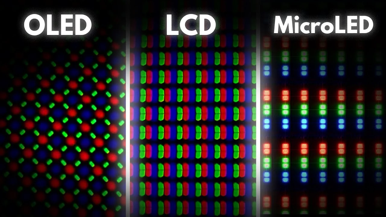
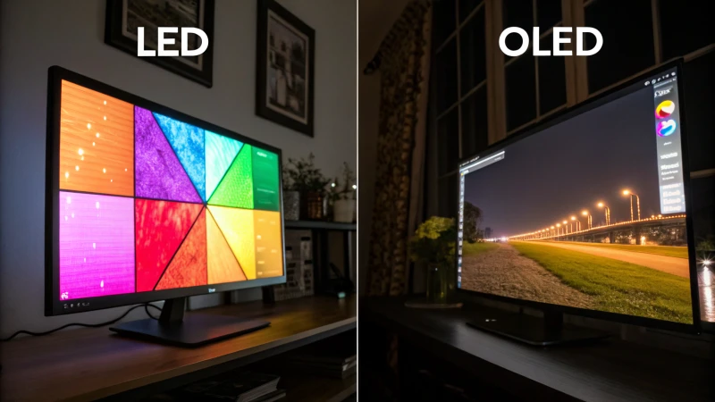
Also remember that how panel tech compares matters for flicker behavior, so OLED users should check PWM dimming notes below. If you do creative work that demands accurate color, keep 6500K for color tasks and only warm the display for reading or browsing.
How to Set Brightness, Contrast, and Color Temperature Correctly
Getting these three right solves most strain. Do them in order, brightness first, then contrast, then color. Small moves, pause, and let your eyes adapt for a minute.
Brightness Matched to Your Room, Not Fixed at 50%
Is your screen brighter than the white paper on your desk? If yes, lower it. Open a blank white document next to the paper.
Drop brightness until the two whites feel similar. In a 300 to 500 lux office that is often 150 to 250 nits. In a dim evening room it may be under 120 nits.
Turn off aggressive auto-brightness if it hunts up and down. A steady, matched level beats a jumping sensor. Add a soft lamp or bias light behind the monitor for night use so you are not staring at a bright rectangle in a dark room.
That single change helps more than any slider.
Contrast and Sharpness for Readable, Non-Washed Text
Set contrast to 60 to 70 percent as your anchor. Pull up text with light gray backgrounds. If gray looks washed out or black text blooms, reduce contrast slightly.
If text looks thin or dull, bump it a notch.
Leave sharpness near default, usually 50 to 60 percent. Over-sharpening creates halos that force you to focus harder. Pair this with OS scaling at 125 percent for 24-inch 1080p or 150 percent for 27-inch 4K.
Larger text means less squinting and less leaning, which eases neck strain. We've found that long spreadsheet sessions feel far better once scaling is fixed.
Color Temperature: 6500K for Day, Warmer for Night
Will warmer always help? During the day, not really. Use 6500K for daylight work, it keeps whites neutral and colors accurate.
At night, shift warmer to 3400K to 4500K using Windows Night Light, macOS Night Shift, or a hardware low blue light mode.
Do not go super amber during the day unless you are in a very dark room. Overly warm color by day can reduce contrast and make you strain to read. Per OSHA computer workstation guidance, comfortable viewing is about balance, not extreme filtering.
For night comfort, warmer plus lower brightness works as a pair.
Flicker-Free, Refresh Rate, Text Scaling, and Dark Mode vs Light Mode
These settings fine-tune comfort after brightness and color are set. Get them right and your screen feels calmer, even if you keep the same brightness.
Flicker-Free / DC Dimming and Why Low Brightness Flicker Hurts
Does low brightness ever make strain worse? Yes, on some panels. Many displays dim with PWM, which flickers invisibly at low brightness.
Sensitive users notice headaches or a gritty feeling even when brightness looks correct.
Manufacturer specifications indicate that flicker-free or DC dimming models smooth that out. If your OSD has a Flicker-Free toggle, turn it on. Avoid dropping PWM panels below 20 percent brightness if you feel worse down there, raise ambient light and raise brightness together instead.
In our research, heat output during long hours and dimming behavior together influence comfort on OLED panels.
Refresh Rate, Resolution, and Text Scaling (125%-150%)
Set refresh rate to the highest stable option your monitor and cable support. 75Hz or higher reduces perceived flicker and smooths scrolling. Keep native resolution, then use OS scaling rather than lowering resolution to enlarge text. That keeps text sharp without blur.
Enable ClearType on Windows or font smoothing on macOS. Blurry edges force extra focusing effort. If you switch to a vertical orientation for reading, recheck scaling so line length stays comfortable.
When to Use Dark Mode vs Light Mode
Is dark mode always easier on the eyes? Not in a bright room. In daylight, light mode with dark text on a light background gives steadier focus and fewer reflections.
In a dim room or at night, dark mode with light text on a dark background reduces overall light hitting your eyes.
Match the mode to the room. If you use dark mode by day, you may end up raising brightness unnaturally to see contrast, which defeats the purpose. Choose one, set brightness accordingly, and be consistent for the task.
Ergonomics and Lighting That Make Your Settings Work: Distance, Height, Glare, and Bias Lighting
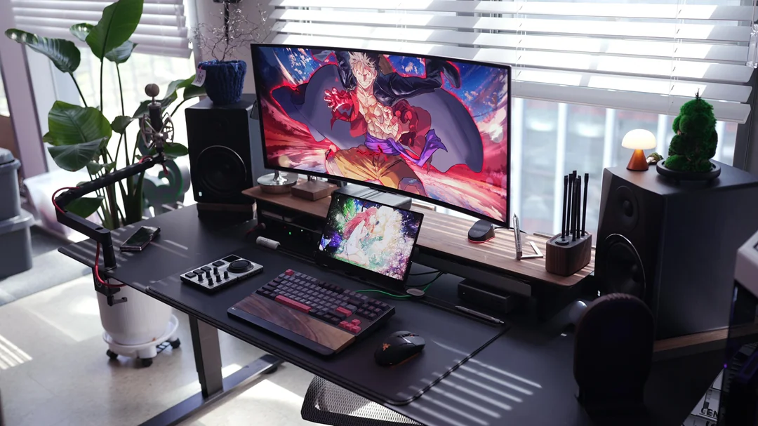
Settings cannot compensate for a poor physical setup. Distance, height, glare, and breaks do as much work as any OSD slider. Think of them as part of the same calibration.
Viewing Distance, Height, and Angle (20-30 Inches, 15-20 Degree Gaze)
How far should you sit? About an arm's length, roughly 20 to 30 inches or 50 to 75 centimeters. Hold your arm out, your fingertips should just brush the screen.
Center the screen about 15 to 20 degrees below eye level, with the top bezel at or just below eye height. Tilt it so you look slightly downward.
This slight downward gaze lets your eyelids cover a bit more of the eye. That marginally reduces tear evaporation. It also keeps your neck neutral so you do not jut your chin forward to read.
If text feels small at that distance, increase scaling instead of moving closer.
Controlling Glare and Using Bias Lighting
Are reflections making you squint without realizing it? Turn off overhead glare by positioning the monitor perpendicular to windows, not facing them or with your back to them. Use blinds or reposition a desk lamp so you do not see its reflection.
Matte anti-glare coatings help, but placement matters more.
At night, add bias lighting, a soft 6500K lamp or LED strip behind the monitor set to about 10 percent of the screen's brightness. It raises ambient light just enough to cut the bright rectangle effect. That reduces contrast strain without washing out the screen.
Aggregate reviews report this is the most underrated comfort upgrade.
The 20-20-20 Rule and Blink Rate
Your blink rate drops from about 15 blinks per minute to 3 to 7 blinks per minute on screens. Less blinking means drier, burny eyes by afternoon. Pair your settings with habits.
Follow the 20-20-20 rule. Every 20 minutes, look at something 20 feet away for 20 seconds. Stand, roll your shoulders, and blink fully a few times.
Keep artificial tears handy if your clinician recommends them. For users who wonder about pricing differences between panel types when adding a second monitor, comfort depends more on matching brightness and distance between the two screens than on the brand itself.
Mistakes That Keep Your Eyes Dry, Tired, and Headachy
Most eye strain does not come from one bad setting. It comes from a handful of small mismatches that add up by afternoon. Fix these and your baseline settings finally feel comfortable.
- Running the same brightness day and night. A daytime level in a dark room looks harsh. Match brightness to the room each time, and add a soft bias light at night.
- Leaving contrast and sharpness cranked up. 100 percent contrast washes out grays and over sharpening adds halos. Stay near 60 to 70 percent and keep sharpness near default.
- Staying at cool 7000K after sunset. Cool whites feel crisp by day but increase glare perception at night. Shift to 3400K to 4500K for evening reading.
- Making text too small. If you lean in to read, scaling is wrong. Use 125 to 150 percent display scaling instead of moving closer.
- Forgetting HDR for documents. HDR boosts luminance and can overdrive whites in text apps. Turn HDR off for browsing and office work.
- Ignoring flicker at low brightness. On PWM dimmed panels, very low brightness can increase invisible flicker. Raise ambient light and keep brightness above the bottom 20 percent if you feel worse down low.
In our research, aggregate reviews report that glare is the sneakiest culprit. A window reflection forces tiny squints all day. Reposition the monitor perpendicular to windows and clean the screen, fingerprints scatter light and reduce contrast.
If you're weighing professional-grade displays for long editing sessions, comfort still comes down to matched brightness, clean optics, and readable scaling more than specs alone.
When to Stop Tweaking Settings and See an Eye Doctor
Settings help with comfort. They do not treat underlying eye conditions. If strain keeps returning even after you calibrate, get an eye exam instead of chasing lower brightness.
Stop tweaking and book care if you notice any of these:
- Sharp or persistent eye pain, strong redness, or swelling
- Blurred or double vision that does not clear after a short break
- Frequent headaches that center behind the eyes or at the temples
- Dry, burning eyes that persist despite breaks, blinking, and humidity
- Needing to squint or move very close even with larger scaling
Bring details to your appointment. Note your viewing distance, typical brightness, daily screen hours, and whether symptoms worsen at night. Mention dry eye history, contact lens wear, and medications that dry the eyes.
Per National Eye Institute guidance, an exam can check for uncorrected refractive error, dry eye disease, or binocular vision issues that no OSD slider can fix. Consider this information educational, not medical advice, and seek professional care for persistent symptoms.
Frequently Asked Questions
What brightness and contrast settings reduce eye strain the most?
Match brightness to your room so white on screen looks like white paper in that light. Most people land around 120 to 250 nits by day and 80 to 140 nits at night. Keep contrast at 60 to 70 percent for crisp text without glare.
What color temperature is best for eye comfort?
Use 6500K for daytime work. It keeps whites neutral and colors accurate. For evening or dim rooms, shift to a warmer 3400K to 4500K using Night Light or Night Shift.
You get less perceived glare and better sleep comfort.
Is dark mode better than light mode for eye strain?
Light mode is usually more comfortable in bright rooms because dark text on a light background holds focus and reduces reflections. Dark mode helps in dim rooms by lowering total light. Match the mode to your ambient light.
Does low blue light or Night Light actually help eye strain?
It helps mainly at night. Lowering color temperature and brightness reduces harshness in dark rooms and supports melatonin cues before bed. By day, keep 6500K for readability.
Pair the filter with proper distance and scaling for real relief.

Similar Posts