How to Use Ips Monitor for Photography
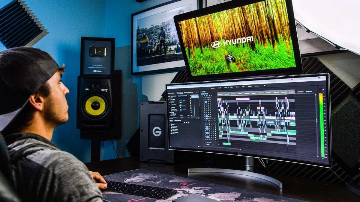
How to use an IPS monitor for photography starts with understanding that the panel type alone doesn't guarantee accurate color. Most photographers assume an IPS display is automatically "good enough" for editing, then wonder why their prints look muddy or their client proofs look oversaturated on someone else's screen. The gap between what your monitor shows and what's actually in your file is almost always a calibration and workflow problem, not a panel technology problem.
In our research, we've found that even a well-chosen IPS monitor can display colors with a Delta E above 5 out of the box, which is clearly visible to the trained eye. Per ISO 12646:2015, the international standard for displays used in color proofing, a properly set up monitor should hit a white point of D65 (6500K), a gamma of 2.2, and a luminance between 80 and 120 cd/m² for print evaluation. Getting there takes more than just buying the right screen.
Quick Answer
To use an IPS monitor for photography, calibrate it with a hardware colorimeter every 2 to 4 weeks. Set the white point to D65 and gamma to 2.2. Match the monitor's gamut to your output: sRGB for web, Adobe RGB or DCI-P3 for print.
Control your room lighting and use a hood. Soft-proof before printing.
Why Your IPS Monitor Isn't Giving You Accurate Photo Colors (Even When You Calibrate)
The most common frustration we see is photographers who bought a decent IPS monitor, ran a calibration once, and assumed they were done. Then their prints come back from the lab with a green cast, or a client says the web images look nothing like what they approved. The problem usually isn't the panel.
It's the setup around it.
IPS technology gives you wide viewing angles and stable color when you shift in your chair. That's a real advantage over TN and even many VA panels. But an uncalibrated wide-gamut IPS display will oversaturate sRGB content badly.
If you're editing web photos on a 98% DCI-P3 monitor without an sRGB clamp or proper color management, every image you export will look duller on normal screens.
Image source: Bing (Web (fair-use with source credit))
Here's what typically goes wrong:
- The monitor ships in "vivid" or "standard" mode, which boosts saturation and contrast to look impressive on a showroom floor. That's the opposite of accuracy.
- Calibration targets are wrong. Too bright (200+ cd/m²) makes your prints look dark. Too cool a white point (7500K+) makes prints look warm.
- The room is too bright or too yellow. Your eyes adapt to ambient light, which shifts how you perceive the screen.
- No soft-proofing in the editing software. You're editing blind relative to your output space.
The fix isn't complicated, but it is sequential. You need to work through the setup in the right order, starting with what you're actually outputting.
First Question: Is Your Workflow Screen-First or Print-First?
This is the decision point that changes everything else. Before you touch a single setting on your monitor, you need to know where your final images are going.
Screen-first workflow (web, social media, digital delivery):
You need an sRGB-accurate display. If your IPS monitor covers 98% DCI-P3 or 99% Adobe RGB, that's not automatically an advantage. Without proper color management, wide-gamut monitors oversaturate sRGB content.
You either need a hardware sRGB clamp mode on the monitor or you need to work in a fully color-managed application like Lightroom or Photoshop with the correct output profile assigned.
Print-first workflow (fine art, commercial, client prints):
You benefit from a wide-gamut IPS panel that can display most of Adobe RGB or at least DCI-P3. This lets you see the full range of colors your printer can reproduce. You'll also need to soft-proof with the specific ICC profile for your paper and printer combination.
Hybrid workflow (both screen and print):
This is where most working photographers actually live. You need a wide-gamut monitor with a reliable sRGB emulation mode, or you need to get comfortable switching between color spaces in your editing software.
Here's a simple decision table:
| Your Primary Output | Ideal IPS Gamut | Key Monitor Feature Needed |
|---|---|---|
| Web / social media only | sRGB (100%) | Accurate sRGB mode or clamp |
| Inkjet / lab prints | Adobe RGB (99%+) | Wide gamut + hardware calibration |
| Both web and print | Wide gamut (P3 or Adobe RGB) | sRGB emulation mode + LUT support |
| Client tethered shooting | sRGB or P3 | Fast calibration, consistent brightness |
If you're not sure which camp you fall into, look at where 90% of your delivered images end up. That's your answer.
Step 1: Match Your IPS Panel to Your Actual Work
Not every IPS monitor is built for photography, even within the same brand. The panel technology is the same family, but the implementation varies wildly between a $250 office display and a $1,500 photo-editing monitor.
What to look for in a photography-focused IPS monitor:
- Factory calibration with Delta E < 2. Some monitors ship with a calibration report showing measured accuracy. That's a good starting point, though you'll still want to verify with your own colorimeter.
- Hardware LUT support. This lets the calibration write directly to the monitor's internal Look-Up Table rather than relying on your graphics card. The result is smoother gradations and accuracy that survives reboots and computer changes.
- Adjustable color space modes. You want dedicated sRGB, Adobe RGB, and DCI-P3 presets that actually clamp the gamut correctly.
- Uniformity compensation. Some higher-end monitors have built-in electronics that even out brightness and color across the panel. This matters because most IPS panels are slightly dimmer or warmer in the corners.
- Matte vs. glossy coating. Matte anti-glare coatings are standard on most IPS monitors and reduce reflections. Some photographers find they slightly soften fine detail compared to glossy panels, but in a room with any ambient light, matte is usually the practical choice.
What you can skip:
- High refresh rate (144Hz+). That's a gaming spec. For photo editing, 60Hz is fine.
- HDR marketing labels. DisplayHDR 400 or 600 on an IPS panel won't give you meaningful HDR editing capability. True HDR reference monitors use FALD backlighting or OLED, not edge-lit IPS.
- Built-in USB hubs and speakers. Convenient, but they have nothing to do with color accuracy.
If you already own an IPS monitor and you're not sure whether it's suitable, check the manufacturer's spec sheet for the color gamut coverage and whether it supports hardware calibration through software like Eizo ColorEdge Utility, BenQ Palette Master, or Calibrite PROFILER. If it only supports software calibration through your operating system, you can still get good results, but you'll need to be more careful about maintaining consistency.
Step 2: Set Up Your Room Before You Touch the Monitor
This is the step most people skip, and it undermines everything else. Your eyes adapt to the environment around the screen. If your room is bright yellow or pitch black, your perception of the monitor shifts.
Ambient light target:
Aim for a moderately dim room with neutral-colored walls. Pure white walls can work, but avoid strongly colored walls (red, blue, green) near your editing position. The ISO 3664:2009 standard for viewing conditions recommends a surround illumination of 32 lux for critical color evaluation, though most home setups land somewhere between 20 and 60 lux in practice.
Practical room setup tips:
- Position the monitor so windows are to the side, not behind you or behind the screen.
- Use a monitor hood. They cost $30 to $80 and cut overhead reflections dramatically.
- Avoid desk lamps that shine directly on the screen. If you need task lighting for paperwork, aim it away from the display.
- Set your desktop background to a neutral gray. That vibrant sunset wallpaper is skewing your color perception every time you look at it.
Monitor positioning:
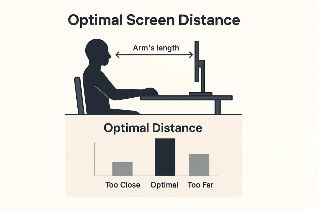
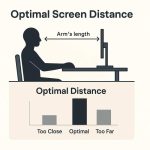
The top of the screen should be at or slightly below eye level. You should be sitting about an arm's length away. For a 27-inch 4K display, that's roughly 24 to 30 inches.
This matters because IPS panels, while far better than TN at off-angle viewing, still show slight gamma shift if you're viewing from too far above or below.
Once your room is set, let the monitor warm up for at least 30 minutes before calibrating. IPS panels shift slightly in color and brightness as they reach thermal equilibrium. Calibrating a cold monitor gives you a profile that drifts within the first hour of use.
Step 3: Calibrate Your IPS Monitor the Way Photographers Actually Need
This is where the real work happens, and it's where most guides either oversell software calibration or skip the details that actually matter.
Hardware calibration vs. software calibration:
Software calibration (using your operating system's built-in tools or a free utility like DisplayCAL) adjusts the graphics card's output to compensate for the monitor's inaccuracies. It works, but it reduces the number of distinct tonal values your GPU can send to the display, which can introduce banding in smooth gradients.
Hardware calibration writes the correction directly into the monitor's internal LUT. You keep the full bit depth from your GPU, and the calibration stays with the monitor even if you switch computers. This is the preferred method for photography, and it's why monitors like the Eizo ColorEdge and BenQ SW series cost more.
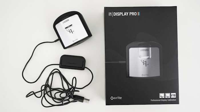
Image source: Bing (Web (fair-use with source credit))
The calibration targets that matter for photography:
| Parameter | Recommended Value | Why |
|---|---|---|
| White point | D65 (6500K) | Matches daylight and most print-viewing conditions |
| Luminance | 80–120 cd/m² | Bright enough to see shadow detail, dim enough to match print viewing |
| Gamma | 2.2 | Standard for Windows and web; use BT.1886 if your software supports it |
| Black point | As low as the panel allows | IPS can't match OLED here, but get it as close to 0.5 cd/m² as possible |
Step-by-step calibration process:
- Reset the monitor to factory defaults. Start clean.
- Select the appropriate color space preset (sRGB for web work, Adobe RGB or native gamut for print).
- Set the white point to D65 and gamma to 2.2 in the monitor's OSD if possible.
- Let the monitor warm up for 30 minutes.
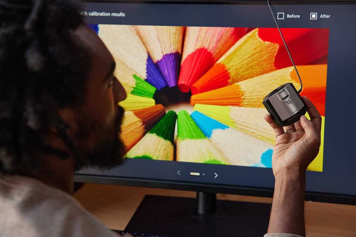
- Launch your calibration software (Calibrite PROFILER, DisplayCAL, or the manufacturer's utility).
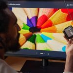
- Place the colorimeter flat against the center of the screen. Use a counterweight or stand to keep it steady.
- Run the full calibration and profiling cycle. This typically takes 5 to 15 minutes.
- Save the resulting ICC profile and verify it's active in your operating system's color management settings.
- Restart your editing software so it picks up the new profile.
One important note on sRGB modes:
Some IPS monitors have an sRGB clamp mode that locks the gamut to sRGB. This is excellent for web work, but on certain monitors it also locks the brightness and contrast controls. If you can't adjust brightness in sRGB mode, you may need to calibrate in native gamut mode and rely on your editing software's color management instead.
Check your monitor's manual for specifics.
Step 4: Manage Your Profiles and Settings So They Don't Drift
Calibration isn't a one-time event. IPS backlights shift over time, and the color filters age at different rates. A monitor that was perfect in January might be noticeably off by March.
Recalibration schedule:
For color-critical photography work, recalibrate every 2 to 4 weeks. If you're doing commercial or fine art work where print accuracy is essential, lean toward every 2 weeks. For hobbyist or web-only work, monthly is usually fine.
Signs your monitor has drifted:
- Skin tones look slightly off compared to your memory of a previous session.
- A known reference image (one you edited and printed successfully) looks different on screen.
- The monitor looks noticeably warmer or cooler than it did at your last calibration.
- You've had the monitor on for more than 2,000 hours total.
Profile management basics:
- Your operating system should automatically load the correct ICC profile at startup. Verify this in your system's color management settings.
- If you use multiple monitors, each one needs its own profile. Don't assume two identical models will match out of the box.
- After a major OS update, check that your profile is still active. Some updates reset color management settings.
- If you switch between computers (desktop and laptop, for example), the calibration stays with the monitor only if you used hardware calibration. Software calibration profiles live on the computer, not the display.
Backlight aging:
Most IPS monitors are rated for 30,000 to 50,000 hours of use before the backlight dims to half its original brightness. You won't notice day-to-day changes, but over years the maximum achievable luminance drops. If you calibrated at 120 cd/m² two years ago and now your monitor can only hit 90 cd/m² at full brightness, it's time to recalibrate at a lower target or consider replacing the display.
Running the monitor at 70 to 80% of maximum brightness rather than 100% extends the backlight's useful life and keeps you in a more stable operating range. Most photographers find 100 to 120 cd/m² is achievable at 60 to 80% brightness on a typical IPS panel, which is a good place to be.
When IPS Works Great for Photography (and When It Doesn't)
IPS panels earn their reputation in photo editing for good reason. The color consistency across viewing angles means you can lean back, lean in, or have a client standing beside you and everyone sees roughly the same image. That's a real workflow advantage over TN panels, where even small shifts in head position change the color you're looking at.
The wide gamut options on IPS also matter. If you're printing on a modern inkjet printer with an expanded color gamut, a wide-gut IPS display showing 98% of DCI-P3 or 99% of Adobe RGB lets you actually see those saturated cyans, magentas, and deep greens. An sRGB-only monitor clips those colors, and you end up editing blind in the most vibrant parts of your image.
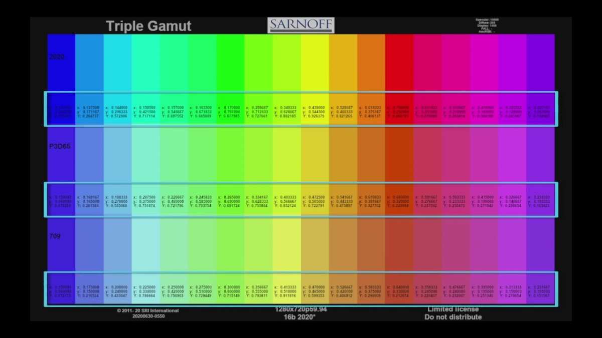
Image source: Bing (Web (fair-use with source credit))
Where IPS falls short:
The contrast ratio is the biggest limitation. Most IPS panels sit around 1000:1 to 1300:1. Deep blacks look dark gray by comparison, and shadow detail that's visible on an OLED or high-end VA panel can get lost on IPS.
If you edit a lot of low-key or nighttime photography, this is the pain point you'll notice first.
IPS glow is the other well-known issue. In a dark room, the corners of an IPS screen can show a faint silver or purple sheen, especially on darker images. It's not backlight bleed in the traditional sense.
It's a property of the panel technology. For most editing work in a reasonably lit room, it's not a problem. If you're evaluating shadows in a near-dark environment, it skews your perception.
Our recommendation by photography type:
- Portrait and wedding photography: IPS is ideal. Skin tones and midtone accuracy are where these panels excel.
- Landscape photography: IPS works well for most situations. If your work leans heavily toward astro or dark forest scenes, pair it with occasional checks on a phone or tablet screen.
- Commercial product photography: Excellent choice. Color accuracy for brand colors and product details is reliable.
- Black and white photography: Good, but be mindful of the contrast limitation. You may be compressing shadows more than you realize.
- Video/photo hybrid work: Strong option. IPS handles color grading for Rec.709 well, and many photo-focused panels also cover DCI-P3 for video work.
Common Mistakes That Ruin IPS Calibration
Image source: Bing (Web (fair-use with source credit))
Even with good hardware and proper targets, a few recurring errors throw off the entire workflow. Here are the ones we see most often.
Mistake 1: Editing in the wrong color space
If you're delivering web images but your Photoshop or Lightroom working space is set to ProPhoto RGB or Adobe RGB without soft-proofing, you're making editing decisions based on colors that won't survive the export. Set your working space to match your output or always soft-proof before finalizing.
Mistake 2: Trusting the factory "photo" or "sRGB" preset
Most of these presets are close but not calibrated to your specific unit. Panel variance means your monitor's version of sRGB is slightly different from the person's across the street. Only a hardware calibration closes that gap.
Mistake 3: Calibrating to the wrong brightness
If you calibrate at 200 cd/m² because that's what looks comfortable in a bright room, your prints will consistently look too dark. The standard print-viewing condition is roughly equivalent to 80 to 120 cd/m². Either calibrate at that level and accept a dimmer screen, or dim your room to match a higher calibration target.
Image source: Bing (Web (fair-use with source credit))
Mistake 4: Ignoring screen uniformity
A monitor can be dead-center accurate in the middle of the screen and slightly warm or cool at the edges. Most photographers never notice this, but if you're doing retouching or fine detail work, it can affect your decisions. Some high-end monitors have uniformity compensation built in.
For everything else, be aware that the center of the screen is your most reliable zone.
Mistake 5: Assuming "wide gamut" means "accurate out of box"
A monitor covering 99% of Adobe RGB is capable of displaying a wide range, but without calibration it may show that range incorrectly. Gamut volume and gamut accuracy are two different things. You need both, and only calibration delivers accuracy.
Mistake 6: Not recalibrating after major system changes
Graphics driver updates, OS updates, even changing which port the monitor is connected to can affect the calibration state. Always verify your ICC profile is active and consider recalibrating after significant system changes.
Step-by-Step Decision Guide for Getting Accurate Colors on Your IPS Monitor
This is the full path from unboxing to consistent output, condensed into a workflow you can follow and repeat.
Step 1: Define your output.
Web only means sRGB-target work. Print means Adobe RGB or native gamut with soft-proofing. Both means a wide-gamut panel with sRGB emulation.
Step 2: Prepare your room.
Dim the lights to a medium level. Position the monitor away from direct window light. Attach a hood if you have one.
Step 3: Reset and preset.
Reset the monitor. Select the appropriate color space. Set white point to D65 and gamma to 2.2 if adjustable.
Step 4: Warm up.
Wait 30 minutes with the monitor on.
Step 5: Calibrate.
Use a hardware colorimeter with the correct targets. Save the ICC profile and verify it's active.
Step 6: Configure your editing software.
Set the working space to match your output. Enable soft-proofing for print work with the correct printer/paper profile.
Step 7: Recalibrate every 2 to 4 weeks.
Mark the date. Don't wait until something looks wrong.
Step 8: Soft-proof before every print.
Use the specific ICC profile for your printer and paper combination. Adjust based on what you see in the soft-proof preview.
Frequently Asked Questions
Is a hardware-calibrated IPS monitor worth the extra cost over a regular one?
For anyone delivering prints or doing client work where color accuracy matters, yes. Hardware calibration writes the correction into the monitor itself, which preserves full bit depth from your GPU and keeps the calibration stable across computers. Regular IPS monitors with software-only calibration work fine for hobbyists, but you'll see smoother gradient handling and better long-term consistency with hardware LUT support.
How do I know if my IPS monitor needs recalibrating?
Trust your eyes as a first check. If a reference image you've edited before looks noticeably different, or if skin tones in new work feel slightly off, recalibrate. For a more objective approach, recalibrate on a fixed schedule.
Every 2 weeks for professional print work, every 4 weeks for web-focused work.
Can I use a gaming IPS monitor for photo editing?
You can, with caveats. Many gaming IPS panels have excellent color gamut coverage and low Delta E out of box. The main downsides are usually the lack of hardware calibration support and the absence of a proper sRGB clamp mode.
If you're willing to rely on software calibration and you're careful about color management in your editing software, a good gaming monitor can do the job.
What brightness should I calibrate to for print matching?
Aim for 100 to 120 cd/m² if your environment is a typical home or studio with controlled lighting. This matches most print viewing conditions. If your room is very bright, you may need to go to 140 cd/m², but pushing higher than that usually results in prints that look too dark.
Does IPS glow affect photo editing accuracy?
In a normally lit room, IPS glow is minimal and rarely affects editing decisions. It becomes noticeable in dark rooms when viewing dark images. If you edit a lot of low-key photography, keep some ambient light on.
Calibration won't fix IPS glow because it's an optical property of the panel, not a color accuracy issue.
Do I need to worry about IPS vs OLED for photography?
OLED delivers better contrast and true blacks, which helps with shadow evaluation. However, most current OLED monitors are either sized for living room use or carry premium pricing with potential burn-in risk. For most photographers, a well-calibrated wide-gamut IPS monitor remains the more practical and cost-effective choice for serious editing work.
Similar Posts