How to Test Color Accuracy on Ips Monitor
Figuring out how to test color accuracy on an IPS monitor comes down to two things: knowing what "accurate" actually means for your workflow, and picking a testing method that matches how much precision you really need. You don't need a $300 instrument to get useful information, but you do need to understand what you're looking at.
Most modern IPS panels ship with reasonable factory calibration, but "reasonable" and "accurate" aren't the same thing. Per ISO 12646 standards for color proofing displays, a Delta E (ΔE) value under 2.0 is considered acceptable for critical work. The good news is you can get meaningful results whether you're using free software and your eyes or a dedicated colorimeter.
Let's walk through both paths.
Quick Answer
Test color accuracy on an IPS monitor using a colorimeter and calibration software. DisplayCAL and Calibrite ColorChecker tools are reliable options. Measure Delta E values across a 9-point grid.
Check white point, gamma, and gamut coverage. Recalibrate every two to four weeks for consistent results.
What "Color Accuracy" Actually Means on an IPS Monitor
Color accuracy isn't a single number you check off a list. It's a combination of measurements that tell you how closely your display reproduces known color values. The core metric is Delta E, which quantifies the difference between what your monitor displays and the intended reference color.
Lower numbers mean closer to the target.
But Delta E alone doesn't tell the full story. You also need to look at white point accuracy (how close your white is to the D65 standard at 6500K), gamma tracking (whether shadow-to-highlight transitions match the expected curve, typically 2.2 for sRGB work), and gamut coverage (whether your panel can actually display the colors you're asking it to show). A panel can have excellent Delta E in the center but terrible accuracy at the edges due to luminance uniformity issues, which is common on IPS panels.
IPS technology gives you better viewing angles and generally better color consistency across the screen compared to TN panels. That doesn't mean every IPS monitor is accurate out of the box. Factory calibration varies wildly between models, and even a well-calibrated panel drifts over time as the backlight ages.
Why Your IPS Monitor Probably Isn't Accurate Out of the Box (And That's Normal)
Here's the uncomfortable truth: most monitors, even expensive ones, aren't calibrated to a useful reference standard when you pull them out of the box. Manufacturers often prioritize vivid, punchy color because that looks impressive on a retail shelf. Features like dynamic contrast, overdrive, and "vivid" picture modes actively distort accuracy.
Even monitors marketed as "factory calibrated" with a included calibration report have limitations. That report reflects the panel's performance on the production line, not your specific unit in your specific environment. Temperature, humidity, and the first 100 to 300 hours of use all shift color response.
A 2024 analysis of consumer calibration data showed measurable drift within the first month of use on several popular IPS models.
The other issue is that accuracy targets depend entirely on what you're doing. A photographer delivering sRGB files to a client needs different targets than a video editor working in DCI-P3 for streaming delivery. Testing without knowing your target is like checking tire pressure without knowing what the sticker on the door says.
The Decision Tree: Three Ways to Test Your Monitor's Color Accuracy
Your testing method should match your actual needs. There's no point buying a $270 colorimeter if you're just making Instagram content. There's also no point relying on visual assessment if you're proofing prints for a paying client.
The Free Visual Method (Good Enough for Most People)
If you're a hobbyist photographer, casual content creator, or office user who just wants to make sure your display isn't wildly off, you can get surprisingly useful information without spending anything. This approach uses free test patterns and your own eyes to catch major issues with white balance, gamma, and obvious color casts.
The limitations are real though. Your eyes adapt quickly to color casts, making subtle inaccuracies nearly impossible to detect. You can't measure Delta E without an instrument.
And you have no way to generate a corrective profile. But for a quick sanity check, this method catches the problems that actually bother people in daily use.
The Colorimeter Method (The Sweet Spot for Creatives)
This is where most working photographers, designers, and video editors should land. A colorimeter like the Calibrite ColorChecker Display Pro (around $170) paired with free software like DisplayCAL gives you actual measurements, Delta E values, and a corrective ICC profile that your operating system loads automatically. You get repeatable, objective data.
The workflow takes about 15 to 20 minutes once you've done it a couple of times. You set your target values, place the instrument on the screen, run the measurement sequence, and let the software build a profile. The resulting data tells you exactly where your monitor excels and where it falls short.
The Pro Workflow with Calman or Lightspace (Broadcast, Cinema, Medical)
If you're working in broadcast, cinema color grading, or medical imaging, visual checks and consumer colorimeters aren't enough. Professional calibration suites like Calman (starting around $299) or Lightspace CMS (around $250) paired with high-end instruments like the Klein K-10 provide the measurement precision and workflow integration that standards-compliant work demands. This tier also supports 3D LUT loading directly into monitors with hardware calibration support, like the EIZO CG series or ASUS ProArt PA32UCG.
Step-by-Step: How to Run an Accurate Color Check with a Colorimeter
This is the workflow I recommend for anyone doing client-facing creative work. It's not complicated, but skipping steps will give you garbage data.
Pre-Flight Checklist (Skip This and Your Numbers Are Garbage)
Before you place anything on your screen, handle these prerequisites:
- Warm up the monitor for at least 30 minutes. LCD color response shifts as the panel reaches operating temperature. Some panels need a full hour.
- Reset the monitor to factory defaults. You want a known starting point, not whatever settings you tweaked last month.
- Disable all "enhancement" features. Dynamic contrast, eco mode, blue light filters, and ambient light compensation all interfere with measurements.
- Set the correct input and picture mode. Use the native or user mode, not a preset like "sRGB emulation" unless that's specifically what you're testing.
- Check your room lighting. You don't need a pitch-black cave, but avoid direct light hitting the screen and strong color casts from nearby walls.
Calibration Target Settings: Picking the Right Values for Your Workflow
This is where people go wrong. You need to set targets that match your actual output, not just accept the software defaults blindly.
| Parameter | Photography / Web | Video (Rec. 709) | Print Proofing | HDR Reference |
|---|---|---|---|---|
| White Point | D65 (6500K) | D65 (6500K) | D50 (5000K) | D65 (6500K) |
| Luminance | 120 cd/m² | 100 cd/m² | 80–120 cd/m² | 1000+ cd/m² (peak) |
| Gamma / Tone Curve | 2.2 (sRGB) | BT.1886 or 2.4 | 2.2 (Gamma 2.2) | ST.2084 (PQ) |
If your monitor is an sRGB-native panel and you set a DCI-P3 target, the software will try to map colors your panel physically can't display. The result is a profile that compensates for a gamut mismatch rather than actual inaccuracy, and your numbers will look worse than they should.
Running the Measurement and Reading the Results
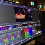
Place the colorimeter centered on the screen with the sensor flat against the panel surface. Don't press hard. IPS panels can shift color slightly under pressure, and you want to measure the display as it actually sits during use.
The software will display a series of color patches and record your panel's response to each one. This takes 5 to 15 minutes depending on the instrument speed and the number of patches. Once it finishes, you'll get a measurement report showing:
- Average and maximum Delta E across all measured patches
- White point deviation from your target
- Gamma curve plotted against the target line
- Gamut coverage and gamut volume relative to your reference color space
- Uniformity map if you measured a grid of points
Save the ICC profile the software generates and make sure your operating system loads it automatically. On Windows, this usually happens by default. On macOS, you may need to verify the profile is selected in Displays preferences.
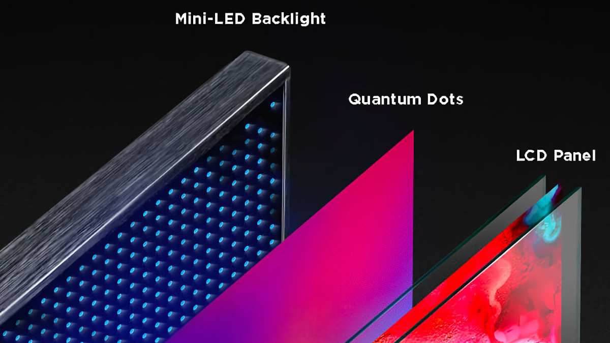
Image source: Bing (Web (fair-use with source credit))
Step-by-Step: The No-Budget Visual Assessment (No Instrument Required)
No colorimeter? No money? You can still catch the most common accuracy problems with free tools and a careful eye.
Check 1: White Point and Grayscale
Open a pure white document or webpage. Then open a series of grayscale steps (Lagom LCD test pages work well for this). Look at the grayscale from your normal viewing distance.
Does white look neutral, or does it lean warm (yellowish) or cool (bluish)? Does each gray step look like a clean neutral gray, or does any step show a color cast?
Your eyes will try to white-balance automatically, so step away for 30 seconds, look at something neutral-toned in the room, then come back. This resets your adaptation slightly and makes casts easier to spot.
Check 2: Saturation and Hue Using Known References
Pull up a photo you know well. Something you've printed before, or an image you've viewed on a calibrated display you trust. Does the on-screen version look obviously different?
Are skin tones too saturated? Do blues shift toward purple?
This isn't precise, but it catches the kind of errors that matter in practice. If your monitor makes everyone look sunburned or gives landscapes a cyan cast, you have a problem regardless of what any instrument says.
Check 3: IPS Glow and Uniformity Impact on Accuracy
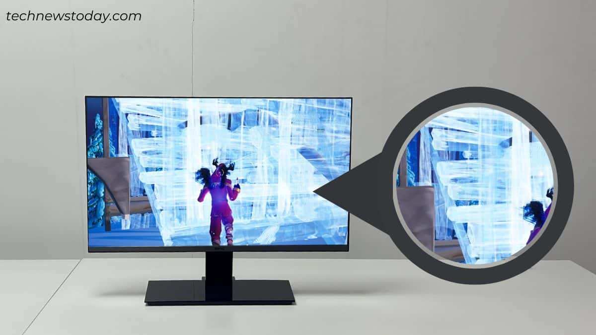
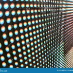
IPS glow is the silvery or golden bleed you see in dark corners when viewing a black screen in a dark room. It's a characteristic of IPS technology, not a defect, but it affects perceived accuracy in shadow tones. Open a dark image or a black background and check whether the corners look noticeably different from the center.
Also check for backlight bleed and color uniformity issues. Display a solid white, then solid red, green, and blue full-screen image. Look for patches of different color or brightness, especially near the edges.
Some variation is normal on IPS panels. Large shifts mean your center-point accuracy numbers don't represent the whole screen.
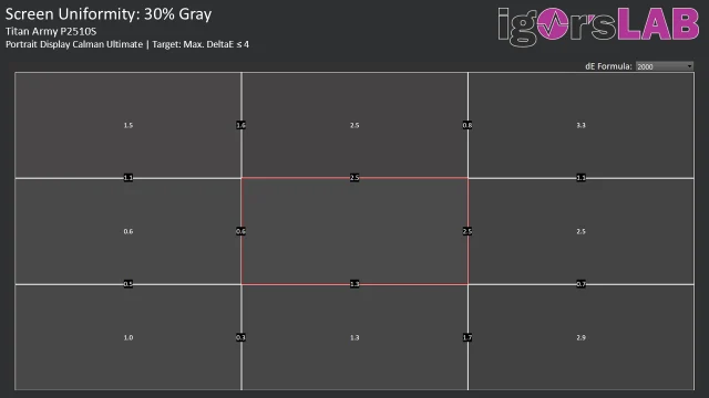
Image source: Bing (Web (fair-use with source credit))
How to Read Delta E Numbers Without Losing Your Mind
Delta E is the standard measurement for color difference, but the number alone doesn't mean much without context. The most common formula in current use is ΔE2000 (also written as dE00 or ΔE2000), which weights differences in a way that better matches human perception than the older ΔE76 formula.
What Counts as "Accurate" Depends on Your Work
Here's a practical breakdown of Delta E values and what they mean in real terms:
- ΔE < 1.0: Essentially perfect. The difference between displayed and reference color is imperceptible to human vision. This is the target for critical proofing work.
- ΔE 1.0 to 2.0: Excellent. Most people won't notice the difference in normal viewing conditions. Acceptable for professional photography and print proofing.
- ΔE 2.0 to 3.5: Good. A trained observer might spot the difference in a side-by-side comparison, but it's unlikely to cause problems in general use. Fine for most creative work.
- ΔE 3.5 to 5.0: Noticeable. The color shift is visible to most people. Acceptable for non-critical work, office use, or casual photo editing.
- ΔE > 5.0: Poor. Colors are clearly wrong. This needs correction or the monitor isn't suitable for the intended use.
The key number to look at in your measurement report is the average Delta E across all patches, not the maximum. A single patch with a high ΔE (like a specific shade of blue) might not matter much if the average is under 2.0. But if the average is above 3.0, your monitor needs calibration or it's not suitable for color-critical work.
Uniformity Matters More Than You Think
A measurement report that only tests the center of the screen is only telling you half the story. Luminance and color accuracy shift across the panel due to backlight arrangement and panel construction. A 9-point or 25-point uniformity grid shows you how much the corners and edges deviate from center.
Look at the spread between the best and worst points. If your center ΔE is 0.8 but your corners are averaging 3.5, you have a uniformity problem that a single ICC profile can't fully correct. Some monitors include uniformity correction features (sometimes called DUE or digital uniformity equalization) that help compensate for this.
The Tool Breakdown: Which Colorimeter Fits Your Situation
Not every colorimeter works well on every display. Some struggle with wide gamut panels. Others can't handle the extreme brightness of modern HDR reference monitors.
Picking the wrong instrument gives you numbers that look precise but don't actually reflect what your panel is doing.
Here's a practical breakdown based on current market options as of 2026:
| Instrument | Best For | Approximate Price | Limitation |
|---|---|---|---|
| Calibrite ColorChecker Display Pro | General creative work, photography | ~$170 | Not ideal for HDR peak brightness above 1000 nits |
| Calibrite ColorChecker Display Plus | High-end print matching, wide gamut | ~$270 | Higher cost for marginal benefit to casual users |
| X-Rite i1Display Pro Plus | Video, HDR, wide gamut panels | ~$250 | Bundled software less intuitive than Calibrite |
| Datacolor SpyderX2 Pro | SDR photography, budget-conscious | ~$130 | Slower measurement speed |
| Built-in sensors (EIZO CG, ASUS ProArt PA32UCG) | Automated recalibration, time savings | Included with monitor | Limited to supported monitor models |
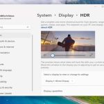
If you're calibrating an HDR-capable display with a peak brightness above 1000 cd/m², the i1Display Pro Plus or the Calibrite Plus are safer choices. The standard SpyderX2 and base ColorChecker Display Pro top out in reliable measurement range well below that.
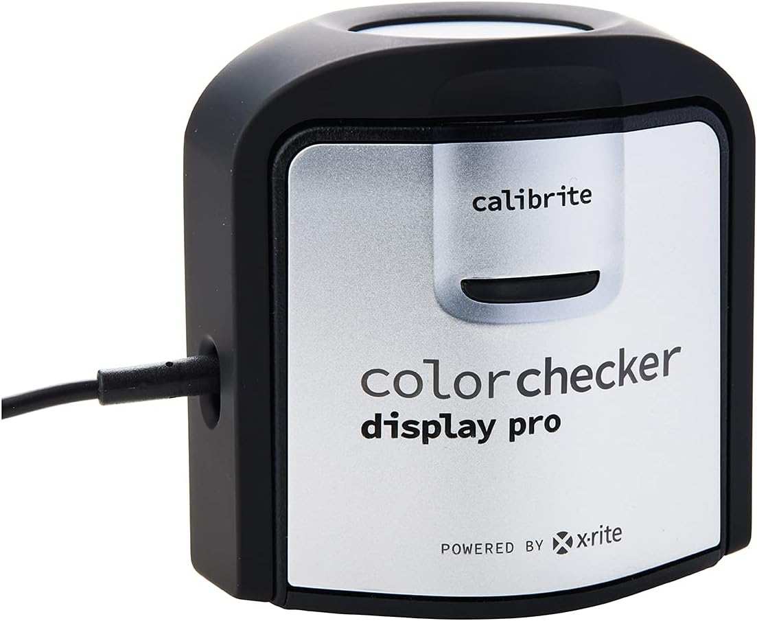
Image source: Bing (Web (fair-use with source credit))
Software Options That Won't Mislead You
The instrument only measures. The software decides what to do with those measurements, and the software choice matters more than most people realize.
DisplayCAL (Free and Remarkably Capable)
DisplayCAL is open-source calibration software that supports virtually every colorimeter on the market. It gives you full control over target settings, measurement options, and profile generation. The verification report feature lets you compare your calibrated state against your baseline, which is exactly what you want for ongoing accuracy checks.
The interface looks dated and the learning curve is steeper than bundled alternatives. But the underlying engine is solid, and the community around it keeps it updated. For anyone who wants maximum control without spending money on software, this is the answer.
Bundled Software: Calibrite CCProfiler, i1Profiler, SpyderX Studio
These ship with their respective instruments and streamline the process to a handful of clicks. They're easier to use than DisplayCAL but offer fewer options for customization. CCProfiler is the most polished of the three. i1Profiler feels dated.
SpyderX Studio is functional but the interface hasn't aged well.
If you just want to press a button and get a profile, bundled software works fine. If you want to understand what's happening under the hood or need specific target configurations, you'll outgrow it quickly.
Calman and Lightspace CMS (Professional Tier)
These are the tools used by professional colorists and post-production facilities. Calman is the industry standard for broadcast and cinema calibration. Lightspace CMS offers similar capabilities with a slightly more accessible interface.
Both support 3D LUT generation for monitors with hardware LUT capability, which provides more precise correction than standard ICC profiles.
The cost is significant. Calman's Ultimate package runs over $1000. Even their entry-level packages start around $299.
Unless you're working in an environment that requires standards-compliant calibration, this tier is overkill.
Common Mistakes That Ruin Your Accuracy Check
People make the same handful of errors over and over. Here are the ones that actually matter:
Testing on a Cold Panel
This is the single most common mistake. LCD color response changes as the panel warms up. Manufacturer specifications typically assume a warm-up period of 30 minutes minimum.
Some panels, especially those with aggressive brightness capabilities, continue shifting for a full hour. If you calibrate immediately after turning the monitor on, your profile will be wrong by the time the panel stabilizes.
Leaving Dynamic Contrast or Eco Mode Enabled
These features actively adjust backlight output based on content. They make the display look punchy in a store, but they destroy any hope of consistent color reproduction. Every measurement you take will reflect the monitor's processing rather than the panel's actual capabilities.
Turn all of this off before you start.
Calibrating to a Gamut Your Panel Can't Actually Display
If your monitor covers 100% of sRGB but only 75% of DCI-P3, setting a DCI-P3 target forces the software to create a profile that maps out-of-gamut colors to the nearest available equivalent. The result looks like good gamut coverage on paper, but the actual accuracy within the panel's real gamut suffers. Always match your target to your panel's native capability.
Ignoring the Profile Loader on Windows
Windows doesn't always load ICC profiles correctly, especially with certain GPU drivers or multi-monitor setups. After calibration, verify the profile is actually active by checking Color Management in the Control Panel. If the profile isn't loaded, your calibration did nothing visible.
Reusing an Old ICC Profile After Changed Ambient Conditions
Room lighting changes affect perceived color accuracy. If you calibrated in a dark room but now work with daylight coming through a window, the white point that looked correct before will look off. Recalibrate when your working conditions change significantly.
How Often Should You Actually Recalibrate?
The 2-4 Week Rule and When It Changes
For most creative work, recalibrating every two to four weeks keeps drift within acceptable bounds. IPS panels with modern LED backlights are more stable than older CCFL-backlit displays, but they still shift gradually. The backlight ages unevenly, and the LCD layer's response changes slightly over time.
If you're doing critical proofing work where a color error has financial consequences (print production, client deliverables), weekly calibration isn't excessive. If you're editing content for social media where viewers are looking at uncalibrated phones and laptops, monthly is probably fine.
Factory Burn-In and Panel Aging
New monitors go through a burn-in period during the first 100 to 300 hours of use. During this window, color response shifts more noticeably. Manufacturer documentation from EIZO and ASUS both recommend more frequent calibration during this initial period.
After break-in, the panel stabilizes and longer intervals between calibrations become reliable.
Over the monitor's full lifespan (typically 30,000 to 60,000 hours for modern LED-backlit IPS panels), the backlight's color temperature drifts toward warmer tones. A monitor that held D65 perfectly at year one might sit at 6200K by year three. Regular calibration compensates for this until the backlight degrades to the point where the profile can't fully correct the shift.
When Visual Assessment Is Enough (And When It's Not)
Social Media Content Creation
If your content is consumed primarily on uncalibrated phones and laptops, instrumented calibration is less critical than you think. Your audience is viewing on displays with wildly varying accuracy. Getting your monitor close to standard matters more than hitting exact targets.
Visual assessment plus a basic calibration is usually sufficient.
Client-Facing Color Grading or Proofing
When a client is making decisions based on what they see on your screen, you need instrumented calibration with documented Delta E values. Visual assessment alone introduces too much subjectivity. If there's a dispute about whether the deliverable matches the proof, you want measurement data to back up your position.
Print Photography and Prepress
Print proofing demands the highest level of display accuracy. You're predicting how ink will render on paper, and the margin for error is small. ISO 12646 defines the requirements for displays used in this workflow.
You need a colorimeter, proper calibration software, and a monitor with hardware LUT capability for the most precise correction.
Frequently Asked Questions
Can I test color accuracy without a colorimeter?
Yes. Use free test pattern tools like Lagom LCD Monitor Test Pages or DisplayCAL's visual evaluation features. You won't get Delta E numbers, but you can catch white balance errors, obvious color casts, and gamma problems.
This approach works well for casual users who just want to verify their monitor isn't wildly off.
What Delta E value is considered good for photo editing?
An average Delta E below 2.0 is considered good for photo editing. Below 1.0 is excellent. If your average is between 2.0 and 3.5, the monitor is usable for general creative work but not ideal for critical proofing or print matching.
Does IPS glow affect color accuracy measurements?
Yes. IPS glow primarily affects dark tones and can cause visible color shifts in corners when viewed in a dark room. It's a panel characteristic, not a defect.
Uniformity correction features on some monitors help compensate, but they can't eliminate it entirely.
How long does a full calibration and verification take?
Expect 15 to 20 minutes for a standard calibration with a colorimeter. Add another 10 minutes if you're running a full verification report with a 25-point uniformity grid. Visual-only assessment takes about 10 minutes if you know what to look for.
Is factory calibration accurate enough for professional work?
Factory calibration is a starting point, not a guarantee. Even with an included calibration report, your specific unit may differ from the sample that was measured. Environmental factors and panel aging mean you should always verify and recalibrate for professional use.
Final Decision Guide: Pick Your Workflow Based on What You Actually Do
Testing color accuracy on an IPS monitor isn't one-size-fits-all. Your workflow, budget, and tolerance for error determine the right approach. If you're editing photos for personal projects or social media, a visual Lagom test plus a quick DisplayCAL calibration is plenty enough.
If you're delivering paid creative work to clients, the Calibrite ColorChecker Display Pro with DisplayCAL gives you documented accuracy that holds up in professional settings. Either way, the core principle stays the same: test with purpose, match your targets to your actual output, and recalibrate regularly. Start with the free visual assessment today to see where your monitor stands, and upgrade to instrumented measurement whenever accuracy starts affecting your work or your clients' experience.

Image source: Wikimedia Commons / Salisbury and South Wiltshire Museum, Richard Henry, 2013-04-22 16:53:41 (CC BY-SA)
Similar Posts