Is 4K Monitor Necessary for Designers
Is a 4K Monitor Necessary for Designers?
is 4k monitor necessary for designers
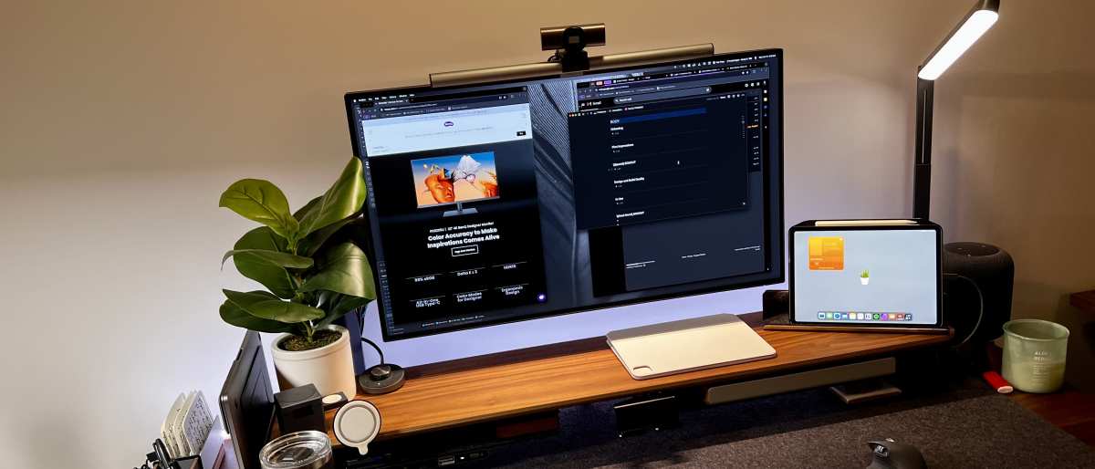
"Is a 4K monitor necessary for designers?" is one of those questions that sounds like it should have a clean yes-or-no answer. It doesn't. The right resolution for your workstation depends on what kind of design work you actually do, what hardware you're running, and whether you'd even notice the difference at your normal viewing distance.
This isn't a "buy the biggest number" situation. A 27-inch 4K display at 163 PPI looks very different from a 32-inch 4K at 138 PPI, and neither one automatically gives you accurate color. Let's walk through the decision the way you'd actually make it, starting with your workflow, not with a spec sheet.
Quick Answer: It Depends on What Kind of Designer You Are
A 4K monitor isn't universally necessary for designers. Print and motion designers benefit most from the extra resolution. Most UI and web designers do well at 1440p.
OS scaling issues and GPU requirements can offset 4K benefits.
Why "Just Get 4K" Is Bad Advice
Generic tech advice loves to throw "just go 4K" at designers like it's free money. It's not. Resolution is just one piece of a monitor's overall picture.
Color accuracy, panel type, and how your operating system handles scaling all matter just as much, sometimes more.
Here's where people get tripped up. They buy a budget 4K VA panel expecting a premium design experience and end up with worse color shift across the screen than a good 1440p IPS. Or they drop $400 on a 4K display, plug it into a three-year-old laptop, and wonder why everything feels sluggish.
Manufacturer specifications confirm that 4K pushes four times the pixels of 1080p. That's real visual data, but it's also real GPU workload.
The decision tree starts with honest answers about your work. Are you doing typography-heavy print layout in InDesign, or are you pushing pixels in Figma all day? Those two designers need very different things from a screen.
One needs to see every serif in pin-sharp detail. The other needs consistent color and comfortable UI scaling without fighting Windows at 150 percent zoom.
The Three Questions That Actually Determine Your Answer
Forget the spec sheet for a minute. These three questions will point you in the right direction faster than any benchmark review.
1. What's your primary design discipline? Print typography, packaging, and editorial layout benefit enormously from 4K because you're scrutinizing fine detail at 1:1 zoom. UI/UX design, web work, and illustration don't need that pixel density nearly as much.
2. What operating system are you running? This matters more than people expect. macOS has handled HiDPI scaling thoughtfully since Retina displays launched. Windows has improved, but per user reports across design forums, inconsistent app scaling at non-native percentages on Windows remains a persistent frustration for UI-focused designers.
3. What's your current GPU situation? Driving 4K comfortably in design applications, especially motion graphics and 3D work, requires adequate VRAM and bandwidth. If your machine barely handles your current display, 4K will magnify the bottleneck.
Think of it as a simple if-then logic chain. If you primarily do print or motion work on a capable machine running either macOS or updated Windows 11, 4K is highly beneficial. If you're doing UI/UX design on Windows and fighting scaling issues daily, 1440p at 109 PPI on a 27-inch panel may genuinely serve you better.
Understanding PPI, Scaling, and Why Your Eyes Don't Always Win
Resolution gets all the marketing love. Pixel density is what actually determines how sharp things look to you. A 32-inch 4K display delivers roughly 138 PPI.
A 27-inch 4K hits about 163 PPI. That difference matters at close working distances.
Here's the rule of thumb. At normal monitor viewing distance, roughly 24 to 30 inches, your eyes stop distinguishing individual pixels somewhere around 110 to 140 PPI for most people. Going beyond that range provides diminishing perceptual returns.
The jump from 82 PPI (a 27-inch 1080p screen) to 109 PPI (27-inch 1440p) is massive and immediately obvious. The jump from 109 to 163 PPI is noticeable in fine text rendering but subtler in day-to-day work.
Scaling complicates the equation. Run a 27-inch 4K at its native resolution with no scaling and text becomes uncomfortably small for extended work sessions. Most designers set scaling to somewhere between 125 and 150 percent, which makes the display behave like a lower-resolution screen but with sharper rendering.
On macOS this generally works well. On Windows, legacy apps that aren't DPI-aware can render blurry at non-integer scaling factors.

Consider five practical scenarios. A UI designer running Windows will often find 1440p with no scaling gives the smoothest experience with the fewest app-compatibility headaches. A print designer benefits more from 4K's extra workspace and fine-detail visibility.
A motion designer editing 4K video timelines needs native 4K to preview content accurately. A freelance web designer watching budget will get more value from a quality 1440p IPS panel with excellent sRGB coverage. A photographer splitting screen time between Lightroom and Photoshop gains from the desktop real estate 4K provides.
When 4K Actually Makes Sense for Design Work
Not every workflow benefits from 4K, but for several categories of designer it's a genuine upgrade with tangible, day-to-day impact.
Print and Editorial Designers
If you spend your days in InDesign fine-tuning kerning and leading, 4K at 163 PPI on a 27-inch panel gives you a sharper on-screen representation of the final printed page. You'll catch spacing inconsistencies and font rendering issues at 1:1 zoom that might not be visible at 1440p.
Motion Designers and Video Editors
Working with 4K video means your timeline content is 4K. Editing on a 1440p screen forces constant downscaling for preview, which sacrifices accuracy. Native 4K on your display lets you see your actual output resolution in real time, especially important for fine compositing detail in After Effects and DaVinci Resolve.
Designers Building for High-DPI Consumer Devices
If your deliverables ship on Retina iPhones, 4K Android displays, or high-end Windows laptops, designing on a 4K monitor gives you an honest preview of how your work will appear to end users.
Photographers Doing Detail Retouching
Skin retouching and fine compositing benefit from seeing actual pixel-level detail without zooming in constantly. A 4K display keeps more of your image visible at full resolution. This reduces the zoom-unzoom cycle that slows down precise work.
Frequently Asked Questions
Is 4K overkill for graphic design?
Not always. For print-heavy and typography-focused design work, 4K's extra pixel density improves on-screen clarity at 1:1 zoom. For general web graphic design, quality 1440p often delivers equal perceived sharpness without the scaling complications.
Does 4K make colors more accurate?
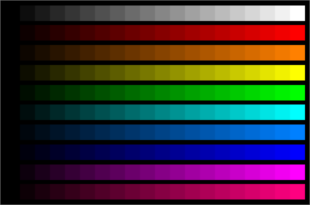
No. Color accuracy depends on panel technology, specifically IPS or wide-gamut OLED, color gamut coverage like sRGB, DCI-P3, or Adobe RGB, and calibration. Resolution and color accuracy are entirely independent specifications.
Budget 4K panels frequently underperform against quality 1440p displays in color-critical evaluation.
How important is monitor calibration for 4K design work?
Critical. Without hardware calibration, even a premium 4K panel can display inaccurate color. Calibration corrects white point, gamma, and color drift over time, making it essential for any design work where color matters.
What's the best screen size for 4K design?
27 inches hits the sweet spot for most designers who blend text work and visual design. At this size, 4K delivers approximately 163 PPI, which remains sharp at 125 to 150 percent scaling. At 32 inches and 138 PPI, some designers perceive diminishing sharpness returns for typography work.
Should I choose 4K or a higher refresh rate for design?
Design work benefits more from resolution and color accuracy than from high refresh rates. A 60 Hz 4K display with strong color performance will serve most designers better than a 1440p 144 Hz panel with mediocre color. Motion designers and those who also game are a reasonable exception.
Does my GPU really matter for 4K design work?
Yes. Driving four times the pixels of 1080p demands more VRAM and processing bandwidth. Most professional reviews suggest targeting 8 GB of VRAM for comfortable 4K performance in Photoshop and Illustrator.
Motion graphics and 3D work, especially in After Effects and Blender, typically call for more.
When 1440p Is Genuinely the Better Move
Sometimes the smarter money sits one rung below 4K. For several common design workflows, 1440p delivers the better overall experience when you factor in scaling behavior, GPU comfort, and cost.
UI and UX Designers on Windows
This is the big one. If your daily tools are Figma, Sketch, or Adobe XD and you're on Windows, 1440p at 109 PPI on a 27-inch panel means you can run 100 percent scaling with no math required. Every app renders crisp.
No blurry panels. No mystery bugs where Illustrator looks fine but your browser mockup doesn't.
Most designers we've seen in forum surveys and workflow breakdowns eventually settle on this resolution for UI work even when 4K was available. The scaling consistency across apps wins the argument.
Designers Running Older or Mid-Range Hardware
If your machine has 6 gigabytes of VRAM or integrated graphics, 4K is going to hurt. Scrolling in a large Photoshop canvas will lag. After Effects previews will stutter.
The experience gets worse, not better.

Budget-Conscious Setups
A quality 27-inch 1440p IPS monitor with strong sRGB coverage can be had for $250 to $350 as of 2026. Comparable 4K options with similar color performance start closer to $450. That $200 difference could go toward a color calibration tool or more RAM, both of which improve your daily output more than the resolution bump.
Dual Monitor or Setups with an Ultrawide
If your workflow matches well with 1440p ultrawide, a high-refresh 1440p display with good color, or pairing a laptop screen with an external at matching PPI, mixing a 4K with a 1080p screen creates scaling headaches on both Windows and macOS. Matching PPI across displays eliminates the problem.
The Hardware Trap: 4K Isn't Free
People budget for the monitor and forget that driving four times the pixels costs something. Here's what actually changes when you move to 4K.
Most professional reviews suggest targeting 8 gigabytes of VRAM for comfortable 4K performance in Photoshop and Illustrator. Motion graphics, 3D work, and video editing typically call for more.
Integrated graphics and older laptop GPUs are consistently reported to struggle at 4K in design applications. Before buying, check whether your GPU supports the resolution you want at the refresh rate you want.
Cable selection matters more than many expect. HDMI 2.0 handles 4K at 60 hertz. Full RGB chroma and 10-bit color depth demand more bandwidth, making DisplayPort 1.4 or Thunderbolt connections the better choice.
Laptop users connecting an external 4K display often report scaling headaches caused by native panel PPI mismatch. If your laptop screen runs at a significantly different PPI than the 4K display, UI elements will appear different sizes on each screen. macOS handles this better than Windows most of the time, but both Laptop + 4K setups can require manual adjustment in display settings.
Color Accuracy Has Nothing to Do With Resolution
Number of pixels determines how much detail a monitor can display. Color accuracy and gamut coverage determine whether the colors it shows are true. These are completely different features that happen to live in the same box, and failing to understand that leads to expensive mistakes.
A sharp, high-resolution panel paired with poor color accuracy will make incorrect colors look crisp and convincing, not correct. An IPS panel with factory calibration and delta E under 2 shows color more faithfully despite fewer pixels.
Professional print and photo designers should look for delta E under 2 for color accuracy, 99 percent sRGB as the minimum, and DCI-PP3 coverage if producing content for digital cinema or modern displays.
Resolution and color performance typically come together in professional-grade monitors, but at the budget end, a decision between sharpness and accuracy sometimes has to be made. When that choice comes up, color accuracy serves design work more reliably than extra pixels for anyone doing color-critical output.
Scaling Showdown: Windows vs. macOS at 4K
Visually the experience is both detailed. Functionally, the experience differs in ways that matter for design work.
macOS uses a fixed scaling system tied to specific display PPI targets. On a 27-inch 4K display, macOS offers scaled resolutions that map cleanly to the panel. Text rendering stays sharp across most system UI and applications.
Designers on MacBooks with Retina displays coming to an external 4K usually report an easier adjustment.
Windows relies on percentage-based integer and fractional scaling. Integer multiples (200 percent, 300 percent) render cleanly, while fractional scaling (150 percent, 175 percent) can introduce blur in legacy applications. Most 4K monitor users on Windows land at 150 percent scaling on 27-inch displays for a usable compromise between size and clarity.
Modern apps are DPI-aware and look fine, but some users notice previews or tool panels from older utilities, and Photoshop in particular can render slightly differently at non-native scaling factors.
The real issue is mixed-DPI setups. Use a 4K display alongside a 1080p monitor and Windows must manage two scaling contexts simultaneously. Exploring display settings in Windows 11 reveals the available scaling options and per-display controls, with reminders to sign effect.
Bottom line. Mac users typically experience fewer scaling pains at 4K. Windows users should be prepared for some trial and error with their specific application mix.
This is one of those follow-the-OS-path decisions no spec sheet can make for you.
Real Scenarios: What We'd Recommend for Five Different Designers
Theory is helpful until you're staring at a product page. Here are five common designer profiles with a straightforward recommendation for each.
Scenario 1 covers a freelance web designer on a 2021 MacBook Pro. We'd suggest running its built-in Retina display alongside a 27-inch 1440p IPS external, matching PPI closely and keeping scaling simple.
Scenario 2 is an in-house print designer on a Windows workstation with a dedicated GPU. We'd recommend a 27-inch 4K IPS panel with hardware calibration support and Adobe RGB coverage. The extra resolution serves this work directly.
Scenario 3 involves a motion designer building 4K social content. We'd look for a 4K display with good coverage of the DCI-P3 color space. Scaling matters less in timeline-based work, but color accuracy is non-negotiable.
Scenario 4 could be a junior designer on a tight budget. We'd say get the best 1440p IPS within budget and save the remaining funds for calibrating it properly. Performance can come later.
Scenario 5 is a photographer splitting time between editing and design work. We'd suggest 4K at 32 inches for the extra desktop real estate. Resolution and workspace both serve someone who thinks in full images.
Common Mistakes When Choosing a Design Monitor
Buying 4K because the spec sounds impressive is the most common trap we see. Resolution doesn't equal quality, and a poor 4K panel often underperforms a strong 1440p display in practical design tasks.
Ignoring PPI is a close second. Many manufacturers push 4K in larger formats, such as 32 inches and above, where PPI drops to 138 or lower. If your work emphasizes crisp text, check that pixel density meets your needs before committing.
Skipping calibration often catches designers off guard, especially those upgrading from laptop screens. Out-of-box accuracy on consumer panels is seldom reliable enough for color-critical work. Budget for calibration hardware or services from the start.
Another overlooked issue is the difference between panel technology and resolution; for instance, a budget VA panel may introduce noticeable color shift when viewed off-center.
Operating a 4K display at very high scaling on a small screen wastes much of the resolution advantage. At 200 percent scaling, for example, the effective workspace shrinks closer to 1080p, so make sure you actually use the extra real estate before paying for it.
Price Ranges and What You Get at Each Level
| Range | Examples Resolution | Panel Type | Color Accuracy | |
|---|---|---|---|---|
| Budget | 300 to 400 dollars | 4K, 27 in | VA or basic IPS | Decent sRGB, calibration recommended |
| Sweet Spot | 500 to 800 dollars | 4K, 27–32 in | IPS with factory calibration | 99% sRGB, Adobe RGB begins, delta E under 2 |
| Premium | 1,000 to 1,600 dollars | 5K or wide-gamut 4K | IPS or OLED with wide gamut | Full P3 coverage, hardware calibration support |
| Reference | 1,600 to 4,000+ dollars | 4K–6K optionally | IPS with full backlight control | Guaranteed delta E under 1, hardware calibration built in |
Entry-level 4K monitors typically offer resolution at reasonable cost, but panel uniformity and color accuracy can be inconsistent. At mid-range, IPS panels with factory calibration start to show up. Professional tiers add wide gamet coverage and hardware calibration, while reference-grade monitors from specialized manufacturers target certified delta E for legal and medical environments.
Decision guide: If you work primarily in print, video, or photography, 4K pays for itself. In most other cases, use 1440p for UI and web work, or match PPI across multiple displays.

Similar Posts