Is Budget Monitor Good for Graphic Design
Is a budget monitor good for graphic design? The short answer is: it depends on what kind of design work you're doing, how serious you are, and which specs you actually pay attention to. A lot of people assume you need to spend $1,000 or more to get accurate colors, but that's not the full picture anymore.
Modern budget IPS panels have come a long way. You can now find 27-inch displays with 99% sRGB coverage and decent factory calibration for under $300. The real question isn't whether a budget monitor can work for design.
It's whether the specific model you're looking at meets the minimum thresholds that matter, like a Delta E under 3 and at least 95% sRGB coverage. Let's break down exactly where budget monitors hold up and where they fall apart.
Quick Answer
A budget monitor can work for graphic design if it has an IPS panel, covers at least 99% of sRGB, and ships with a Delta E under 3. It won't match a professional display for print or brand-critical work. For web design, social media, and learning, a good budget IPS panel is perfectly usable.
The panel type and color gamut matter far more than the price tag.
What Actually Makes a Monitor Good for Design Work
Before you can judge whether a budget monitor cuts it, you need to understand what separates a design-worthy display from a regular office screen. It's not about resolution or refresh rate. It's about how faithfully the monitor reproduces color.
The core requirements for design work are straightforward. You need an IPS (In-Plane Switching) panel for consistent colors across viewing angles. You need wide color gamut coverage, ideally 99% or more of sRGB at minimum.
You need low color accuracy deviation, measured as Delta E, where anything under 3 is considered acceptable and under 2 is professional grade. And you need decent panel uniformity, meaning the brightness and color stay consistent from corner to corner.
Professional monitors add hardware calibration support, wider gamuts like Adobe RGB and DCI-P3, 10-bit color depth, and better out-of-box calibration. But for a lot of design work, especially digital-first work, those extras are nice to have rather than mandatory.
Here's a quick breakdown of the minimum specs that matter for design:
| Spec | Minimum for Design | Professional Standard |
|---|---|---|
| Panel Type | IPS | IPS (IPS-Black or AHVA) |
| sRGB Coverage | 99% | 100% |
| Delta E (Color Accuracy) | Under 3 | Under 2 |
| Bit Depth | 8-bit | 10-bit |
| Brightness | 250 nits | 300+ nits |
| Adobe RGB Coverage | Not required | 95%+ |
| Hardware Calibration | Not required | Yes |
The panel type is the single biggest factor. TN panels twist colors when you shift your seat. VA panels crush shadow detail.
IPS panels keep colors stable, which is why they're the baseline for any design work.
Where Budget Monitors Fall Short (And Why It Matters)
Let's be honest about the compromises. Budget monitors cut corners somewhere, and in design work, those corners tend to be the ones that affect color accuracy and consistency.
The most common issue is poor out-of-box calibration. A budget monitor might cover 99% of sRGB on paper, but ship with a color temperature way too blue or a gamma curve that's off. Without a colorimeter to calibrate it, you're essentially guessing.
Professional monitors spend more on factory calibration, and it shows.
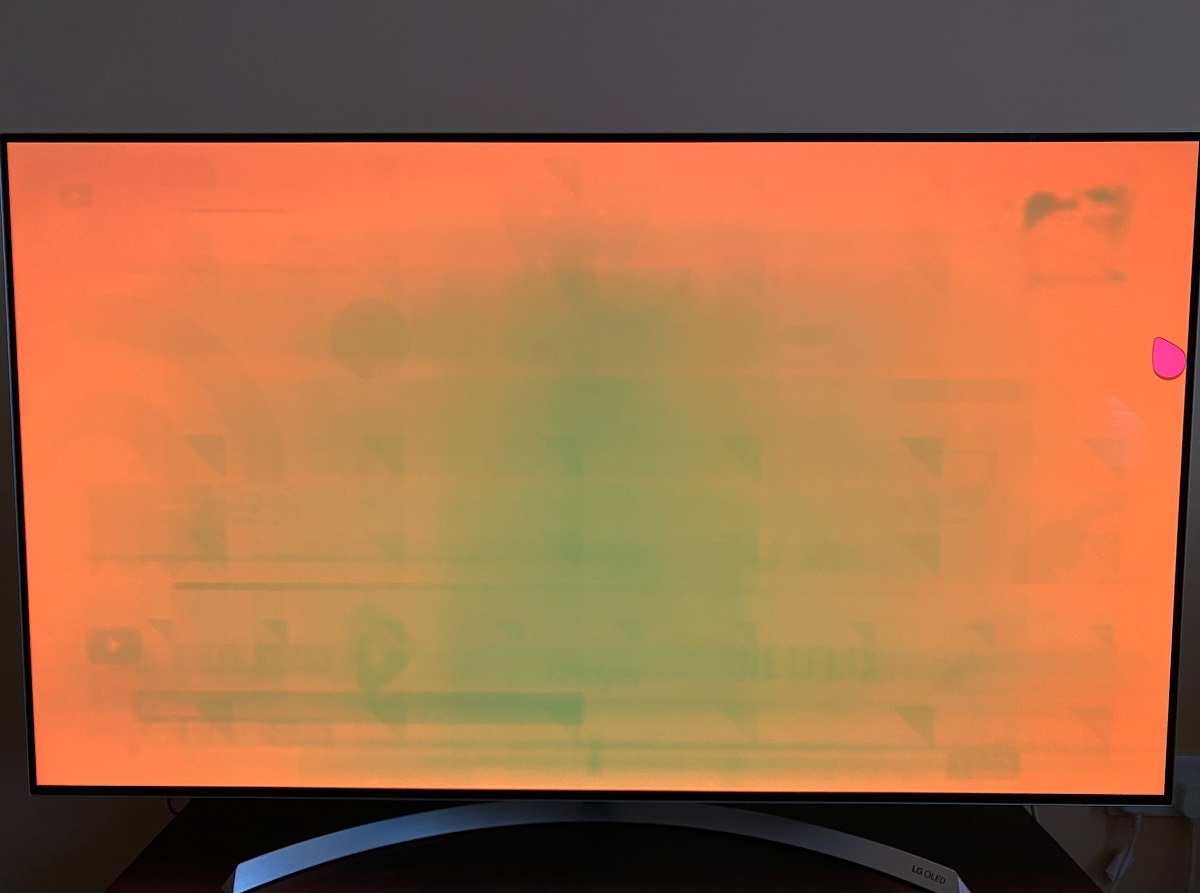
Panel uniformity is another weak point. Cheaper panels often have backlight bleed in the corners, IPS glow when viewing dark content, or slight color shifts from the center to the edges. For photo editing or print design, that inconsistency can cause real problems.
You might edit an image that looks perfect in the center of your screen but has a warm shift near the edges.
Color gamut claims can be misleading too. Some budget monitors advertise "72% NTSC" or "120% sRGB" without clarifying whether that's volume or coverage. Gamut volume tells you how wide the range is, but gamut coverage tells you how much of the target space is actually reproducible.
A monitor can have 120% sRGB volume but only 85% sRGB coverage, which means it oversaturates some colors while missing others entirely.
Build quality and ergonomics also tend to suffer. Cheap stands that don't adjust for height, tilt, or pivot make it hard to position the screen properly. And proper positioning matters for color accuracy, since even IPS panels shift slightly if you're viewing from a bad angle.
The biggest risk with budget monitors for design is client work. If you're delivering brand colors, print files, or anything where color accuracy is contractually important, a budget monitor without calibration is a liability. The colors you see might not match what the client sees or what comes out of the printer.
Where Budget Monitors Surprise You
Here's the part that often gets overlooked. The gap between budget and professional monitors has narrowed significantly, especially in the $200 to $350 range. As of 2026, you can buy a 27-inch 1440p IPS panel with 99% sRGB coverage, a factory calibration report, and a Delta E under 2 for around $250 to $300.
Five years ago, that spec sheet would have cost you twice as much.
For web design, UI/UX work, social media graphics, and digital illustration, a good budget IPS panel is genuinely sufficient. Most digital content is created and consumed in sRGB. If your monitor covers sRGB well and you calibrate it occasionally, you'll produce work that looks consistent across the vast majority of screens your audience uses.
Students and hobbyists get the most value here. If you're learning Photoshop, Illustrator, or Figma, you don't need Adobe RGB or hardware calibration. You need a screen that shows colors accurately enough that your skills transfer when you eventually move to a professional display.
A budget IPS panel does that job well.
The 1440p resolution at 27 inches is another sweet spot. At roughly 109 pixels per inch, you get sharp text and enough screen real estate for design tools without the scaling headaches or GPU demands of 4K. Most budget 27-inch monitors now ship at 1440p, which was a premium feature not long ago.
Refurbished professional monitors are worth mentioning too. A used Dell UltraSharp or BenQ PD series from two or three years ago often costs the same as a new budget monitor but gives you better calibration, wider gamut, and superior build quality. The trade-off is no warranty and potential panel wear, but for budget-conscious designers, it's a legitimate path.
The Specs That Actually Matter for Design (And the Ones That Don't)
Monitor marketing is full of numbers that sound impressive but don't translate to better design work. Let's separate the signal from the noise.
Specs that actually matter for design:
- Panel type (IPS): Non-negotiable for color-critical work. Avoid TN and VA for design.
- sRGB coverage: Look for 99% or higher. This is the color space of the web and most digital content.
- Delta E: Under 3 is acceptable. Under 2 is great. This measures how far off the displayed color is from the intended color.
- Panel uniformity: Harder to find in spec sheets, but reviews from sources like RTINGS.com test this directly.
- Factory calibration: A monitor that ships with a calibration report and a Delta E spec is worth the small premium.
Specs that matter less than you'd think:
- Refresh rate: 60Hz is fine for design. 144Hz is for gaming. Higher refresh rates don't improve color accuracy.
- Response time: Irrelevant for static design work. This matters for gaming motion clarity.
- HDR: Most budget monitors with "HDR" labels don't have the brightness or local dimming to actually deliver it. True HDR requires 600+ nits and local dimming, which you won't find at budget prices.
- Resolution beyond 1440p at 27": 4K is nice but not necessary for design. It also demands more from your GPU and makes UI scaling trickier.
- Contrast ratio: IPS panels typically sit around 1000:1 to 1300:1. VA panels offer higher contrast but worse color accuracy for design. Don't chase contrast numbers for design work.

The chart above shows the CIE 1931 color space with the sRGB gamut triangle overlaid. When a monitor claims 99% sRGB coverage, it means it can reproduce 99% of the colors within that triangle. Adobe RGB and DCI-P3 extend beyond sRGB into wider areas, which is why they matter for print and video work respectively.
One spec that's often overlooked is bit depth. Most budget monitors use 8-bit panels, which display 16.7 million colors. Professional monitors use 10-bit panels with 1.07 billion colors.
For most design work, 8-bit is fine, especially if the monitor uses FRC (Frame Rate Control) to simulate deeper color. But if you're doing gradient-heavy work like photo retouching or digital painting, banding can appear on 8-bit panels in subtle gradients.
Connectivity matters more than people realize. A monitor with USB-C that carries video, data, and power delivery is a genuine quality-of-life upgrade for laptop users. Some budget monitors now include USB-C, which used to be reserved for premium models.
DisplayPort is preferable to HDMI for design work because it supports higher resolutions and refresh rates more reliably, though HDMI 2.0 is sufficient for 1440p at 60Hz.
Budget vs Professional Design Monitors: Side-by-Side
The differences between a $250 budget monitor and a $700 professional display aren't always obvious on paper. Both might claim 99% sRGB coverage and 1440p resolution. But the devil is in the details that spec sheets don't always reveal.
Professional monitors invest in tighter quality control. Every unit gets individually calibrated at the factory, and you receive a report showing the measured Delta E for your specific panel. Budget monitors might get a spot-check calibration on a sample unit, but your individual panel could vary by a Delta E of 2 or 3 out of the box.
Build quality is noticeably different too. Professional monitors use thicker chassis, better shielding, and higher-grade components. They're designed to maintain color accuracy over thousands of hours of use.
Budget monitors use cost-optimized components that may drift faster over time.
Hardware calibration is the biggest functional difference. Professional monitors from brands like EIZO, NEC, and BenQ's PhotoVue series can store calibration data in the monitor itself. Your colorimeter profiles the hardware directly, so the calibration works regardless of what computer or OS you plug into.
Budget monitors rely on software calibration through your graphics card's LUT, which is less precise and can be reset by driver updates.
Bit depth is another gap. True 10-bit panels handle gradients more smoothly and display over a billion colors. Most budget monitors use 8-bit panels, sometimes with FRC dithering to simulate 10-bit.
For most design work, this difference is subtle. But in photo retouching, it can mean visible banding in smooth sky gradients or skin tones.
The connectivity on professional monitors is usually more robust. You'll find DisplayPort, HDMI, USB hubs, and sometimes SD card readers. But as mentioned earlier, some budget monitors have started including USB-C with power delivery, which closes part of the gap for laptop users.
Here's how the two categories compare in practice:
| Category | $200-$350 Budget IPS | $500-$800 Professional |
|---|---|---|
| Panel Quality | Good IPS, some uniformity issues | Premium IPS, tight uniformity |
| Out-of-Box Accuracy | Varies, often Delta E 2-4 | Delta E under 2, tested per unit |
| Factory Calibration | Sometimes included | Standard with report |
| Hardware Calibration | No | Yes |
| Bit Depth | 8-bit (or 8-bit + FRC) | 10-bit native |
| Adobe RGB | Usually limited | 95%+ common |
| Build Quality | Plastic, basic stand | Metal chassis, ergonomic stand |
| Warranty | 2-3 years | 3-5 years, better support |
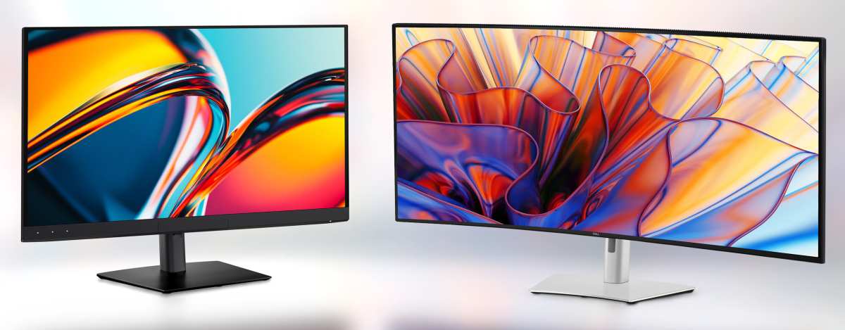
The honest take is that the practical difference for web and UI work is smaller than the price gap suggests. If your final output lives on screens and your color space is sRGB, a well-calibrated budget IPS panel will get you 90% of the way there. The last 10% matters for print professionals and brand agencies, but it's overkill for most digital design work.
Who Can Get Away With a Budget Monitor
Not everyone needs a professional display, and pretending otherwise is just wasteful. If you fit into one of these categories, a budget IPS panel will serve you well.
Design students and learners. If you're studying design at university or working through online courses, your priority is learning the software, principles, and workflow. A $250 IPS monitor with good sRGB coverage teaches you everything you need without locking you into a massive investment. You can upgrade later when professional work justifies the expense.
Social media and content creators. Instagram posts, YouTube thumbnails, TikTok graphics, and blog images are all consumed on sRGB screens. Your audience is viewing your work on phones, tablets, and laptops, not calibrated reference monitors. A budget monitor that covers sRGB accurately is more than enough.
Freelancers doing primarily web and UI design. Websites, apps, and digital products are built in sRGB. If your deliverables are Figma files, PNGs, and web assets, you don't need Adobe RGB or DCI-P3. You need a screen that shows sRGB colors accurately and gives you enough workspace, which a 27-inch 1440p budget IPS panel does perfectly.
Hobbyists and part-time designers. If design isn't your primary income and you're creating for personal projects, a professional monitor doesn't make financial sense. Spend the savings on software, education, or a better input device like a drawing tablet.
Remote designers with a secondary screen. If you already have a calibrated laptop screen or a small professional display, a budget monitor makes a great secondary screen for tool palettes, reference images, or communication apps.
Who Should Spend More
There are situations where a budget monitor genuinely isn't enough, and trying to make one work will cost you more in time and frustration than buying the right display.
Print designers. If your work goes to commercial printers, you need to see how colors translate to CMYK. That requires Adobe RGB coverage and hardware calibration so you can preview accurately before press. A budget monitor simply can't show you enough of the printable color space.
Brand and identity designers. When you're specifying Pantone colors and creating brand guidelines that need to reproduce accurately across business cards, signage, packaging, and digital media, consistency is everything. A professional monitor with hardware calibration and wide gamut coverage isn't optional for this work.
Photographers editing for print or portfolio. Print reproduction demands precision in shadow detail, highlight rolloff, and color accuracy that a budget panel struggles with. The lack of 10-bit depth can hide clipping in gradients that would show up on a professional display.
Video editors and colorists. DCI-P3 and Rec. 2020 coverage are essential for video work. Most budget monitors barely cover sRGB, let alone cinema gamuts. This is one category where the professional premium is non-negotiable.
Teams delivering to clients. If multiple designers are working on the same project, everyone needs consistent color. Mixing budget and professional panels in a workflow introduces variables that are hard to manage. Standardizing on professional displays eliminates that inconsistency.
The key question to ask yourself is whether color accuracy directly impacts your deliverables. If you're creating content that lives and dies by color fidelity, invest in a professional monitor. If your work is digital-first and consumed primarily on sRGB screens, a budget panel will serve you well.
How to Make a Budget Monitor Work Harder for Design
If you've already got a budget monitor or you're set on buying one, there are concrete steps to get the best possible color performance from it.
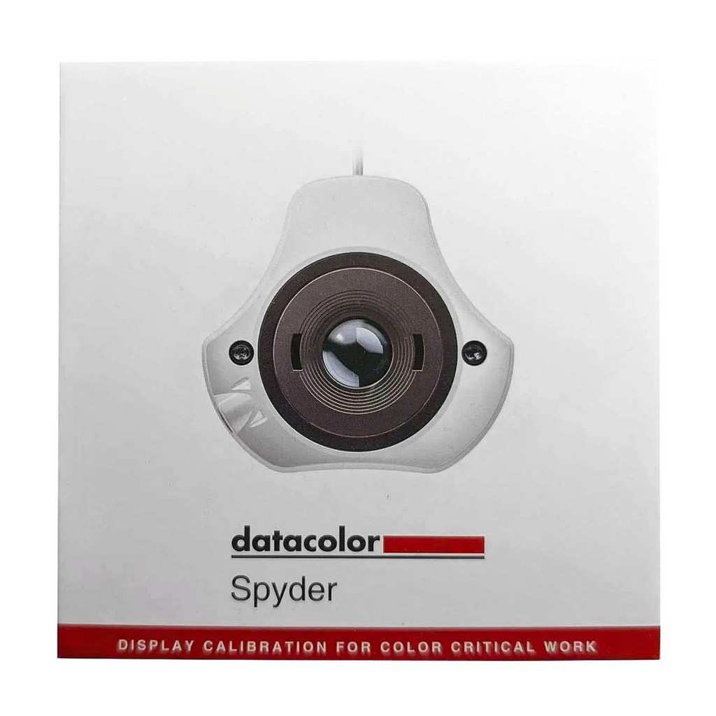
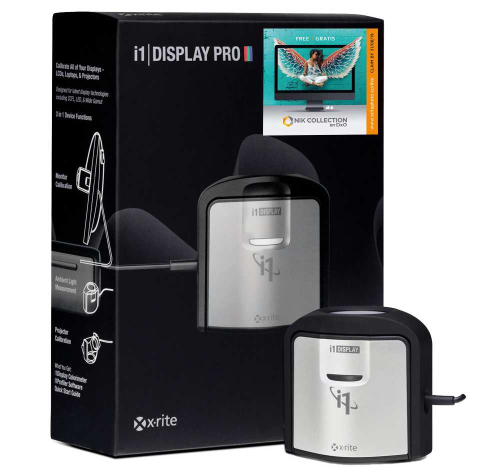
Calibrate with a colorimeter. This is the single most impactful step. A device like the X-Rite i1Display Pro or Datacolor SpyderX measures your panel's actual output and creates a correction profile. For around $150-$250, it can bring a budget monitor's color accuracy much closer to professional levels.
Software calibration through your operating system's built-in tools can help, but a hardware colorimeter is far more accurate.
Let the monitor warm up. Budget panels can shift color and brightness during the first 30-60 minutes of use. Turn your monitor on and let it stabilize before doing color-critical work. This also applies to calibration, always profile a warmed-up display.
Adjust your room lighting. Ambient light affects how you perceive screen color. Working in a dark room or under inconsistent lighting makes even a great monitor look off. Aim for neutral, diffused lighting around 5000K to 6500K.
Position your monitor to avoid glare from windows or overhead lights.
Set the correct white point. Most design work targets D65, which is 6500K. Many budget monitors ship with a cooler default around 7000K or higher, which makes whites look bluish. Check your monitor's OSD settings and adjust the color temperature to 6500K before calibrating.
Use the right input. DisplayPort generally provides more reliable color depth and refresh rate handling than HDMI on budget monitors. Some budget panels only support full chroma at certain resolutions over specific ports. Check your manual to confirm you're using the best connection.
Test with known references. Pull up images with familiar skin tones, neutral grays, and saturated colors. If skin looks too pink or too yellow, something is off. There are free online test patterns for checking gamma, contrast, and color accuracy.
Use them regularly, especially after driver updates or system changes.
Recalibrate regularly. Panels drift over time. A budget monitor might need recalibration every 2-4 weeks. Professional monitors with hardware calibration are more stable, but budget panels benefit from more frequent profiling.
Common Mistakes People Make With Cheap Design Monitors
The biggest mistake is trusting the box specs without verifying. A monitor that claims 99% sRGB might only achieve that in a specific picture mode that cranks up saturation and ruins accuracy. Always check independent reviews that measure actual performance.
Ignoring the stand is another common error. A wobbly, non-adjustable stand forces you into a bad viewing angle, which shifts colors even on IPS panels. Budget around $30 for a VESA monitor arm if your display doesn't come with a decent stand.
Skipping calibration entirely is the most damaging choice. Out of the box, most budget monitors run too cool and too bright. Without profiling, you're editing based on inaccurate colors, and your work will look wrong on every other screen.
Realistic Budget Monitor Picks for Design Work
Look for 27-inch 1440p IPS panels with confirmed 99% sRGB coverage and factory calibration reports. Models from Dell's S-series, ASUS ProArt's entry-level options, and BenQ's GW series consistently test well in independent reviews. Avoid anything that only lists gamut volume without specifying coverage.
The Final Call: Should You Buy a Budget Monitor for Graphic Design?
Yes, if your work is digital-first and you're willing to calibrate. A good budget IPS panel handles web design, UI work, and social media content without issue. No, if you're doing print production or brand-critical color work.
In that case, save up for a professional display with hardware calibration and wide gamut support.
Frequently Asked Questions
Can I do professional graphic design on a budget monitor?
You can for digital work like web and UI design. For print or brand-critical color work, a professional monitor is the safer choice.
Is IPS necessary for graphic design?
Yes. IPS panels provide the color stability and viewing angles that TN and VA panels can't match for design work.
Do I need 4K for graphic design?
No. 1440p at 27 inches gives you sharp text and enough workspace. 4K is nice but not required, and it demands more from your system.
How important is monitor calibration for design work?
Very important. Even a great monitor drifts over time. A colorimeter pays for itself quickly by ensuring your colors stay accurate.
What is a good Delta E for graphic design?
Under 3 is acceptable for most work. Under 2 is the professional standard. Most budget monitors can hit under 3 with calibration.
Is a refurbished professional monitor better than a new budget monitor?
Often, yes. A used professional display from a reputable brand typically offers better calibration, build quality, and color accuracy than a new budget panel at the same price.

Similar Posts