Why Your Photos Look Wrong Without a Color Accurate Monitor
You've spent hours editing a portrait. The skin tones look perfect. The shadows have just the right depth.
You send the file to the lab, wait a few days, and open the box to find… something else entirely. The print is too warm. The greens are muddy.
Your client's shirt is a completely different shade.
That disconnect between what you see on screen and what comes out of the printer is the single most expensive problem in digital photography. And the root cause is almost always the monitor. That's exactly why do photographers need color accurate monitors, because everything downstream of your display inherits its mistakes.
As of 2026, the standard for professional color work is Delta E ≤ 2, a measurement of color difference defined by the International Commission on Illumination (CIE). If your monitor can't hold that tolerance, neither can your reputation.
Let's break down what "color accurate" actually means, how to achieve it, and why guessing is a losing game.
Quick Answer
Photographers need color accurate monitors because a wrong display produces wrong prints. The human eye adapts to color shifts. A monitor does not lie on its own.
But it will lie consistently until you calibrate it. Color accuracy removes the guesswork from editing. It ensures your prints match your screen.
And it protects your income from costly reprints.
The Real Cost of an Uncalibrated Monitor – Prints, Clients, and Credibility
Let's put hard numbers on this. A standard 8×10 print from a pro lab runs roughly $3 to $8 depending on paper and finishing. A single reprint due to color mismatch costs you that money plus shipping.
If you're printing twenty proofs for a wedding album and half come back wrong, you've thrown away $60 to $160 in materials alone. Over a year of regular client work, that adds up fast.
But the real loss isn't ink and paper. It's trust.
Clients don't care about color spaces or calibration schedules. They care that the print on their wall matches the photo they approved on your screen. When it doesn't, they start questioning everything.
Your editing skill. Your professionalism. Your rates.
One bad batch of prints can sour an entire client relationship. And in the wedding and portrait world, referrals are everything.
There's also a subtler cost: your own editing confidence. If you're constantly second-guessing whether your monitor is telling the truth, you waste time toggling between proofing tools, uploading test files, and making "fixes" that only make things worse. A calibrated, color-accurate monitor removes that noise.
You see the real image from the start.
For commercial and product photographers, the stakes are even higher. A brand's signature red or a specific Pantone color isn't negotiable. If your monitor shows it differently than the physical product, the client will reject the entire delivery.
Large e-commerce catalogs and advertising campaigns involve thousands of images. Each one needs to match the reference. Without color accuracy, you're flying blind.
What Actually Makes a Monitor “Color Accurate”? (Panel, Gamut, Bit Depth, Delta E)
Color accuracy isn't one thing. It's a combination of several hardware and engineering factors that work together. Let's look at each one in plain language.
Panel Type: Why IPS Matters
Not all LCD panels are created equal. TN (twisted nematic) panels are fast and cheap but have terrible viewing angles. VA (vertical alignment) panels offer better contrast but shift color when you move your head.
For photo editing, IPS (in-plane switching) is the standard. IPS panels maintain consistent color and brightness across the entire viewing area. Move two inches to the left and the image stays the same.
That consistency is non-negotiable for evaluating skin tones, gradients, and shadow detail.
Color Gamut: The Range Your Monitor Can Show
Color gamut describes the range of colors a monitor can display. The most common gamuts in photography are:
| Gamut | Coverage (Target) | Best For |
|---|---|---|
| sRGB | 99-100% | Web, social media, consumer prints |
| Adobe RGB | 90-99% | Print workflow, commercial work, wide-gamut editing |
| DCI-P3 | 90-99% | Video, HDR, some print workflows |
| ProPhoto RGB | Limited on monitors | 16-bit editing (theoretical, rarely practical on screen) |
A monitor that covers 99% of Adobe RGB will show colors that a standard sRGB monitor simply can't render. That matters when you're editing for print. But here's the catch: if you edit in Adobe RGB and export to sRGB without soft proofing, you'll crush saturation in conversion.
The wide gamut is only useful if you manage it properly.
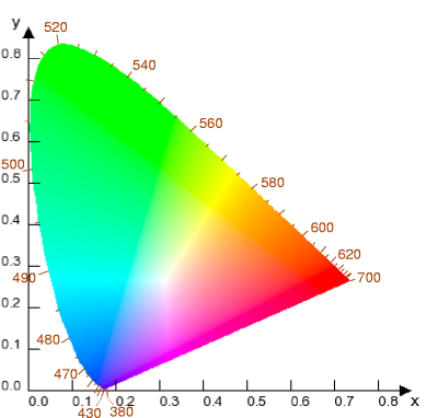
Image source: Wikimedia Commons / User:Shizhao
The diagram above shows the visible color spectrum as defined by the CIE. The triangle inside represents what your monitor can display. A larger triangle (wider gamut) means more of those real-world colors are available for editing.
Bit Depth: How Smooth the Transitions Look
Bit depth determines how many distinct shades your monitor can produce. An 8-bit panel can show 256 shades per channel (red, green, blue), which totals about 16.7 million colors. That sounds like a lot, but it's not enough for smooth gradients in subtle areas like skies or skin.
You'll see banding, visible steps where color shifts abruptly.
A 10-bit panel can show 1,024 shades per channel, totaling over a billion colors. That's enough for completely smooth transitions. Many monitors marketed as "8-bit + FRC" use frame rate control to simulate 10-bit.
It works reasonably well, but true 10-bit panels are still the gold standard for critical color work.
Delta E: The Number That Measures Error
Delta E (ΔE) is a single number that quantifies the difference between the color your monitor shows and the color it should show. Aggregate reviews and manufacturer specs report this value. The lower, the better.
- ΔE < 2: Good for most professional work.
- ΔE < 1: Excellent, required for fine art and product matching.
- ΔE > 3: Noticeable to most viewers, unacceptable for client work.
Factory calibration reports from brands like EIZO, BenQ, and NEC state Delta E values for each unit. Don't buy a monitor that doesn't come with a printed calibration report. It's your first assurance that the display left the factory in reasonable shape.
Hardware Calibration vs Software Calibration – Which One Do You Really Need?
This is one of the most misunderstood topics in color management. The difference is simple: where the calibration LUT (look-up table) lives.
Software Calibration (GPU LUT)
When you calibrate with a colorimeter and software like DisplayCAL or SpyderX, the calibration data lives in your graphics card's LUT. It modifies the signal before it reaches the monitor. The catch is that your GPU only holds one LUT at a time.
Plug in a second monitor and you can't independently calibrate both. Switch to a different computer and the profile is gone. Also, software calibration can clip the signal if you push it too hard, losing subtle highlight or shadow detail.
Best for: Beginners, single-monitor setups, photographers who don't move their display between machines.
Hardware Calibration (Monitor Internal LUT)
Higher-end monitors include a dedicated LUT chip that stores the calibration directly in the display's firmware. You run the calibration software once, and the profile stays in the monitor forever. Plug it into a different computer, the calibration stays.
Use it with a laptop dock, the calibration stays. The monitor processes the color internally, so the graphics card sends a clean, unmodified signal.
Best for: Professionals who work across multiple systems, retouchers who need consistent color on different machines, and anyone who wants one less variable in their workflow.
Which One Is Right for You?
Ask yourself these questions:
- Do you use a single desktop computer? Software calibration works fine.
- Do you switch between a laptop and desktop? Hardware calibration saves headaches.
- Do you ever need to show color on a second monitor during editing? Hardware calibration allows independent profiles.
- Is your monitor's internal LUT 14‑bit or higher? Look for "hardware LUT" in the specs. If it's not listed, you're getting software calibration.
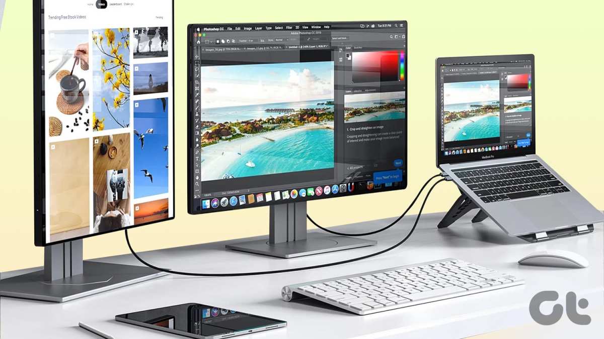
If you're just starting out, a good colorimeter with software calibration is a massive improvement over no calibration at all. But as your work scales, hardware calibration becomes the logical next step. Many photographer editing workflows also involve an extra display for palettes and previews; if you've ever wondered about the practicality of a wider workspace, you might want to look into the pros and cons of using a single large curved display.
How to Set Up a Color-Managed Workflow from Camera to Monitor to Print
A color-accurate monitor is the centerpiece, but it's only one link in the chain. Here's the full workflow step by step.
Step 1: Shoot with a Color Reference
Include a color checker (like the X‑Rite ColorChecker Passport) in the first frame of every new lighting setup. This gives you a known target for white balance and exposure in post‑processing. It also helps you confirm later that your monitor is showing you what the camera actually captured.
Step 2: Calibrate Your Monitor
Let the monitor warm up for at least 30 minutes before calibration. Set your ambient lighting to D65 (roughly 6500K), a neutral daylight spectrum. Run your calibration software using the following targets:
- White point: D65
- Gamma: 2.2
- Luminance: 120 cd/m² (or 200 cd/m² if your room is bright)
Aim for a Delta E under 2 across the board. Save the profile and name it by date.
Step 3: Assign the Correct Color Space
In Lightroom Classic, set your working color space to Adobe RGB (or ProPhoto RGB for maximum latitude). In Photoshop, the same. This gives your editing a wide canvas.
But export everything for web in sRGB. For print, export in the color space your lab specifies (usually Adobe RGB or sRGB).
Step 4: Soft Proof Before You Print
Never send a file to the printer without soft proofing. In Lightroom or Photoshop, enable the "Proof Colors" feature and select the ICC profile for your specific paper and printer. This shows you a rough preview of how the image will look on that medium.
Adjust saturation, contrast, and brightness in this mode. What looks punchy on a bright monitor may look flat on matte paper.
Step 5: Validate with a Test Print
Print a small reference file that came with your calibration tool (or a controlled image with known colors like skin tones, grass, and sky). Compare it to your soft proof under the same lighting. If they match, you're good to go.
If not, double-check your printer profile and monitor luminance.
For the best results, keep a consistent viewing environment. Dimmable D65 bulbs and neutral gray walls help your eyes stay adapted to a known baseline. If you're someone who likes to keep multiple screens side by side, pay attention to uniformity differences.
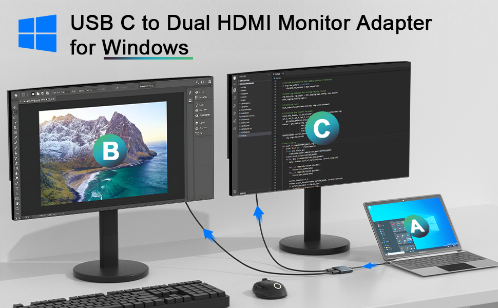
Some users prefer a single ultrawide screen instead of a dual monitor setup to reduce variance.
Common Calibration Mistakes That Ruin Your Results (and How to Avoid Them)
Even with a good monitor and a capable colorimeter, small errors during calibration can punch a hole in your entire workflow. Here are the most frequent ones we see in aggregate user reports.
Skipping the Warm-Up Period
Cold displays drift. The backlight needs time to stabilise. If you calibrate a monitor that has been on for only five minutes, the profile will be wrong an hour later.
Let your monitor warm up for a minimum of 30 minutes. Some professional units from EIZO and BenQ have a built-in timer that warns you when the display is ready. Don't ignore it.
Calibrating in the Wrong Ambient Light
Your eyes and your colorimeter both react to the room you're in. Calibrating under warm incandescent bulbs will shift your white point toward yellow. Calibrating next to a sunny window will introduce a blue bias.
Set up your workspace with neutral D65 lighting. Close the blinds. Turn off overhead lights that aren't colour matched.
A monitor hood helps block stray reflections.
Using the Wrong Luminance Target
A common mistake is setting the monitor to its maximum brightness. That looks punchy on the showroom floor, but it ruins print matching. Most professional workflows target 120 cd/m².
If your room is very bright, you might go up to 160 cd/m². If you're editing in a dim studio, 100 cd/m² works better. Stick to one value and note it in your calibration report.
Relying on a Single Calibration Profile Forever
Monitors drift over time. The backlight ages. The colour filters degrade.
A calibration from six months ago is no longer accurate. Recalibrate at least once a month for critical commercial work. For general portrait and wedding work, every two to three months is safer than pushing to six.
Mark the date on your calendar.
Forgetting to Recalibrate After Moving the Monitor
Even a slight shift in position changes how light hits the screen. If you transport your monitor to a client site or a second studio, recalibrate it when you set it up again. The internal LUT from hardware calibration survives, but the ambient environment has changed.
Run a full calibration, not just a quick verification.
Best Monitors for Photo Editing – What to Look For at Different Budget Levels
You don't need to spend $3,000 to get good colour accuracy. But you do need to know which corners you can afford to cut and which ones will cost you later.
Entry Level (0 to 0)
At this price, you're looking at high-sRGB coverage monitors with decent factory calibration. Look for 99% sRGB, an IPS panel, and a ΔE ≤ 3 out of the box. These monitors typically use software calibration only.
They won't have hardware LUT, but they will give you a much better baseline than a gaming or office display. Brands like Dell UltraSharp and ASUS ProArt offer solid options in this range. You'll need to calibrate them yourself with a separate colorimeter.
Mid Range (0 to ,500)
Here you start seeing hardware calibration, wider gamuts, and factory Delta E reports. Aim for 99% Adobe RGB or DCI-P3 coverage. Native 10-bit panels appear at the higher end of this bracket.
BenQ's PhotoVue series and ASUS ProArt PA series both offer models with hardware LUT at around $1,000. These are the sweet spot for most working photographers who need consistent prints without selling a kidney.
High End (,500 to ,500+)
This is the zone where EIZO ColorEdge and NEC SpectraView live. You get full hardware LUT calibration, built-in uniformity compensation, and 10‑bit panels with factory Delta E < 1. Some models include a self-calibration sensor that adjusts automatically.
If you do fine art printing or commercial product work, this is where you belong. The price stings, but the consistency removes one more variable from your workflow.
What to Avoid
- Gaming monitors with high refresh rates. They prioritise speed over accuracy.
- TN panels with poor viewing angles.
- Very wide gamut monitors without sRGB emulation, they can oversaturate sRGB content if you don't know how to manage colour spaces.
Calibration Tools: Colorimeter vs Spectrophotometer – When to Spend More
A colorimeter measures colour through three colour filters (red, green, blue). It's fast, affordable, and accurate enough for calibrating monitors. A spectrophotometer measures the full light spectrum.
It's more precise and can also measure printed output and ambient light.
Colorimeter (SpyderX, i1 Display Pro)
- Price: $150 to $300
- Best for: Monitor calibration only.
- Accuracy: Excellent for modern monitors. Drift can occur over 2, 3 years.
- Speed: 1 to 2 minutes for a full calibration.
If you are strictly editing on a single monitor and never print your own work, a colorimeter is all you need. Most photographers fall into this category.
Spectrophotometer (i1Studio, i1 Pro 3)
- Price: $300 to $1,500
- Best for: Monitor calibration + printer profiling + light measurement.
- Accuracy: Higher, with less drift over time.
- Speed: 3 to 5 minutes for a full calibration.
If you print your own images and want to build custom printer profiles for specific paper stocks, a spectrophotometer pays for itself in saved ink and paper. It also handles uneven monitor technology better, like OLED panels.
Which One Should You Buy?
If you only need one device and you send your files to a lab, get a colorimeter. If you are a fine art or hybrid photographer who prints at home, a spectrophotometer is worth the extra cost. You can also rent a spectrophotometer for a week if you only need to build printer profiles once a year.
Soft Proofing: How to Predict Your Final Print Without Wasting Paper or Ink
Soft proofing is the process of simulating how your image will look on a specific printer and paper combination, right on your monitor. It's the single most effective technique for avoiding bad prints.
How to Enable Soft Proofing
In Adobe Lightroom Classic, open the Develop module and press the "S" key. This opens the soft proofing panel. Check the box titled "Soft Proofing." Then select the ICC profile that matches your paper and printer.
Your monitor will show a preview that accounts for the paper's whiteness and the printer's gamut.
In Photoshop, go to View > Proof Setup > Custom. Select your printer profile and choose "Relative Colorimetric" as the rendering intent. Check "Simulate Paper Color" and "Simulate Black Ink." The image will look flatter.
That's expected. Paper can't match a backlit screen.
What to Adjust in Soft Proof Mode
- Brightness: Reduce highlights that clip on paper.
- Saturation: Desaturate colours that fall outside the printer's gamut.
- Contrast: Increase microcontrast to compensate for the paper's lower dynamic range.
Make these adjustments while soft proofing is active. Don't switch back and forth. The changes you make in this mode apply to a separate "proof" version of the file.
Your original RGB image stays untouched.
The Test Print Method
After soft proofing, export a small reference image, something with skin tones, grass, sky, and a neutral grey. Print it on the actual paper you plan to use. Compare it to your soft proof under D65 lighting.
If they match, you're ready to print your full job. If not, revisit your monitor calibration or your printer profile selection.
When and How Often to Re-Calibrate (Plus Long-Term Monitor Maintenance)
Calibration is not a one‑and‑done task. Monitors drift physically and electrically. The rate of drift depends on the monitor's age, usage hours, and build quality.
Recommended Re-Calibration Schedule
| Work Type | Frequency | Notes |
|---|---|---|
| Fine art / commercial | Every 2 to 4 weeks | Critical colour consistency |
| Wedding / portrait | Every 4 to 6 weeks | Good enough for client delivery |
| Enthusiast / hobbyist | Every 3 to 6 months | Better than no calibration |
| After moving the monitor | Immediately | Environment changes matter |
Signs You Need to Re-Calibrate Sooner
- Prints start to look noticeably different from previous batches.
- Your monitor's white point looks off compared to a known reference (like a phone set to D65).
- You notice a colour cast in neutral grey areas.
- Your calibration software reports a Delta E above 2 during verification.
Long-Term Monitor Maintenance
- Clean the screen with a microfiber cloth and a mild solution of distilled water. Harsh chemicals can damage the anti-glare coating.
- Monitor the backlight hours. Some professional monitors display total usage hours. After 10,000 to 15,000 hours, the backlight may dim unevenly. At that point, a full calibration can only compensate so far.
- Keep the monitor in a stable environment. Humidity and extreme temperatures accelerate drift. Avoid placing it near air conditioning vents or radiators.
- Use a monitor hood to block ambient light. It reduces the need for frequent re‑calibration caused by changing daylight.
- Run a verification check monthly, even if you don't do a full calibration. Most calibration software can quickly check whether your current profile still holds within Delta E tolerance.
Final Checklist for Professional Color Accuracy – What Every Photographer Should Do
- Calibrate monthly for commercial work, quarterly for everything else.
- Warm up your monitor for 30 minutes before every calibration session.
- Use a colorimeter if you send files to a lab. Use a spectrophotometer if you print at home.
- Soft proof every job before exporting for print. Adjust brightness, saturation, and contrast in proof mode.
- Store your calibration profile with a dated filename. Keep a backup on a second drive.
- Verify your profile with a quick Delta E check each month. If it exceeds 2, recalibrate immediately.
- Control your lighting with D65 bulbs, neutral walls, and a monitor hood.
- Don't skip recalibration after moving your monitor or changing your workspace.
- Invest in hardware calibration when your workflow crosses multiple computers or requires absolute consistency.
Frequently Asked Questions
Can I use a gaming monitor for photo editing?
Gaming monitors prioritise refresh rate and response time over colour accuracy. Most use TN or VA panels with poor viewing angles and limited gamut. You can edit on one, but you will not get reliable prints without frequent calibration and compromise.
How much should I spend on a colorimeter?
A good colorimeter costs between $150 and $300. The SpyderX Pro and i1 Display Pro are the standard choices for most photographers. Spending more on a spectrophotometer only makes sense if you also profile your own printer.
Do I need a 10‑bit monitor for photography?
A 10‑bit panel eliminates banding in smooth gradients like skies and skin. 8‑bit + FRC (frame rate control) is acceptable for most work. True 10‑bit is worth the upgrade if you edit fine art prints or commercial product shots with subtle tones.
How long does a monitor calibration last?
Monitors drift continuously. A calibration profile stays reliable for about 2 to 4 weeks for critical work. For general use, recalibrate every 2 to 3 months.
The backlight and colour filters age, so even a perfect profile loses accuracy over time.
Can I calibrate a laptop screen?
Yes, but laptop screens are harder to calibrate well. They often have limited gamut, uneven backlighting, and glass coatings that create reflections. An external monitor is always a better choice for colour‑critical work.
If you must use a laptop, a colorimeter is still better than nothing.
Similar Posts