What Brightness Setting Is Ideal for Editing Rooms
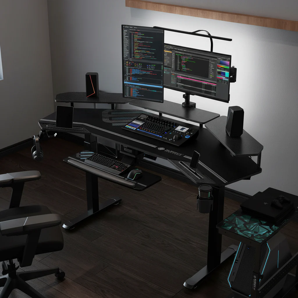
When you're trying to figure out what brightness setting is ideal for editing rooms, it's easy to get lost in technical jargon. Many people simply crank up their monitor's brightness, thinking "brighter is better." However, for critical work like photo retouching or video color grading, this can actually be detrimental. Getting it wrong leads to inaccurate color decisions and serious eye fatigue.
The true "ideal" isn't a single, universal number. It’s a carefully considered balance tailored to your specific environment and workflow. For instance, the Society of Motion Picture and Television Engineers (SMPTE) recommends specific luminance targets for professional video monitoring.
We're going to walk through how to find your perfect brightness sweet spot, ensuring your work looks right everywhere.
Quick Answer: Your Brightness Target Depends
The ideal brightness for an editing monitor usually falls between 80 and 120 nits (cd/m²). This range ensures accurate color perception. It also helps reduce eye strain.
Your specific target hinges on ambient room light. Calibration is always essential for consistency.
Why Editing Room Brightness Matters More Than You Think
Getting your editing room's brightness right is more than just a preference; it’s fundamental to both your health and your work quality. Think of your monitor as the window to your creative output. If that window is dirty or incorrectly lit, everything you see through it will be skewed.
This impacts everything from subtle color shifts to overall contrast.
The Impact on Your Eyes: Strain and Fatigue
Working for hours in front of a screen with incorrect brightness can wreak havoc on your eyes. If your monitor is too bright compared to your room, your eyes constantly struggle to adapt. This leads to symptoms like dry eyes, blurred vision, headaches, and general eye strain.
Over time, it can even contribute to chronic discomfort. Maintaining a balanced viewing environment helps reduce this stress significantly.
The Impact on Your Work: Color Accuracy and Consistency
This is where the rubber meets the road for professionals. If your display brightness is off, your perception of colors, tones, and contrast becomes unreliable. You might brighten an image too much because your monitor feels dim, or crush shadows because your screen is overly vibrant.
This leads to inconsistent results across different screens and devices. Your carefully graded footage could look washed out or overly dark when viewed by others. A correctly calibrated and brightness-matched setup ensures your creative decisions translate accurately to the final output.
Understanding the Key Factors That Influence Your "Ideal" Setting
Finding your perfect brightness setting isn't about guessing. It's about understanding the key variables at play and how they interact. We'll look at three main areas that dictate what's "ideal" for you.
These factors create a unique set of conditions in your personal editing space.
Your Monitor's Capabilities and Calibration
Not all monitors are created equal, and their inherent capabilities play a huge role. Professional reference monitors offer far greater color accuracy and brightness uniformity than consumer-grade displays. Regardless of your monitor type, calibration is non-negotiable.
This process ensures your monitor accurately displays colors, gamma, and most importantly, luminance. Without calibration, any brightness setting you choose is just a shot in the dark.

The Ambient Light in Your Room: Friend or Foe?
The light surrounding your monitor, known as ambient light, significantly influences how you perceive your screen. A bright window behind you can cause glare, while dim room lighting can make your monitor appear excessively bright. The goal is to have controlled, consistent ambient light that is neutral in color and dimmer than your monitor's output.
This minimizes distractions and prevents your eyes from constantly readjusting. Even the color of your walls can impact this. Neutral gray walls are often recommended for professional editing environments to avoid color casts.
What Kind of Content Are You Editing? (SDR vs. HDR)
The type of content you're creating also drives your ideal brightness setting. Standard Dynamic Range (SDR) content, which covers most web video and traditional broadcast, has a much lower luminance target. High Dynamic Range (HDR) content, on the other hand, utilizes a wider range of brightness and typically requires a much brighter display for monitoring.
Mixing these up will lead to wildly inaccurate results. As of 2026, the adoption of HDR for consumer content continues to grow, making this distinction even more critical.
Deciding Your SDR Monitor Luminance Target: A Step-by-Step Approach
Let's get practical. For most SDR (Standard Dynamic Range) editing, there’s a commonly accepted range for monitor luminance. However, arriving at your specific number requires a systematic process.
This isn't just about punching a number into your monitor's settings. It's about understanding your environment and tools.
Step 1: Assess Your Room's Ambient Light Level
Before you even touch your monitor, look at your room. Is there natural light streaming in? Are your overhead lights bright or dim?
Ideally, your editing space should have controlled, dim, and color-neutral ambient light. A good rule of thumb is that the ambient light should be roughly 10% to 20% of your monitor's target brightness. For instance, if your monitor target is 100 nits, your room should be around 10-20 lux.
You can measure this with an inexpensive lux meter, or a colorimeter often includes a light-measuring function.
Step 2: Consider Your Monitor's Native Brightness and Contrast
Your monitor’s maximum brightness and its native contrast ratio matter. While you'll calibrate to a specific target, a monitor that struggles to achieve that brightness, or one with poor contrast, will always be a limiting factor. A good editing monitor should be able to comfortably hit your target luminance without sacrificing black levels or causing image clipping.
Check your manufacturer specifications; professional displays like those from EIZO or Flanders Scientific typically offer excellent control over these parameters.
Step 3: Choose Your White Point and Gamma
These are crucial calibration settings that work hand-in-hand with brightness.
- White Point: This defines the "color" of white on your screen. For most video and photo editing, D65 (6500K) is the standard. This matches natural daylight and common broadcast standards like Rec. 709. For print work, D50 (5000K) is often preferred.
- Gamma: This determines how tones transition from black to white. For SDR video and web content, Gamma 2.2 is the general standard. Broadcast workflows sometimes use Gamma 2.4, which creates a slightly darker, more contrast-rich image. You need to know what your final output standard is to set this correctly.
Step 4: Calibrate Your Display to the Target Luminance
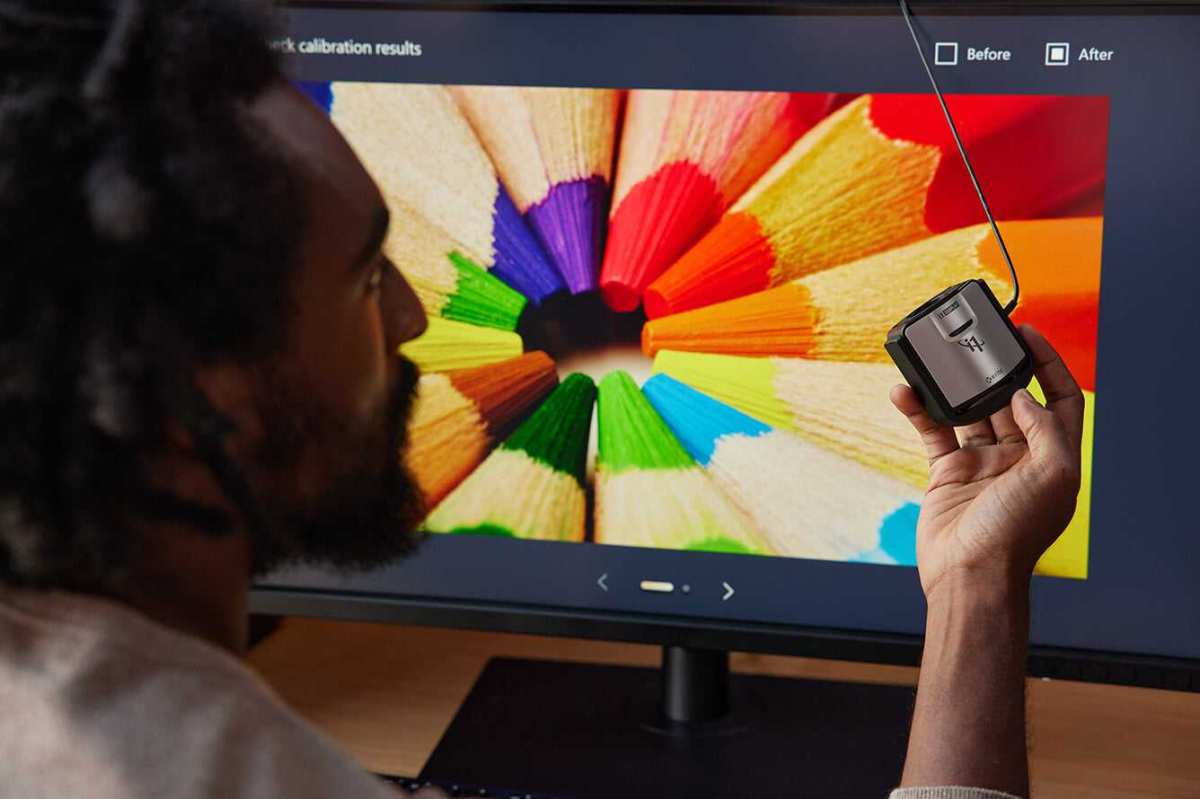
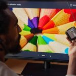
This is where you use a hardware calibration device, like a colorimeter or spectrophotometer. This device measures your screen's output and creates a profile that corrects any inaccuracies. During the calibration process, you'll specify your target luminance.
For most SDR work, this is usually between 80-120 nits (cd/m²). Many professionals target 100 nits as a balanced starting point. The calibrator software will guide you through adjustments.

Specific Luminance Targets for Common Editing Tasks
Knowing what you're working on helps narrow down your target brightness. Different deliverables have different standards, and aligning your monitor with these standards is critical for accurate work.
General Video and Photo Editing (SDR)
For everyday SDR video and photo editing, where your content is destined for platforms like YouTube, Vimeo, or general web use, a luminance target between 80 and 120 nits (cd/m²) is widely recommended. Many pros settle on 100 nits (cd/m²) as a sweet spot. This provides enough brightness to see detail without causing excessive eye strain or making your work look overly dark when viewed on consumer devices.
It's a versatile target that balances accuracy with comfortable viewing.
Broadcast and Web Deliverables (SDR)
If you're delivering content for television broadcast, standards become much more rigid. For Rec. 709 HD broadcast, a target of 100 nits (cd/m²) at a D65 white point and Gamma 2.4 is a common requirement in many regions. The European Broadcasting Union (EBU) and SMPTE provide detailed guidelines for these environments.
For web-specific content, 80-100 nits (cd/m²) with D65 and Gamma 2.2 is usually appropriate. Always check the specific delivery requirements for your project.
High Dynamic Range (HDR) Workflows
HDR editing is a different beast entirely. Unlike SDR, which has a relatively low peak brightness, HDR aims for much higher luminance values to show a greater range between the darkest shadows and brightest highlights. For HDR mastering, you'll need a monitor capable of much higher peak brightness, often 500 nits, 1000 nits, or even higher, depending on the HDR standard (e.g., HDR10, Dolby Vision).
You don't always grade at peak brightness, but you'll need the display's capability to monitor those peaks accurately. Dedicated HDR reference monitors are essential here; attempting HDR grading on an SDR monitor is an exercise in futility.
The Role of Ambient Lighting in Your Editing Environment
Your monitor's brightness isn't the only light source that matters. The ambient lighting in your editing room plays an enormous, often overlooked, role in how you perceive your work. An ideal editing room has meticulously controlled lighting to ensure a consistent, neutral viewing experience.
Minimizing External Light Sources
Windows are fantastic for natural light during the day, but they're a nightmare for color grading. Sunlight changes in intensity and color temperature throughout the day, making consistent evaluation impossible. We recommend blocking out all natural light with blackout blinds or heavy curtains.
Overhead room lighting should also be adjustable and as neutral as possible, ideally around D65 (6500K) or D50 (5000K) for print. Avoid fluorescent lights that flicker or have a strong color cast.
The Magic of Bias Lighting for Consistency
Bias lighting is one of the best investments you can make for your editing room. This involves placing a light source directly behind your monitor, illuminating the wall with a soft, neutral light. It shouldn't spill onto the screen itself.
Bias lighting reduces eye strain by decreasing the contrast between your bright monitor and a dark wall. It also helps your pupils remain consistently dilated, improving color perception. Research from the International Organization for Standardization (ISO) often cites the benefits of proper bias lighting in controlled viewing environments.
Wall Color and Room Reflections
Even your wall color matters. Brightly colored walls, especially saturated blues or reds, can reflect light back onto your monitor or into your eyes, subtly shifting your color perception. Neutral gray is the industry standard for editing suites.
It provides a consistent backdrop that doesn't introduce any color casts. If painting isn't an option, consider hanging neutral gray fabric panels behind and beside your monitor.
Mistakes to Avoid When Setting Up Your Editing Space
Even with the best intentions, it's easy to make common errors when optimizing your editing room. These missteps can undermine all your efforts toward color accuracy and eye comfort. We see these issues crop up repeatedly, so it's worth highlighting them.
Too Bright: The Overpowered Monitor
One of the most frequent mistakes is simply setting your monitor too bright. If your display is pushing 200-300 nits for SDR content, your images will appear much darker and less vibrant to others. You'll end up over-brightening your work to compensate, leading to blown-out highlights and an overall flat look when viewed on a correctly calibrated screen.
Remember, your monitor's peak brightness capability isn't necessarily its ideal working brightness.
Too Dim: Crushing Your Blacks
Conversely, a monitor set too dim can also cause significant problems. If your brightness is too low, you might lose subtle detail in the shadows, leading you to artificially lighten them. This can "crush" your blacks, making dark areas look flat and lifeless.
A monitor that's too dim can also exacerbate eye strain if the ambient light is still too bright, forcing your eyes to work harder to perceive detail.
Inconsistent Lighting: The Shifty Reference
An editing room with inconsistent ambient lighting is a moving target for accurate color work. If one side of your room is brighter than the other, or if light levels fluctuate throughout the day, your perception of color and contrast will constantly shift. This inconsistency means you're never truly seeing your work under stable conditions.
This leads to endless adjustments and rework. Make sure every light source is accounted for and controlled.
Skipping Calibration: The Ultimate Sin
This is perhaps the biggest mistake of all. Without regular hardware calibration, your monitor will drift over time. Colors will become less accurate, gamma values will shift, and your luminance might change without you realizing it.
Relying on your eyes alone to judge color is unreliable; human perception is highly subjective and easily fooled by surrounding conditions. A professional hardware calibrator is an essential tool for any serious editor.
Expert Tips for a Harmonious Editing Setup
Beyond the core principles of brightness and calibration, a few expert tips can further refine your editing environment. These small adjustments can make a big difference in both your comfort and your consistency. They are often overlooked but incredibly impactful.
Use a Monitor Hood
A monitor hood is a simple, effective tool that attaches to the top and sides of your display, essentially creating a mini darkroom around your screen. It blocks stray ambient light from hitting the monitor surface, preventing glare and improving perceived contrast. This creates a more controlled and consistent viewing area.
Many professional monitors come with custom-fit hoods, or you can find aftermarket options.

Schedule Regular Calibration Checks
Calibration isn't a one-and-done process. Monitors drift over time due to factors like component aging and temperature changes. We recommend calibrating your primary editing monitor at least once a month, or even more frequently if your work is extremely color-critical.
Maintain a consistent schedule to ensure your display always meets its target luminance and color accuracy. Setting a reminder can help make this a regular habit.
Consider Your Ergonomics and Eye Health
While not directly about brightness, good ergonomics are vital for long editing sessions. Position your monitor at arm's length, with the top of the screen at or slightly below eye level. Take regular breaks, look away from the screen, and focus on distant objects to reduce eye strain.
Proper screen brightness and ambient lighting work together with ergonomic setup to protect your vision. Your long-term health is just as important as your short-term creative accuracy.
Test Your Deliverables on Other Screens
Even with a perfectly calibrated system, it's always smart to perform a "sanity check." View your finished work on a few different consumer devices: a smartphone, a tablet, a laptop, and a consumer TV. This doesn't mean you should edit to make it look good everywhere, but it provides valuable insight into how the average person will see your content. This step helps catch any major discrepancies that might have been missed in your controlled environment.
You might be surprised by what you find.
FAQs About Editing Room Brightness
What is a good starting point for monitor brightness?
A good starting point for SDR monitor brightness is 100 nits (cd/m²). This is a widely accepted target for general video and photo editing. However, you'll need to calibrate your monitor and assess your ambient light to fine-tune this.
How often should I calibrate my editing monitor?
You should calibrate your editing monitor at least once a month. For highly color-critical work, a weekly calibration might be beneficial. Monitors drift over time, so regular checks ensure continued accuracy.
Can too much monitor brightness cause eye strain?
Yes, too much monitor brightness is a major cause of eye strain. If your screen is significantly brighter than your surrounding environment, your eyes constantly struggle to adjust. This leads to fatigue, dryness, and headaches.
Is bias lighting really necessary for an editing room?
Bias lighting isn't strictly "necessary," but it's highly recommended. It significantly reduces eye strain and improves color perception by providing a consistent, neutral light behind your display. This helps your eyes adapt to the screen's brightness more comfortably.
Should my editing room be completely dark?
Your editing room doesn't need to be completely dark, but it should be dim and controlled. Eliminate direct light sources and reflections. A small amount of neutral ambient light, ideally with bias lighting, creates a more comfortable and accurate viewing environment than total darkness.
Your Decision Guide: Finding Your Personal Brightness Sweet Spot
Finding the truly ideal brightness setting for your editing room is a personalized journey, not a fixed destination. It’s about creating a harmonious environment where your eyes are comfortable and your creative decisions are accurate. You’ll need to combine your monitor’s capabilities with your room's conditions.
Remember, the goal is consistency. Once you've set your monitor's luminance, chosen your white point and gamma, and managed your ambient light, stick with it. Regular calibration and a disciplined approach will ensure your work looks just as you intended, every single time.
By following these steps, you'll build an editing environment that supports your vision and protects your eyes.

Similar Posts