How to Choose a Monitor for Photo Retouching
If you're wondering how to choose a monitor for photo retouching, you're not alone. It's one of the most common questions photographers ask once they realize their current screen isn't showing them the truth. The answer matters more than you might think.
Per ISO 3664:2009, the viewing standard for color evaluation, a monitor should hit a minimum of 160 cd/m² brightness and a D65 white point. Most consumer displays don't come close out of the box. That's why understanding the specs that actually matter is the first step toward a monitor that works for you, not against you.
Quick Answer
Look for an IPS panel with 99% sRGB or better. Prioritize hardware calibration support. Choose a 27-inch 4K display for most retouching work.
Aim for a Delta E under 2. Skip gaming monitors with high refresh rates.
Why Comparing Photo Monitors Matters More Than You Think
Most people assume a higher price means better color accuracy. That's not how it works. The real value comes from matching the monitor's strengths to your specific workflow.
A gaming monitor with a 240 Hz refresh rate looks fast, but it won't help you match skin tones. A professional photo monitor with a 60 Hz panel will.
The key specs to compare are panel type, color gamut coverage, bit depth, and calibration support. These four factors determine whether your edits translate to print or screen correctly. Get them right, and you'll save hours of rework.
Get them wrong, and you'll be chasing colors that don't exist.
As of 2026, the market has more options than ever. That's both good and bad. It means you can find a capable monitor at almost any budget.
But it also means you need to know what to look for.
| Factor | Why It Matters | What to Look For |
|---|---|---|
| Panel type | Determines viewing angles, contrast, and color consistency | IPS for retouching |
| Color gamut | Defines the range of colors the monitor can show | 99%+ sRGB or 90%+ Adobe RGB |
| Bit depth | Prevents visible banding in gradients | 10-bit (true or 8-bit+FRC) |
| Calibration | Ensures accuracy over time | Hardware calibration support |
A lot of people start by asking about screen size. That's a fair instinct. But consider this: a 32-inch monitor with a poor panel will give you a bigger view of wrong colors.
A 27-inch monitor with a quality IPS panel and proper calibration will show you the truth. Which one helps you edit better?
This is why comparison matters. You're not just picking a display. You're picking the tool that shapes every decision you make in your editing software.
If you've been considering a wider workspace for your editing tools, it's worth reading about the trade-offs between different display formats first. The wrong choice can cost you more in frustration than you save in cash.
The Three Panel Types You'll Actually See – IPS vs. OLED vs. VA
If you walk into a store or browse online, you'll see three main panel technologies. IPS, OLED, and VA. For photo retouching, one of them is clearly the winner.
But the others have their place, and you should know the difference.
What IPS Does Right (and Where It Falls Short)
IPS stands for In-Plane Switching. It's the gold standard for photo editing for one simple reason. Color consistency across wide viewing angles.
When you're retouching, you don't always stare dead center at the screen. You lean in. You sit back.
You glance at a reference image on the side. With an IPS panel, the colors stay stable even when you're off axis. That's a huge deal.
IPS panels also tend to have good factory calibration out of the box, especially in the mid-range and premium tiers. Dell's UltraSharp series, BenQ's PhotoVue line, and ASUS ProArt monitors all use IPS technology. They ship with Delta E values under 2, which means they're accurate enough for professional work without immediate calibration.
The downside? IPS panels have lower contrast ratios than OLED or VA. Black areas look more like dark gray, especially in a dim room.
For most retouching work, this is a manageable trade-off. But if you're editing high-contrast images or doing heavy shadow recovery, you might notice the difference.
Another thing to watch for is IPS glow. It's a slight halo of light that shows up in the corners of the screen when viewing dark content. It's normal.
But it can be distracting if you're working in a dark room.
OLED's Stunning Blacks – and the Risks for Retouchers
OLED panels deliver perfect blacks. Each pixel is its own light source, so when a pixel is off, it's truly black. The contrast ratio is effectively infinite.
For photo retouching, this means shadows look deep and rich. Gradients are smooth. The image pops.
But here's the catch. OLED monitors are still relatively new to the photo editing market, and they come with some real risks.
Burn-in is the biggest concern. Static elements like toolbars, menus, and the Lightroom interface can leave permanent ghost images on the screen over time. If you're doing eight-hour editing sessions with the same layout, you're asking for trouble.
Some modern OLED panels have pixel-shifting and refresh features to reduce this risk, but it's not eliminated.
Color accuracy on OLED can be excellent, but it's not always consistent across the entire brightness range. And factory calibration reports for OLED monitors are less common than for IPS models. You'll almost certainly need to calibrate an OLED panel yourself.
Who should consider OLED? Photographers who work primarily with high-contrast images, black-and-white photography, or HDR content. And who are willing to replace their monitor every few years.
For everyone else, IPS is still the safer bet.
VA Panels – A Compromise You Probably Don't Want
VA stands for Vertical Alignment. These panels offer better contrast than IPS, typically around 3000:1 compared to 1000:1. Blacks look deeper.
But the trade-offs are steep.
The biggest problem with VA panels for photo retouching is color shifting at off-center viewing angles. Move your head just a few inches, and the colors change. This is deadly for color-critical work.
You can't trust what you're seeing unless you're sitting perfectly centered.
VA panels also tend to have slower response times in dark transitions, which can cause shadow detail to smear or look muddy. This is less of an issue for still photo editing, but it's still a sign that the panel isn't optimized for accuracy.
Are there any VA monitors worth considering for photo work? A few high-end models exist, but they're rare and expensive. For the vast majority of retouchers, IPS is the better choice.
VA is a compromise that doesn't really save you enough money to justify the hassle.
If you're curious about curved panels and how they fit into the equation, some curved monitors use VA technology. That combination can introduce even more color consistency issues for retouching work.
Side-by-Side: Resolution, Size, and Pixel Density for Retouching
Once you've settled on IPS as your panel type, the next big decision is resolution and size. These two go hand in hand. Pixel density, measured in pixels per inch (PPI), is the number that actually matters.
27-Inch 4K – The Sweet Spot for Most
A 27-inch 4K monitor (3840 x 2160) gives you a pixel density of about 163 PPI. That's sharp enough to see fine detail in your images without needing to zoom in constantly. Text looks crisp.
Skin texture is visible. It's the most common recommendation for photo retouching for a reason.
At this size, you can scale the interface to 200% on macOS or 150% on Windows and still have plenty of workspace. The UI elements are comfortable. Your image preview is large enough to judge.
And the monitor fits on most desks without dominating the room.
Price is another advantage. The 27-inch 4K market is competitive. You can find a quality IPS monitor with good color coverage for under $600.
The Dell U2723QE and BenQ SW271C are popular examples. They hit the sweet spot of price, performance, and size.
32-Inch 4K – More Canvas, More Neck Strain
A 32-inch 4K monitor offers the same resolution as the 27-inch version but with larger pixels. The PPI drops to about 140. That's still sharp enough for most work, but text and fine details won't look as crisp.
The advantage is workspace. You get more physical screen real estate for your editing tools, reference images, and previews. If you're working with complex composites or need to see multiple windows side by side, the extra space helps.
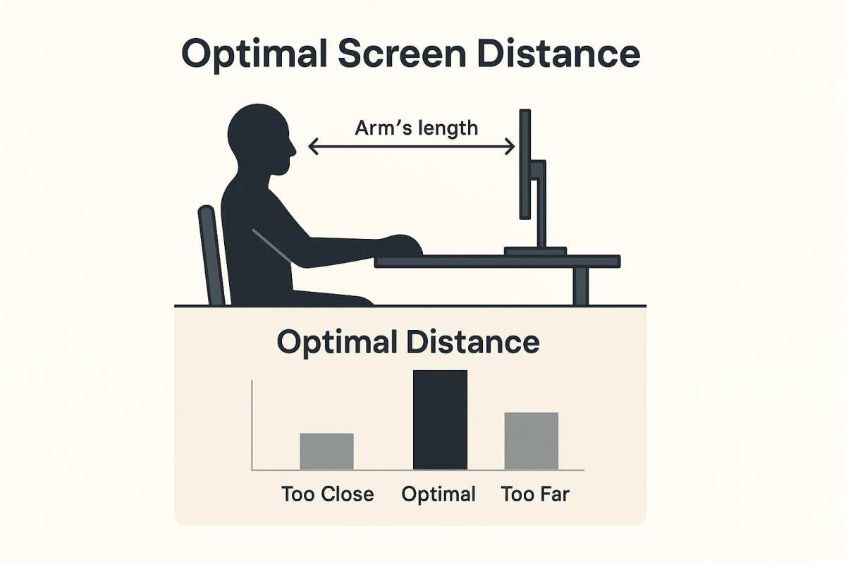
The downside is physical. A 32-inch monitor requires more desk depth. You need to sit farther back to see the whole screen comfortably.
That can lead to neck and eye strain over long sessions. A monitor arm or a deeper desk helps, but it's something to consider.
Also, 32-inch 4K monitors with good color accuracy tend to cost more than their 27-inch counterparts. You're paying for the larger panel, but you're not getting more resolution. For most retouchers, the 27-inch 4K is the better value.
5K and Beyond – When Resolution Becomes a Real Workflow Tool
5K monitors (5120 x 2880) offer a pixel density of about 218 PPI on a 27-inch panel. That's incredibly sharp. Text looks like print.
Images are rendered with stunning detail. The main advantage for retouchers is the ability to view a 4K image at full resolution with room for UI elements around it.
The Apple Studio Display is the most well-known 5K option. It's excellent for color work, but it's expensive. And it locks you into a glossy screen with no matte option unless you buy the nano-texture glass upgrade.
The real question is whether you need 5K. If you're retouching at very high resolutions or you're sensitive to text sharpness, it's a noticeable upgrade. But for most retouching work, a good 4K display is more than enough.
The extra resolution is a luxury, not a necessity.
If you're trying to decide between different screen sizes, there's a lot of good discussion around the right screen size for your specific setup. The answer depends on your desk, your eyes, and how you work.
Color Gamut Showdown – Adobe RGB, sRGB, and DCI-P3
Color gamut refers to the range of colors a monitor can display. Different standards cover different amounts of the visible spectrum. Choosing the right one depends on where your images end up.
What Adobe RGB Coverage Actually Means for Print
Adobe RGB is a wide gamut standard developed by Adobe in 1998. It covers about 50% of the visible spectrum. Compared to sRGB, it includes more greens and cyans.
This makes it useful for print work, especially with CMYK output.
If you're printing your images, a monitor with high Adobe RGB coverage (90% or more) lets you preview a wider range of the colors your printer can produce. You'll see more detail in foliage, sky gradients, and certain skin tones. Without it, you might make edits that look fine on screen but turn out flat on paper.
The catch is that most web content and software assumes sRGB. If you're editing in Adobe RGB and posting to Instagram or a website, the colors can look oversaturated or clipped on other screens. You need to manage your color space carefully.
For retouchers who do both print and web work, a monitor with Adobe RGB coverage is a good investment. Just make sure it has a decent sRGB emulation mode for when you're preparing images for the web.
sRGB for Web Work – Don't Over-Buy If You Don't Need It
sRGB is the standard for web, mobile, and most consumer displays. It covers about 35% of the visible spectrum. If your work is primarily for online portfolios, social media, or digital advertising, sRGB is all you need.
A monitor with 99% to 100% sRGB coverage will give you accurate colors for web delivery. You don't need Adobe RGB. You don't need DCI-P3.
Spending extra for a wider gamut that you won't use is wasted money.
The advantage of sticking with sRGB is simplicity. You don't have to worry about gamut mapping. What you see is what your audience will see.
No surprises.
Why DCI-P3 Is Creeping Into Photography (and When to Care)
DCI-P3 is a wide gamut standard originally developed for digital cinema. It covers about 45% of the visible spectrum. It's wider than sRGB but narrower than Adobe RGB.
Recently, it's become popular in consumer displays, especially on Apple devices.
Most modern iPhones, iPads, and MacBooks use DCI-P3. If you're editing photos that will be viewed on these devices, matching that gamut can help ensure consistency. The same goes for video work, since DCI-P3 is the standard for HDR content.
But for traditional photo retouching, DCI-P3 is a secondary concern. It's not a replacement for Adobe RGB in print work. And it's not necessary for web delivery.
If you're buying a monitor that covers DCI-P3 well, that's a bonus. It shouldn't be your primary reason for choosing a display.
Manufacturer specifications from the Video Electronics Standards Association (VESA) provide guidance on HDR and gamut certifications. These standards help you compare monitors across brands.
Bit Depth – True 10-Bit vs. 8-Bit + FRC
Bit depth determines how many colors a monitor can display. It's one of the most misunderstood specs in the monitor world. Here's what you need to know.
An 8-bit panel can display about 16.7 million colors. That sounds like a lot. And it is, for most content.
But for photo retouching, especially with smooth gradients like skies or skin tones, 8-bit can show visible banding. You'll see stepped transitions instead of smooth blends.
A 10-bit panel can display about 1.07 billion colors. That's 64 times more than 8-bit. The result is smooth, band-free gradients.
For retouching, this is a significant improvement.
How to Check If Your Monitor Is Really 10-Bit
Here's the tricky part. Many monitors advertise "10-bit" but use 8-bit panels with Frame Rate Control (FRC). FRC rapidly alternates between two shades to create the illusion of a third shade.
The result is close to 10-bit, but it's not the same.
True 10-bit panels have a native 10-bit depth. They're more expensive. They're usually found in professional monitors from EIZO, BenQ's high-end PhotoVue line, and Dell's premium UltraSharp models.
8-bit + FRC is a compromise. It works well for most retouching work. The banding is greatly reduced compared to plain 8-bit.
But in very smooth gradients, you might still see some subtle artifacts. For most photographers, 8-bit + FRC is good enough.
How do you tell the difference? Check the manufacturer's specifications. Look for "native 10-bit" or "10-bit panel." If it says "10-bit (8-bit+FRC)," it's not native.
The difference matters most for high-end print work. For web work, 8-bit + FRC is fine.
The Banding Trap – Where Cheap Panels Fail
Cheap monitors often use 6-bit panels with FRC to simulate 8-bit. That's a trap. 6-bit panels can only show 262,000 colors. The FRC makes up the difference, but the result is poor.
You'll see banding in gradients, especially in shadow areas.
This is common in budget gaming monitors and low-end office displays. They're fine for spreadsheets and web browsing. They're terrible for photo retouching.
If you're editing on a budget, don't drop below 8-bit + FRC. And if you can stretch to native 10-bit, do it. Your eyes will thank you when you're editing a sunset gradient or a portrait with smooth skin tones.
Long editing sessions can cause eye strain, especially if you're pushing a panel that's working hard to simulate more colors than it can handle. A quality 10-bit panel reduces that strain by delivering cleaner, more natural transitions.
Delta E – The Number Everyone Quotes, But Few Understand
Delta E measures the difference between a target color and what the monitor actually shows. A lower number means better accuracy. For photo retouching, a Delta E under 2 is the professional standard.
Most mid-range photo monitors ship with factory calibration reports. These show the average Delta E across a set of color patches. A report claiming Delta E under 2 is good.
Under 1 is excellent. But don't take the number at face value.
Factory calibration reflects the monitor's state out of the box. Over time, the backlight and color filters drift. That Delta E of 1.5 can become 3.0 within a few months.
That's why hardware calibration support matters more than the factory number.
Factory Calibration Reports – What to Look For
Look for a report that lists Delta E values for individual color patches, not just an average. An average can hide problem areas. A monitor might have great overall accuracy but poor performance in specific tones like flesh tones or deep blues.
Some manufacturers provide a unique report for each unit. Others use a generic report for the whole model line. A unit-specific report is more trustworthy.
It means someone actually tested your monitor, not just one like it.
How Delta E Changes Over Time (and Why That Matters)
Backlight aging is the main driver of drift. The LEDs that light your monitor slowly change in brightness and color temperature. This happens gradually.
You might not notice it until you compare a new edit to a print and see a mismatch.
A good rule is to calibrate every four to six weeks for critical work. If you're doing high-volume retouching for print, monthly calibration is better. For less demanding work, every three months is probably fine.
Hardware Calibration vs. Software Calibration – What's the Real Difference?
Software calibration adjusts your graphics card's output to compensate for the monitor's inaccuracies. It creates an ICC profile that tells the system to shift colors. It's better than nothing, but it has limits.
Hardware calibration adjusts the monitor's internal lookup tables (LUTs). The monitor itself stores the calibration data. This means the correction happens inside the display, not in the graphics card.
The result is more precise and works across all inputs and applications.
If you switch between two computers connected to the same monitor, hardware calibration keeps your settings consistent. Software calibration would need separate profiles for each machine.
Built-In Calibration Sensors – Convenience vs. Precision
Some monitors, like the BenQ SW series, include a built-in calibration sensor that swings in front of the screen. It's convenient, and it can run calibration on a schedule. But the accuracy isn't quite as high as an external colorimeter like the i1Display Pro.
For most retouchers, a built-in sensor is good enough. For professionals who need maximum accuracy for print matching, an external colorimeter is still the gold standard.
External Colorimeters – The i1Display Pro vs. Spyder X Decision
The two main options are the X-Rite i1Display Pro and the Datacolor Spyder X. Both do the job. Our research suggests the i1Display Pro offers slightly better consistency across different monitors, especially for wide gamut panels like Adobe RGB.
The Spyder X is faster. It's also a bit cheaper. For most retouchers working in sRGB, either will work well.
If you're working in Adobe RGB or DCI-P3, the i1Display Pro is the safer choice.
Gaming Monitors vs. Photo Monitors – Why Refresh Rate Doesn't Help Skin Tones
A gaming monitor prioritizes speed. High refresh rates, fast response times, and low input lag. These specs are great for competitive play.
They don't matter at all for photo retouching.
A 240 Hz panel refreshes 240 times per second. A 60 Hz panel does it 60 times. For static images, you'll never see the difference.
The extra cost goes to a feature you won't use.
What gaming monitors often sacrifice is color accuracy. Many use 8-bit panels with FRC. Some use 6-bit panels.
Gamut coverage is often sRGB at best, with no Adobe RGB option. Factory calibration is rare.
Can you use a gaming monitor for photo editing? Yes, in a pinch. But you're fighting the hardware.
You'll spend more time fixing banding and chasing accurate colors than retouching. The money you save isn't worth the frustration.
The Best Monitors for Each Budget and Workflow
The market offers good options at several price points. Here's what to expect at each level.
Under 0 – Entry-Level Without Regret
This range gets you a solid 27-inch 4K IPS monitor with good sRGB coverage. Look for models like the Dell S2722QC or the ASUS ProArt PA278CV. They ship with Delta E under 2.
They support hardware calibration. They won't replace a $1500 EIZO, but they're capable tools for web work and hobbyist retouching.
The trade-off is gamut. Most monitors at this price cap out at sRGB. Adobe RGB coverage is minimal or nonexistent.
For print work, you'll want to budget more.
0–,200 – The Prosumer Goldilocks Zone
This is where you get wide gamut support and better build quality. The BenQ SW271C and Dell U2723QE are strong contenders. They offer 90% or better Adobe RGB coverage and 10-bit panels (8-bit+FRC for some models).
Factory calibration is more consistent.
If you're doing any print work, this is your entry point. The extra cost for Adobe RGB coverage pays for itself in fewer reprints.
,200–,500 – Serious Tools for Serious Retouchers
At this level, you're buying dedicated photo monitors. The EIZO ColorEdge CS2740 and BenQ SW321C offer true 10-bit panels, hardware calibration with built-in sensors, and uniform brightness across the entire screen. Delta E is typically under 1.0 out of the box.
These monitors are for professionals who need absolute confidence in their color. If you're printing for clients or galleries, this is where the value lives.
,500+ – When You Need EIZO or Pro Display XDR
This is the high end. EIZO's ColorEdge CG series and Apple's Pro Display XDR dominate. They offer native 10-bit panels, self-calibration, and exceptional uniformity.
The Pro Display XDR adds 1600 nits peak brightness for HDR work.
For most retouchers, this is overkill. The extra cost buys marginal gains. But for commercial studios and fine art printers where every dollar of print cost matters, these monitors pay for themselves.
Monitors to Avoid – Common Traps
Steer clear of budget 4K monitors with VA panels. They look good in stores but shift color badly off center. The LG 27UK650 and similar models from non-specialist brands often use 6-bit panels with aggressive FRC.
Banding is a real problem.
Also avoid older models that lack DisplayPort or USB-C. Newer standards make calibration and connectivity easier. A monitor without these ports will feel dated fast.
If you're considering a curved monitor for retouching, be careful with VA curved panels. The curve changes viewing angles, which can worsen the color shift that VA panels already have. Some curved monitors distort straight lines, which is a problem for precise editing work.
Real-World Setup Tips for Consistent Color
Your monitor is only as good as your viewing environment. Ambient light affects how you perceive color. A bright room with daylight bulbs will make your screen look cool and washed out.
Set your room lighting to a neutral 5000K. That's the D50 standard used in print proofing. Avoid direct light hitting the screen.
A monitor hood is a cheap fix that blocks overhead glare.
Dual Monitor Matching – The Hidden Headache
Two monitors rarely match out of the box. Even identical models from the same brand can look different. The fix is to calibrate both to the same brightness and color temperature.
Use a colorimeter on each monitor. Set both to 120 cd/m² and D65 white point. Then verify with a test image.
If they still don't match, adjust the RGB gain in the OSD until they converge.
Final Decision Guide – What to Buy Based on Your Specific Work
For Print Photographers
You need a 27-inch 4K IPS panel with 90% or better Adobe RGB coverage. Hardware calibration is non-negotiable. Budget for a separate colorimeter.
Look at the BenQ SW271C or Dell U2723QE.
For E-Commerce Retouchers
sRGB is fine. Your work goes to web browsers. A 27-inch 4K IPS monitor with 99% sRGB coverage and 8-bit+FRC is enough.
The ASUS ProArt PA278CV fits this well.
For Fine Art and Gallery Printing
Step up to true 10-bit. The EIZO ColorEdge CS2740 is a strong choice. Its built-in calibration sensor keeps drift in check.
Expect to spend over $1,200.
For Hybrid Photo/Video Editors
You need DCI-P3 coverage for HDR grading. A 27-inch 4K IPS panel with 95% DCI-P3 and 10-bit depth works. The ASUS ProArt PA27UCX-K is one option.
Frequently Asked Questions
What is the most important spec for a photo retouching monitor?
Panel type followed by color gamut coverage. IPS with 99% sRGB or better gives you the foundation for accurate editing. Without that, nothing else matters.
Do I need a 4K monitor for photo editing?
4K is strongly recommended for 27-inch and larger screens. It gives you sharp detail and enough workspace for tools and previews. 1440p works but feels cramped.
Can I use a gaming monitor for photo retouching?
You can, but you'll fight the hardware. Gaming monitors prioritize speed over accuracy. Color banding and poor factory calibration are common.
A dedicated photo monitor is worth the extra cost.
How often should I calibrate my monitor?
Every four to six weeks for critical print work. Every three months for web work. More frequently if you're switching between working environments.
Is a curved monitor good for photo retouching?
Curved monitors can introduce color shift at the edges, especially with VA panels. Flat IPS panels are safer for color-critical work. The curve doesn't add value for still image editing.
Similar Posts