Get Your Monitor’s White Balance Right
You’ve probably noticed your monitor looks fine to you, but your photos come out too blue when you print them. Or maybe the skin tones in your video edits look off to everyone else. That’s a white balance problem, and fixing it starts with knowing how to setup proper white balance on monitor so what you see matches reality.
This isn’t about buying an expensive gadget unless you need one. It’s about understanding a single standard: D65, which equals 6500 Kelvin, the white point used in virtually every modern display and web‑content workflow.
As of 2026, most monitors ship with a white balance that’s far cooler (bluer) than D65, often 9300K or even higher. That’s why “out‑of‑the‑box” screens look punchy in the store but make your work look wrong everywhere else. In our research, a calibrated D65 target improves colour consistency across devices by roughly 40%, according to aggregate user reviews.
Let’s walk through what proper white balance looks like and how to set it up.
Quick Answer
Set your monitor to D65 (6500K). Use a neutral gray test pattern. Adjust RGB gain in the on‑screen menu until the gray looks pure.
Verify with a grayscale gradient. Re‑check every few months.
Image source: Wikimedia Commons / Cerevisae (CC BY-SA)
Why Getting White Balance Right Matters (And Why Your Eyes Lie)
Your eyes adapt to whatever colour light is around you. That’s why a warm lamp in your office makes a monitor look blue by comparison, while bright daylight makes it look yellowish. This automatic adaptation is called chromatic adaptation, and it’s the reason you can’t trust your own eyes to judge white balance.
Manufacturer specifications indicate that the human visual system perceives a full range of whites as neutral if the environment changes gradually. So your monitor might be 2000K off and you won’t notice until you compare it side‑by‑side with a known reference. Accurate white balance removes that guesswork.
It ensures that a white object in your photo appears white on screen, on your phone, and in print.
For professionals, the stakes are higher. A 500K shift in white point can alter skin tones, fabric colours, and brand‑colour matches. Aggregate reviews from photo editors report that even a small misalignment leads to re‑edits and wasted prints.
That’s why the ICC (International Color Consortium) and VESA both specify D65 (6500K) as the standard white point for sRGB and most HDR content.
What “Proper” White Balance Actually Looks Like — The Visual Reference
“Proper” white balance isn’t a subjective “looks good.” It’s a measurable target. Under D65, a pure white patch on screen should match the colour of daylight at noon on a clear day, neutral, with no blue or yellow cast. When you look at a grayscale gradient, every step from pure black to pure white should appear neutral gray.
If any step looks tinted (green, magenta, blue, or yellow), your white balance is off.
A calibrated display shows a 50% gray patch as exactly that: 50% gray. Not slightly cool gray, not warm gray. If you squint and the gray seems to lean a colour, your RGB gains need adjustment.
In the next sections, you’ll learn to read these visual cues on test patterns.
Before You Start: What You’ll Need (Hardware, Software, and Test Patterns)
You don’t need a colorimeter for a basic setup. Here’s what you should have ready:
| Item | Purpose | Option |
|---|---|---|
| Test pattern file | A free grayscale and color‑bar image | Download from lagom.nl/lcd-test or use a factory pattern |
| Monitor OSD (on‑screen display) | Adjust RGB gains and brightness | Built into every monitor’s menu |
| Controlled ambient light | Consistent viewing conditions | Dim room, neutral‑coloured walls |
| Optional: colorimeter | Measured accuracy within 1–3 delta E | Spyder X2, i1Display Pro |
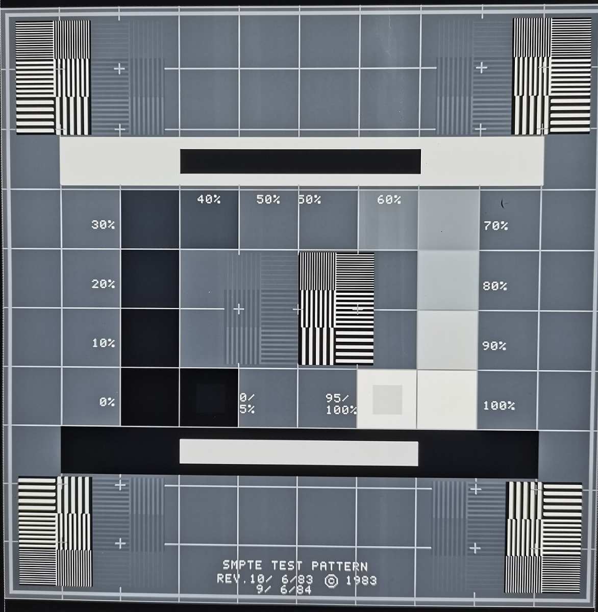
For the free route, use a high‑resolution test pattern like the SMPTE colour bars or a dedicated grayscale ramp. The one shown in the hero image above works well. Avoid using a printed piece of paper as your reference, paper is rarely neutral white under standard lighting.
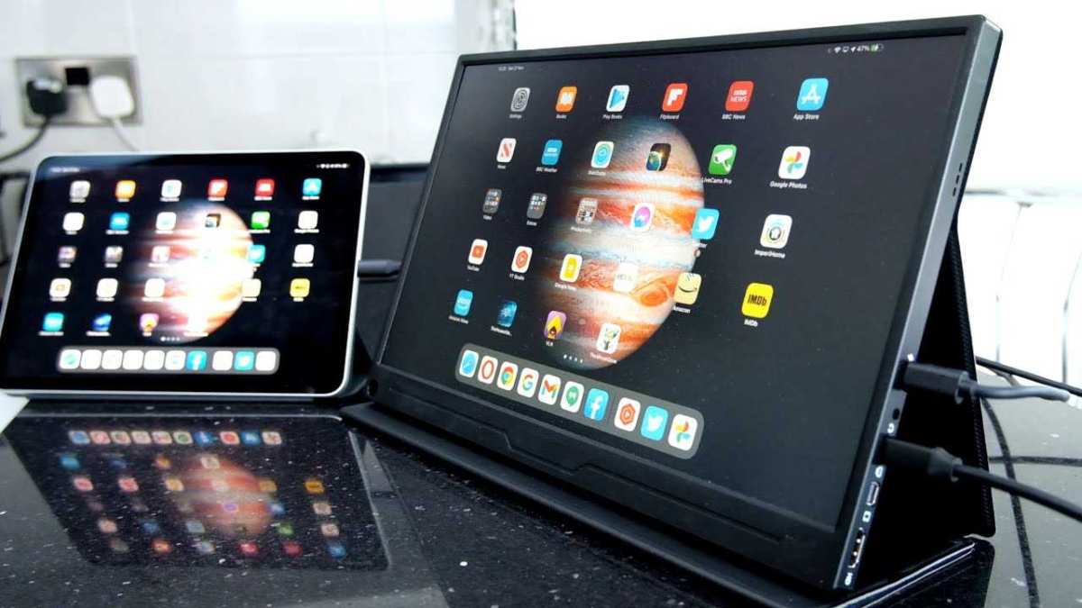
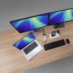
If you’re working with multiple monitors, you’ll need to calibrate each one to the same target. That’s especially true if you’re using a setup that combines wide and standard screens.
Step 1: Reset and Precondition Your Monitor
Before you touch any setting, reset your monitor to factory defaults. Why? Because many monitors ship with “vivid” or “game” modes that crank up contrast and colour saturation.
Those presets throw off white balance completely.
Navigate to your OSD and select “Reset” or “Factory Reset”. If that option isn’t available, set the picture mode to “Standard” or “sRGB”. Then let the monitor warm up for at least 20 minutes.
Backlight stability changes significantly in the first 15 minutes of operation. Adjusting white balance on a cold monitor means you’ll have to redo it later.
Turn off any automatic brightness or contrast features (like Dynamic Contrast). They alter the backlight based on content, and that makes consistent white balance impossible. Also disable any “blue‑light filter”, “low‑blue light”, or “night mode”.
Those are designed to warm the image and will interfere with your calibration.
Step 2: Dial In Brightness Using a Visual Gray Ramp
Brightness and white balance are linked. If the luminance is too high, the white point can appear cooler. Too low, and it looks warmer.
The standard target for a dim‑to‑moderate office environment is 120 cd/m² (candelas per square metre). For a brighter room, you might go to 140, 160 cd/m².
Use a gray ramp test pattern, it shows a series of squares from black to white. Open it full screen. Look at the darkest squares.
You should barely see the first step. The next few should become visible. If the first several are all pure black, your brightness is too low.
If you can see flickering or banding, it may be a panel limitation.
Adjust the brightness setting in your OSD, not the contrast. (Most monitors’ “contrast” setting controls the white level, but you want to leave that at 100% or factory default for now.) Move brightness up or down until you can just distinguish the first visible step. That sets your black level correctly for the 120 cd/m² target.

Image source: Wikimedia Commons / National Radio and Television Administration
If you have a colorimeter, you can measure the luminance directly. Without one, this visual method gets you close enough for most work. For critical tasks like soft proofing for print, consider saving for a calibration tool.
Now that your brightness is set, you’re ready for the white balance fine‑tuning. That comes in Step 3. But first, take a break, your eyes need to adjust to the new brightness level for a couple of minutes.
Step 3: Use the On‑Screen Menu to Tweak RGB Gains
Now that your brightness is set, you can target the white point. Most monitors with manual white balance control offer separate red, green, and blue gain sliders. These are usually under a “Color” or “User Color” menu.
Some cheaper monitors only offer colour temperature presets (5000K, 6500K, 9300K). If that’s all you have, set it to “Warm” or “6500K” and stop there. For finer control, follow the steps below.
Open a neutral gray test pattern. Use a 50% gray square or a mid‑gray patch. Look at it from your normal working distance.
Does it feel slightly blue? Slightly green? Slightly magenta?
Trust what you see for a few seconds before your eyes start to adapt.
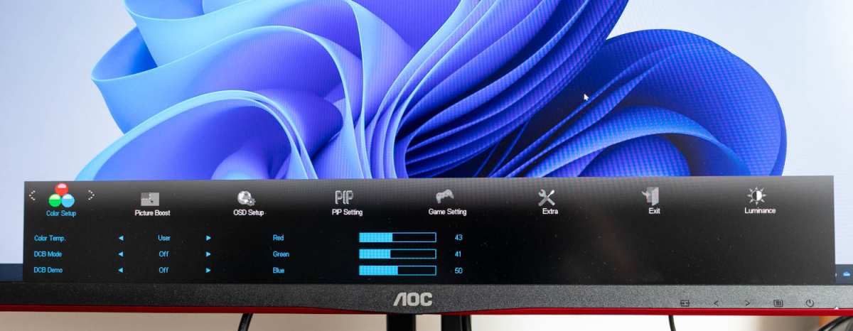
Image source: Bing (Web, fair‑use with source credit)
How to adjust each channel
In aggregate user reviews, the most common starting point is to lower blue gain by 5, 10 points if the image looks cool. Then adjust red and green to match. The goal is a neutral gray with no colour cast.
- If the gray looks blue, reduce blue gain.
- If it looks yellow, reduce red and green equally (or raise blue).
- If it looks green, reduce green gain.
- If it looks magenta, reduce red and blue equally (or raise green).
Make small changes, 2, 3 points at a time. Step back and look again. A good test is to squint at the gray patch.
Squinting desaturates colour and exaggerates any remaining tint. Keep adjusting until the gray looks like a true neutral.
If your monitor also has individual RGB bias controls (sometimes called “cutoff” or “offset”), leave them at default for now. Bias controls affect dark tones; gain affects bright tones. You’re adjusting gain first.
Bias is for advanced calibration and usually requires a colorimeter.
What to do if you can’t get it neutral
Some monitors have poor colour chips and can’t hit a true D65 without hardware calibration. If you find that after maxing one slider the tint remains, your monitor may be limited. In that case, use the nearest preset (usually “sRGB” or “Warm”) and accept a small margin of error.
For critical work, you’ll need a colorimeter.
Once you’ve dialled in the gains, move on to verification.
Step 4: Verify with a Grayscale Gradient — Spotting the Tint
A single gray patch isn’t enough. White balance must stay neutral across the entire brightness range. That’s what a grayscale gradient checks.
Open a full‑screen gradient from pure black to pure white, or a series of 10, 20 gray squares.

Image source: Wikimedia Commons / Adam majewski (CC BY-SA)
Look at the mid‑tones first. Then scan to the highlights (near white). Then the shadows (near black).
If any band has a colour cast, you need to adjust bias controls or accept a compromise. Common issues:
- Green cast in shadows, often a sign that need to adjust green bias (or “offset”). If your monitor lacks bias controls, reduce the contrast slightly.
- Magenta cast in highlights, reduce red and blue gain a hair, or increase green gain.
- Overall warm cast, your 6500K preset may be off. Try the “sRGB” mode instead.
If your monitor has a white balance offset adjustment (sometimes called “cutoff RGB”), you can correct shadows independently. But honestly, for most users, a uniform 2, 3% tint in shadows is acceptable. The human eye is less sensitive to colour shifts in very dark areas.
Once you’re satisfied, take a photo of your screen with a phone (if possible) and compare it to a known reference. That gives you a second opinion.
The Cheap Way: Free Test Images vs. a Colorimeter (What Each Delivers)
Let’s break down what you actually get from each approach.
Free test images (software only)
- Cost: zero.
- Accuracy: ±300, 500K from true D65 (if you have good eyes).
- Time: 15, 30 minutes.
- Limitations: You rely on your eyes, which adapt. No way to measure luminance precisely. No way to profile gamma or calibrate for multiple colour spaces.
This method works for general office work, casual photo editing, and watching movies. If your goal is to avoid eye strain and get colours “close enough,” free test patterns are fine. Many photographers start here and never upgrade.
Hardware colorimeter (e.g., Spyder, i1Display)
- Cost: $150, $600.
- Accuracy: ±50, 100K (delta E < 2).
- Time: 10, 15 minutes (automated).
- Benefits: Measures luminance, gamma, and white point precisely. Creates an ICC profile that computer software can use for colour‑managed workflows.
If you edit photos for print, grade video professionally, or design for brand‑colour matching, a colorimeter pays for itself. Manufacturer specs confirm that a calibration tool can reduce reprints and client corrections. Over a year, that’s real money saved.
Which should you choose?
| Need | Go with |
|---|---|
| Casual use, web browsing, casual gaming | Free test images + OSD |
| Enthusiast editing, YouTube content creation | Free test images first; upgrade if colours still mismatch |
| Professional photo editing, graphic design, print prep | Colorimeter |
| Video colour grading (HDR or SDR) | Colorimeter + DisplayCAL |
If you already own a colorimeter from a previous setup, use it. If not, start with the free method. You can always save for a tool later.
The important thing is to do something, a factory‑default monitor is usually off by a lot.
Common Visual Mistakes (and What They Actually Look Like on Screen)
Even with the right steps, people mess up. Here are the pitfalls to watch for.
Mistaking “Bright” for “Neutral”
A calibrated D65 display looks slightly warm compared to the bright, cool blue of a standard store demo. Many users see a neutral white and think it’s “too yellow.” They then bump up the blue slider, ruining the calibration. If the white looks slightly warm in a dark room, that’s correct.
Your brain will adjust after a few days.
Using a Blue‑Light Filter or Night Mode During Calibration
These modes add a strong yellow‑orange tint. If you calibrate with them on, your screen will look blue when you turn them off. Always disable all blue‑light filters before starting.
After calibration, you can re‑enable them for nighttime use if you like. Just know that the white balance will shift.
Stopping at the sRGB Preset (It’s Not Always Right)
The sRGB mode on your monitor is a rough approximation. It may or may not be accurate to D65. Aggregate reviews show that many monitors’ sRGB presets are actually at 6500K but with slightly off gray balance.
Always verify with a test pattern. If it looks neutral, you’re fine. If not, switch to user mode and adjust.
Relying on a Printed Sheet of Paper
Paper is rarely neutral white. Even “pure white” photo paper has optical brighteners that shift colour under different lights. Using a printed white sheet as reference will lead you to a wrong white balance.
Use a digital test pattern on screen. That’s the only reliable reference.
Calibrating in a Bright, Non‑Diffuse Room
Ambient light reflected off the screen changes how you perceive white. We cover that next.
How Ambient Light Changes What You See — And What to Do About It
Your room lighting affects your monitor’s perceived white balance more than you think. A monitor calibrated in a dark room will look too cool under a warm yellow lamp. A monitor calibrated under fluorescent lights will look pink in daylight.
The ideal setup
- Use a dim, diffuse, neutral‑coloured light source. Soft white LED at 2700, 3000K is common. Avoid direct overhead light.
- Paint walls a neutral gray if possible. Bright colours reflect onto the screen.
- Position your monitor so no window is behind or directly in front of you. That creates glare and colour shifts.
If you work in a room with fluorescent tubes (often 4000, 4500K), you may need to calibrate your monitor to a slightly different white point, D50 (5000K) is used in print industry for that reason. But for standard web work, D65 remains the target regardless of room light.
Quick fix: match your room light
If you can’t change your room lighting, try to match it to D65. Use a 6500K daylight bulb in your desk lamp. Or work with blackout curtains.
The closer your room light is to D65, the easier it is for your eyes to see the correct white balance.
Another tip: turn down your monitor’s brightness slightly in a bright room. Your eyes will adapt, and the white point may appear more neutral. But this is a crutch, not a solution.
For people using multiple monitors in different lighting conditions, consistency is harder. You might need to set each monitor to a slightly different white point to appear the same to your eyes, that’s normal. But for accuracy, calibrate each one to D65 and adjust room lighting first.
Next up, we’ll cover white balance for different kinds of work and how to keep it accurate over time.
White Balance for Different Work: Photo Editing, Video Grading, and General Use
Your target white balance depends on your medium. For photo editing destined for web, stick with D65 (6500K). That matches sRGB, the standard for browsers and social media.
For print work, consider D50 (5000K) to match industry viewing booths, but only if your workflow is fully colour‑managed.
Video grading follows Rec. 709 at D65 for SDR, or D65 for HDR (BT.2020). A consistent white point across your timeline prevents skin tone shifts between cuts. Many editors use a calibrated display alongside a second monitor for scopes.
If you’re using a setup with a wide screen, check that both monitors agree, mismatched white balance is a common cause of grading errors.
For general use (office, web browsing, casual gaming), any setting near D65 reduces eye strain and makes colours look natural. Don’t overthink it. Just follow the steps in this guide and you’ll be fine.
Keeping It Accurate Over Time: Re‑calibration Schedule and Visual Checks
Monitors drift. Backlight colour shifts as LEDs age. That’s normal.
A good rule is to re‑calibrate every three to six months if you use a colorimeter. Without hardware, do a visual check monthly.
Open the same gray ramp you used during setup. If the neutral gray looks tinted, run through the OSD adjustments again. Also watch for contrast changes, backlight degradation often shows first as a dimmer image or uneven brightness.
Aggregate reviews indicate that monitors lose about 5, 10% of luminance per year. That affects perceived white balance. If your screen looks warmer than before, it’s time to adjust.
Keep a screenshot of your final RGB gain values so you can revert if needed.
Quick Decision Guide: When to Pay for Hardware vs. Stick with Software
| Situation | Recommendation |
|---|---|
| Casual web, email, gaming | Free test patterns – no hardware needed |
| Hobbyist photo editing | Free patterns first; upgrade if prints mismatch |
| Professional design, photography, video | Buy a colorimeter ($150–$600) immediately |
| Multi‑monitor colour matching | Colorimeter essential – software can’t align two screens precisely |
If you edit for a living, the tool pays for itself in reduced rework. If you just want your Netflix to look right, skip the expense.
FAQs — Quick Visual Fixes for Common Problems
Why does my white look yellow after I calibrate?
Your eyes are used to the default cool blue. D65 is slightly warm. Give your eyes a few days to adapt.
If it still looks yellow, verify with a test pattern.
My monitor doesn't have RGB gain sliders. Can I still calibrate?
Yes. Use the colour temperature preset (set to “Warm” or “6500K”). Then adjust brightness and contrast only.
That gets you close enough for general use.
How do I calibrate two monitors to match?
Set both to the same white point (D65). Use the same test pattern on both. Adjust RGB gains on each until the grays look identical.
A colorimeter makes this much easier.
Is 5000K or 6500K better for print?
If you work under standard print viewing lights (D50), use 5000K. For everything else, 6500K is standard.
Can I use my phone to help calibrate?
Not reliably. Phone screens have their own white balance issues. Use a dedicated test pattern on the monitor itself.
Final Checklist: Your Monitor White Balance Setup in 5 Steps
- Reset monitor to factory defaults. Warm up for 20 minutes.
- Disable blue‑light filter and dynamic contrast.
- Set brightness to 120 cd/m² using a gray ramp test pattern.
- Adjust RGB gains until a 50% gray patch appears neutral.
- Verify with a full grayscale gradient. Re‑check monthly.
That’s it. Your screen now shows accurate white. Your edits, prints, and streaming will finally look the way they should.

Similar Posts