How To Make Your Apps Look Cool On Android In 55 Characters
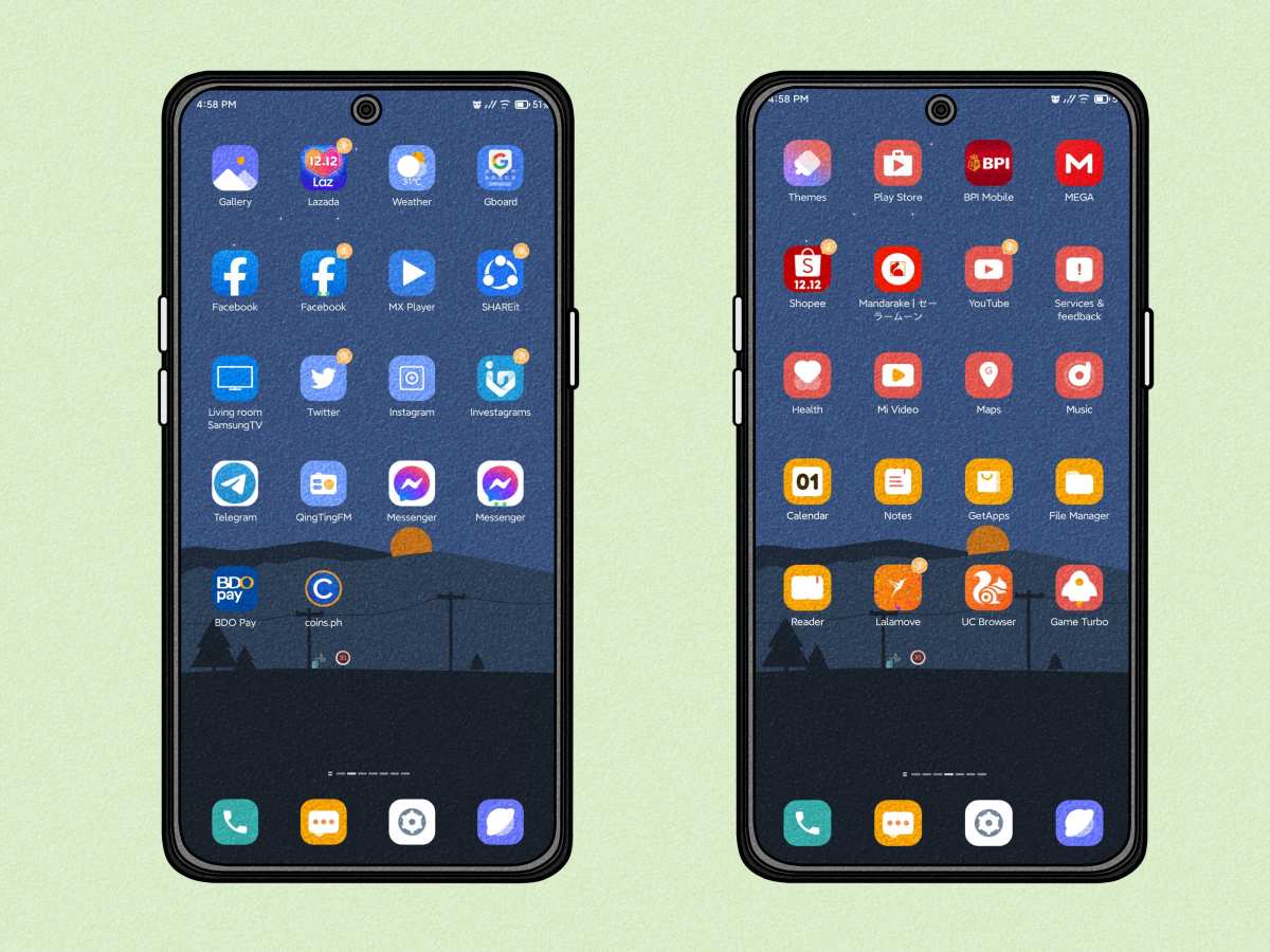
To make your apps look cool on Android, focus on sleek design, vibrant colors, and intuitive interfaces. **Use eye-catching themes, custom icons, and smooth animations** to grab user attention instantly. When you learn how to make your apps look cool on Android, you create a more engaging experience for users, encouraging them to explore more. Simplify navigation and add modern touches to your layouts to keep everything fresh and appealing. With a few simple tweaks, your app will stand out and look great on any device.

How to Make Your Apps Look Cool on Android
Creating an app that looks stylish and engaging can make a big difference in how users perceive and interact with your project. When your app has a fresh, modern look, it invites more downloads, better reviews, and increased user retention. So, how do you craft an app that stands out visually? Let’s explore some key strategies that will help your Android app look cool and feel intuitive.
Understand Your Audience and Define Your Style
Before diving into design details, it’s essential to grasp who your users are. Are they teenagers looking for trendy features, professionals requiring a clean interface, or kids enjoying playful elements? Recognizing your target group helps shape your app’s visual style, ensuring it resonates with them.
– **Research popular trends**: Look at trending apps in your niche and note what makes their design appealing.
– **Create user personas**: Sketch profiles of your ideal users, including their preferences and expectations.
– **Choose a style that fits**: Decide on a visual theme—minimalist, colorful, futuristic, or playful—that aligns with your app’s purpose.
Once you know your audience, pick a cohesive design style that guides every element, from colors to typography, ensuring your app feels unified and appealing.
Leverage Material Design Principles
Google’s Material Design offers a comprehensive set of guidelines to craft apps that look modern and feel intuitive. It emphasizes clarity, hierarchy, and motion, creating interfaces that are both visually appealing and easy to use.
– **Use bold colors and contrast**: Material Design favors vibrant, contrasting colors that make elements pop.
– **Implement depth and shadows**: Elevate clickable elements with subtle shadows to mimic physical layers.
– **Prioritize typography**: Use clear, readable fonts and appropriate sizes to improve legibility.
– **Follow consistent spacing**: Maintain uniform padding and margins to give your app a clean look.
Incorporating Material Design ensures your app adheres to familiar visual cues, making it more appealing and accessible.
Choose the Right Color Palette
Colors play a fundamental role in app aesthetics. An attractive color scheme can make your app look fresh and energetic.
– **Pick a primary color**: This will be the main hue used in headers, buttons, and icons.
– **Select secondary and accent colors**: Use these for highlights, notifications, or to guide user attention.
– **Maintain contrast**: Ensure that text is easy to read against background colors by using sufficient contrast ratios.
– **Use color psychology wisely**: Bright colors evoke energy, while muted tones feel calm and professional.
Tools like Adobe Color or Coolors can help you experiment with color schemes that fit your app’s personality.
Focus on Clean, Modern Typography
Typography directly influences your app’s visual identity and readability.
– **Choose easy-to-read fonts**: Sans-serif fonts like Roboto or Open Sans work well on screens.
– **Limit font styles**: Use a maximum of two font styles to keep the look simple.
– **Highlight important elements**: Use larger or bolder fonts for headings and buttons.
– **Adjust line spacing and letter spacing**: Proper spacing improves legibility and overall aesthetic.
Consistency in typography helps your app look professional and easy to navigate.
Create Engaging Icons and Visual Elements
Icons and graphics add personality and clarity to your app.
– **Design custom icons**: Unique icons make your app memorable and show attention to detail.
– **Use uniform icon styles**: Keep icon sizes and styles consistent across screens.
– **Incorporate subtle animations**: Light animations on icons or transitions can make interactions feel smooth.
– **Utilize high-quality images**: Use crisp, well-designed images that enhance your app’s look without clutter.
A well-crafted visual language invites users to explore your app confidently.
Implement Smooth Animations and Transitions
Animations add life to your app, making interactions feel natural and engaging.
– **Use motion to guide users**: Animate button presses, page transitions, and feedback cues.
– **Avoid overdoing it**: Keep animations subtle to prevent distraction.
– **Align with Material Guidelines**: Follow recommended durations and easing functions for consistency.
– **Leverage Android’s animation tools**: Use the built-in Animator or MotionLayout for advanced effects.
Smooth motion not only enhances aesthetics but also improves user experience.
Design User-Friendly Layouts
A cool-looking app must also be easy to navigate. Thoughtful layout design ensures users find what they need effortlessly.
– **Prioritize simplicity**: Avoid clutter and keep essential features upfront.
– **Use grids and alignment**: Structured layouts make content easier to scan.
– **Create clear call-to-action buttons**: Make buttons stand out with contrasting colors and ample padding.
– **Ensure responsiveness**: Design layouts that adapt well to different screen sizes and orientations.
A well-organized interface feels modern and invites continued engagement.
Utilize Custom Components and Themes
Personalizing components and themes boosts your app’s uniqueness.
– **Create custom buttons, switches, and other UI elements**: Add your style to standard widgets.
– **Implement themes and styles**: Define color schemes, fonts, and shapes in style files to maintain consistency.
– **Apply dynamic themes**: Allow users to switch between dark and light modes for a modern touch.
This level of customization helps your app stand out visually and functionally.
Test and Iterate Your Design
Design isn’t static. Testing your app’s look and feel ensures it remains appealing and user-friendly.
– **Gather user feedback**: Conduct user tests to understand how your target audience perceives your design.
– **Utilize design tools**: Use prototypes with tools like Figma or Adobe XD to refine visuals.
– **Check across devices**: Make sure your app looks great on various screen sizes and resolutions.
– **Refine based on data**: Adjust colors, layouts, or interactions to improve aesthetics and usability.
Continuously improving your visuals keeps your app looking cool and fresh.
—
With these strategies, you can create an Android app that not only functions well but also catches the eye with modern, engaging visuals. Remember to stay consistent, follow design principles, and listen to user feedback. Incorporating these elements thoughtfully will help your app stand out and make a memorable impression on every user.
Frequently Asked Questions
How can I customize the color schemes and themes to make my app more appealing?
To enhance your app’s visual appeal, experiment with vibrant and cohesive color schemes that match your brand identity. Use consistent themes throughout the app, including background, buttons, and icons, to create a harmonious look. Incorporate material design principles and consider offering theme options, such as dark and light modes, to cater to user preferences and improve overall aesthetics.
What are some effective ways to improve the navigation design for a sleeker app appearance?
Design intuitive navigation layouts that are simple and easy to use. Use clear icons and labels, and keep the menu structure minimal to avoid clutter. Implement smooth animations and transitions between screens to add a modern touch. Ensuring consistent placement of navigation elements across all screens helps users feel comfortable and enhances the app’s polished look.
How can I incorporate modern UI elements to give my app a fresh look?
Integrate contemporary UI components such as rounded buttons, subtle shadows, and gradient backgrounds. Use high-quality icons and engaging typography to make the interface stand out. Adding micro-interactions and subtle animations can also bring your app to life, making it feel current and engaging for users.
What role does icon design play in making my app visually attractive?
Creating custom icons that align with your app’s theme can significantly improve its visual appeal. Ensure icons are simple, recognizable, and consistent in style. Well-designed icons help users navigate easily while adding a professional appearance to the overall interface, making your app look more polished and stylish.
How can I optimize my app’s layout for different device sizes and orientations?
Use responsive design techniques such as flexible layouts and scalable UI elements to ensure your app adapts well to various screen sizes. Test your app on multiple devices and orientations to identify and fix layout issues. Properly aligning content and using media queries or constraint layouts helps maintain a clean, attractive look across all devices.
Final Thoughts
To make your apps look cool on Android, focus on sleek UI design and smooth animations. Use vibrant color schemes and modern fonts to catch users’ eyes. Incorporate engaging interactions that make navigation intuitive and fun. By paying attention to these details, you can give your app a fresh, appealing feel that stands out. In summary, how to make your apps look cool on android involves combining stylish visuals with responsive functionality to create an engaging user experience.
Related posts
how to remove search bar from home screen android
So you just want the search bar gone. That little Google pill sitting on your home screen, taking…
how to send a gif in a text on android
Sending a GIF in a text on Android sounds simple, but the exact steps change depending on your…
how to enable push notifications android
You're staring at your Android phone, waiting for a notification that never comes. Maybe it's a message from…